JOHN LEWIS.
TISSUE PAPER AND STICKERS.
As caitlin is working on refining and testing the box nets, I got to work on designing the tissue paper and stickers that would wrap the orders inside the boxes. Part of our concept is that customers will be able to personalise an order and send it to someone else for special occasions. We also thought that John Lewis could use these during seasonal periods. Our aim for the project is to create 3 different combinations - One for 'every day' occasions, and then 2 seasonal combinations encompassing Valentine's day and Christmas.
I gathered a range of images of tissue paper / wrapping styles for inspiration, and presented these to her to gather her opinion.


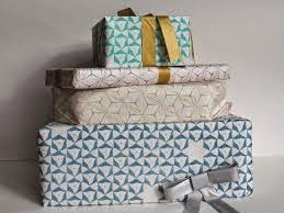


When looking at the range of wrapping I had collected I found there were two styles in particular I felt would suit John Lewis and the packaging me and Caitlin were designing.
Firstly were the combination of bold minimalist shapes in bright colours to create a repetitive pattern. I thought these were great in terms of simplicity and clarity in that the style would be easily transferable across different seasons. A new symbol could be created to reflect a special occasion such as a balloon for a birthday, and this could be repeated to create a pattern. The process is aesthetically pleasing, simple and not time hoarding.
I also felt it was an appropriate aesthetic for the brand. John Lewis have a bold established geometric logo consisting of repetitive stripes. They have incorporated the idea of minimalism across their brand, in the thought that more minimal design allows the quality of the product to speak clearly.
I also considered a more traditional style wrapping paper in which hand drawn/ traditional looking illustrations possibly created via production processes such as screen print are used to create patterns. I felt that such a style would also represent John Lewis well as it is such a traditional brand. I also felt that such a style could work well when applying the wrapping to seasons as we could draw inspiration from elements such as the John Lewis Christmas adverts in which people wait for routinely every year, which causes a great amount of customer involvement.
Possible Monty the penguin?
I discussed both Ideas with Caitlin in showing the her the collection of wrapping paper designs. When speaking together we came to a joint decision that the first idea was going to be better for the brand. Although the second concept worked well with the tradition of John Lewis, the first worked well to bring the idea to a contemporary audience, for a brand that was developing as a contemporary department store. The minimalist designs were also simple and fuss free, and therefore more enjoyable for the customer to unwrap.
Development.
Firstly I began playing with the tissue paper designs as I figured I would design stickers to match these afterwards.
Starting with the 'signature' tissue combination, we together tried to think of a design that was both classic, like the John Lewis brand, but also clean and contemporary. We felt that bold horizontal stripes portrayed the kind of attitude that we were going for. In terms of colour, we experimented with both grey and black. We wanted to choose colours that were quite neutral and would complement the John Lewis green that already exists within the brand.


With this in mind I transferred the colour of the pattern to a classic red, which I thought worked well, much better than the pink, but I also felt like it was a bit too cliche.


Next I played with the idea of being 'Almost there!' creating excitement within the customer, thus boosting their experience of unwrapping the parcel and not just getting their hands on they order. I wasn't sure how well this would work as it could also sound quite patronising?


Possible Monty the penguin?
I discussed both Ideas with Caitlin in showing the her the collection of wrapping paper designs. When speaking together we came to a joint decision that the first idea was going to be better for the brand. Although the second concept worked well with the tradition of John Lewis, the first worked well to bring the idea to a contemporary audience, for a brand that was developing as a contemporary department store. The minimalist designs were also simple and fuss free, and therefore more enjoyable for the customer to unwrap.
Development.
Firstly I began playing with the tissue paper designs as I figured I would design stickers to match these afterwards.
Starting with the 'signature' tissue combination, we together tried to think of a design that was both classic, like the John Lewis brand, but also clean and contemporary. We felt that bold horizontal stripes portrayed the kind of attitude that we were going for. In terms of colour, we experimented with both grey and black. We wanted to choose colours that were quite neutral and would complement the John Lewis green that already exists within the brand.
In terms of complementing the brand, we thought that the black might be too drastic and bold, fighting the box for attention, we want something which will complement the outside branding. Therefore we have jointly decided that the grey and white combination is going to be most appropriate for the brand.
With that decided I began playing around with the two festive options we will be creating for Christmas day and Valentines.
I began playing with one of the most simple shapes that can be linked with the Christmas season; a christmas tree. I copied and pasted the shaped into a pattern, creating something bold and simple, that when looked at, tree shapes could be distinguished from both the green and white shapes.
I also played around with the spacing in-between each shape, which illuminated the idea that a tree shape could be made for the areas of negative space. However it did bring a new breath of simplicity to the wrapping which I thought was good. The space almost made it took more subtle, which matched the aesthetic of the light grey stripes we had chosen to use.
I played with reversing the colour scheme, however wasn't sure due to the darkness of the green that this was a bit too much. I think it will be more successfully consistent also if we stick to white being the most dominant colour through out all of the patterns.
I switched back to having a white background, however I changed the shade of green to be lighter, to further match the subtleness of the grey stripes. However, looking at the pattern I felt it was too light in reflection to the grey stripes.
I went back to the original formation in which the pattern was more tightly packed, using the same lighter colour allowed the pattern to become bolder, which is exactly what I was looking for.
I again inverted the colours so that they were reversed, however even though I had lightened the colour, I still agreed with my previous decision to keep the most dominant colours as white across the tissue papers for better consistency.
With a range of patterns created in relation to christmas I moved onto creating a range in relation to valentines day which I will later get Caitlin's opinion on.
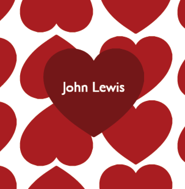
Although I tried to stay away from hearts as the symbol to represent valentines day, and go for something else that wasn't so obvious, I had to remind myself that sometimes the most obvious ideas can be the best ones, and also that one of my main aims for the tissue paper is simplistic, bold, contemporary patterns.
I created a simple heart shape and stacked it into a pattern, and at first I played with the colour pink. I had in mind that I want the patterns to contrast with the stickers that would be used to hold the tissue paper together.
However looking at the tissue paper design it was much too subtle and almost appeared too feminine due to the daintiness of the colour. The pattern will have to be something that works for recipients who are both female and male.
With this in mind I transferred the colour of the pattern to a classic red, which I thought worked well, much better than the pink, but I also felt like it was a bit too cliche.
As John Lewis is a traditional brand, I made the colour even more intense in a darker and deeper shade. I think this colour works the best so far out of the three I have tested, and appears much more bolder, and romantic in contrast to the previous two.
However I still wasn't to ally happy with the pattern and I think that this was down to the formation rather than the colour. I tried experimenting slightly with the layout and flipped every other line of vertical hearts upside down. I felt like editing the pattern with a slight change as this one really made it appearing more interesting to look at.
Final Pattern Designs
After creating both festive patterns by myself, I asked Caitlin what she thought of the selection I had created.
We were both joint in opinion in deciding that the last valentines pattern I had created was the best out of the selection. It is bold and simple, but the colour attaches the pattern to John Lewis' traditional roots and the formation appears interesting with the simple shape used adding a contemporary edge and bringing the design in tune with John Lewis' modern audience.
In terms of the Christmas tissue paper pattern I was undecided with both the original, and one in which I had created more space between each shape. I felt like the first was again exciting and bold, however I wondered if it was a little too busy compared to the second which appears more subtle.
When showing them to Caitlin, she ultimately preferred the first design. When looking at the two christmas designs side by side with the 'signature' and valentines pattern we had created, I did feel that the pattern with the spaces in between looked too out of place, and in fact the original design worked better in combination with the others.
Stickers
With the tissue paper designs decided, I then went onto thinking about the designs of the stickers which would seal the tissue paper together. I had two different ideas that I wanted to try out for these designs. Firstly I wanted to try out a more type based sticker in which sent a fun and friendly message to the customer. Secondly I wanted to again, alike to the patterns, play with simple shapes and icons.
I began with the 'signature' combination that would be used on 'everyday' orders. Playing with this concept I came up with the short phrase 'To me, from me' experimenting with the idea of giving a gift to yourself. However I considered its function and how it might cause issues if someone buys some else a gift and sends it straight to their recipient, without personalising the order? because the order would no longer be to me from me. We need something that would work successfully across all situations.
Again I came up with the concept of 'treating yourself' but thought back to my previous design in which I distinguished wouldn't work when one was talking about sending a gift to themselves.
Again I went back and played with the concept of unveiling an order, and it being truly special with the message of 'Ta day' creating a fun and friendly atmosphere, that connected the store and customer on a more personal level.
I found christmas was a little bit harder to create ideas for without simply stating 'Merry christmas' or using other traditional sayings. I wanted to continue the idea of creating something fun, and almost quite punny to connect the store and the customer.
The slogan that I managed to come up with 'all I want' played on both the name of the christmas song 'All I want for christmas' and also the customers assumed reaction to the order. In the idea that the order that they receive is all they want for Christmas.
I was liking the type based stickers and felt that they were working well in contrast to the illustration based tissue paper patterns. Next I moved onto the valentines design in which I came up with a couple of different ideas.
The first was more simple, obvious and a little bit old school, using the word 'valentine' as a statement. This conjures ideas back to the idea of asking people to be your valentine, playing on tradition, which is a big part of the John Lewis brand, but making it more relatable to a contemporary audience.
Again I experimented with a more playful and casual toned Idea which plays on the idea of being shot with cupids bow. I felt that this Idea was really great and again lowered the barrier between store and customer, making the relationship more friendly.
Although I felt like the type stickers were evolving really well, I also wanted to work on the symbol stickers to see what kind of combinations I could come up with. I began working with the christmas wrapping, in which the inspiration came from the tree.
I first played with the idea of the star on top of the tree, I thought that visually these worked well together, as it is normal, within a christmas tree to see both symbols together. I also thought that the yellow contrasted really well with the John Lewis green. And so I continued to use this colour with the next symbol.
Again I was inspired by the Christmas tree using the symbol of a bauble, I felt lie the symbols were also working really well, as they tied in well due to their likeliness using simple shapes just as the wrapping does.
I couldn't really decided between which I thought was more successful, I think both shapes work as equally as well as each other, and we could even consider having more than one sticker design per festive event.
Next i began developing visuals for the valentines stickers. I found it quite hard to find symbols that differentiate from the hearts as previously discussed. For this reason I tried creating a sticker using the same heart shape used in the pattern but deepening and darkening the colour and increasing the size. I thought that this was a ok idea, and if I couldn't find any other visual that could work this could be viable.
Next I tried to be a bit more experimental and considered the idea of a love letter type sticker. However looking at it laid over the top of the pattern I felt that it was a bit too messy and fussy for the minimalist type look we were looking for.
In order to combat the fussiness, I really tried to go back to basics and created a simple circle sticker. I felt that this would contrast the heart shaped pattern well, in both shape and colour and still submits to the minimalist look we are trying to achieve.
Finally I looked at the signature combination of sticker and tissue paper. I thought it would be a great idea for the sticker to reiterate the whole concept of the project. The idea of the delivery being a gift. Therefore shaping the sticker like a gift.
Again I asked Caitlin on her thoughts about the two different sticker types I had created, type based and symbol based. When discussing, we leaned towards the symbol based designs, as we felt the type ones were too similar to the type of branding that Selfridges used which we found earlier on in our research. The Symbols also seemed to work well as the pattern is also illustration based. We also liked how the symbols linked contextually and visually to each other such as the christmas tree with star topper and bauble. I asked Caitlin out of the two christmas options she preferred as I thought both worked well, and she leaned towards the bauble shape as there was more contrast between this and the tree shape than the star.
Final decision:
No comments:
Post a Comment