FLORIST BRANDING.
DEVELOPING THE BRAND.
It seems from experience that the next step should be to work on brand elements such as flower packaging. Previously I would have moved onto business cards next but these should reflect the rand as a whole including such elements as flower carriers etc. Therefore, I will move onto platforms such as this once I have completed other brand components.
Next I looked at how other florists package their flowers to give to customers:


After looking at the range of packaging options above, I think that simplicity and minimalism are again going to be best in choice. There are a few ideas that I have translated from above which I think I could adapt to make work for Beckett and Beccari. I want to create a couple of different packaging shapes for both shorter and longer stemmed flowers, as a brand as luxurious as this would be more than likely to create bespoke lengths of packaging for different bouquets, rather than use wrapping paper and just cut it down depending on the size of bouquet.
For this reason I looked more so at boxes and how I could play with the height of these to create a consistent collection of packaging across the brand.
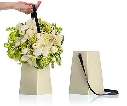
I noticed a shape packaging above that I thought was quite simple and elegant and resembled that of a vase, I also liked the use of ribbons as handles and thought that this added an extra touch of luxury, especially as it added extra textures.

I also tried flipping the shape of the packaging to fit more so will the natural shape of the bottom of a bouquet, but I wasn't keen on the shape and felt that it would look off for short stemmed flowers.

I also tried the same format, but using a square and felt that having straighter more parallel, lines brought the packaging design into a more contemporary for front. I think in packaging shorter flowers this will be the best option.
I then thought about how I could translate the packaging idea to suit longer flowers as well such as bouquets.
There was a packaging idea that I found earlier which I thought particularly had a great function.
I thought that the erganomics behind the design were really well thought out. I thought it was very successful how the design had considered new ways to carry the flowers, as carrying them by the bottoms of the stems can often be a bit awkward and mean that you have to carry the new bouquet upside down.
Although I think that the design above is much too casual for Beckett Beccari I think it can be translated taking the same elements from the short flowers packaging design to suit the brand.
I took the exact shape and formmat, creating a base that would wrap around the flowers in the same upside down pyramid, however keeping the same structural and straight line format of the previous packaging.

I then considered how the logo could be used on this shape packaging. I thought that having the logo horizontally placed across the packaging would make it too small, and wouldn't be making use of the space.
Instead I flipped the logo to be placed vertically across the packaging, which I felt worked well as the packaging is vertically focused. Although the logo is not as readable turned on its side, the size of the logo will increase which I think will counter act this.

With the shapes and logo placement decided I started considering colour scheme, the main colours that I wanted to work with are black, with subtle hints of white to break up the monotone.
I experimented with a few different colour combinations using both white and black and black on black, I feel that not only is this the best decision as they are the sorts of colours associated with luxury items, but I feel that such a colour combination will also help to frame flowers, which will contrast the minimalist colour pallet and stand out. In order to achieve a black on black effect as seen below, I will have to consider a process such as foiling so that the background and logo differentiate via texture. This would work for the brand as often foiling is seen as a luxury process.

I have found looking at the colour combinations that the most luxurious aesthetic seems to come from the pairings that use black on black within the design.

However I do feel that the one that works best between the two black on black designs, is the one that incorporates a hint of white. I think that having this one symbol standing out from the rest of the design, helps to enhance its luxuriousness, as it is a bold and minimalist statement. I think that the use of black foil on the black backdrop will also increase the idea of luxury, as it is bring in an extra texture.

From deciding the colour combination from the flower carriers, I also wanted to increase the use of texture by incorporating tissue paper that would wrap around the flowers before they are placed into the flower carrier as shown below:
I think that increasing layers, and again textures will help contribute not only to an up scale feel, but also somewhat make the designs more reflective of nature, which has many layers and textures.
Again, I began playing with a monochromatic pallet, in thinking of opulence, and trying to think of classic motifs that would compliment the brand so far I began to play with stripes. Stripes create the allusion, when bold of being strong and powerful, which as I was reading previously when researching, is something that a luxury brand had to be.

I also played with the aesthetic of thinner stripes as well just to experiment, but felt that the bolder stripes would as assumed, be more successful for the brand.

I also thought about how I could incorporate the shortened logo into a simple pattern. I experimented with the pattern in both white on black and black on black. However I think that white on black would be the most realistic of both versions as it would only need printing. Black on black would have to be foiled or flocked which I have never tried on tissue paper, and am not sure if it would work.

Looking back at the six different patterns I have created, I think that the ones that work most for the brand are the first bold black and white powerful stripe pattern, and the repetitive logo pattern in black and white. I created an illustration putting both into context and asked my peers for their opinion.

After showing my peers the two different options I was working with their vote rested heavily with the second option in which they decided appeared much more luxury than the first, with one commenting that the black and white striped paper appeared to mirror something like Beetlejuice which was definitely an association I was wanting to avoid.
I also felt that this combination helped to even further contrast with the idea that I want the flowers to contrast as much as possible with the flowers. Using more of one colour, and having black dominate the colour pallet will help to push this forwards.

No comments:
Post a Comment