Florist Branding.
Thank you cards.
Next I moved onto designing the thank you cards that people can fill out when sending someone a bouquet or arrangement. My inspiration for the shape of the thank you cards derived from the flower carriers, in which take on a gift like appearance. It was the idea of gifting that led me to create a thank you card shape that looked like a gift tag, which could be threaded though the ribbon handles on the bags.
Firstly I tried a design that was inspired by other elements such as the flower carriers and the business cards. I do however, looking at this design, feel like it is promoting the company too much, and it should instead working as something that should be slightly more personal to the customer.

Next I created a design on the front of the card to resemble my final tissue paper design. I thought that this seemed much less promotional, However I wondered if it was too similar to the tissue paper design and I should alter or change it to stand apart from this.

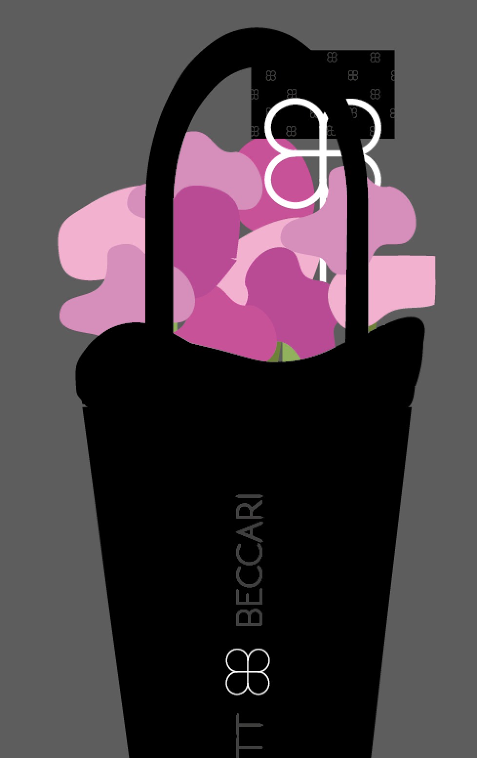
In development from the previous consideration I looked at using the colour values of the logo and applying this to the pattern. Switching it to black on black with one central symbol shown in white, mirroring the logo in which the central symbol is white.

I feel that this Idea is the most successful I have had so far, however I have one more layout in mind. I wanted to try something very simple that was completely different to anything else. I have taken the logo symbol, enlarged it and off centred it to the left. Although I feel that the design is contrasting, I feel that it is not particularly in like with the brand, in which across all other elements the logo symbol is a small element. In a high end brand power and consistency is key and for this reason I will be sticking with the previous design.

After choosing this design as the final design, I looked into the placement of Thank you/ message cards within the bouquet which are normally placed in a card holder into the floral arrangement itself.

Whilst browsing I came across these wire card holders in which can be moulded to any shape wanted to hold the card.

After looking at this I began to think about how I could instead of having the message cards as tags threaded onto the handles, create a message card holder as the shape of the logo symbol. I think adding a detail such as this will add that extra special touch, that is further than a regular floristry brand. I considered creating the card holders in both white and black.

However as the logo symbol is printed in white across the rest of the brand, I thought that for consistency this would be the best colour to choose, and would also create a nice bold contrast to the rest of the branding with is heavily dominated by black.
Now I have chosen to do the thank you cards using a small pattern, I think that doing this and having patterned tissue paper will be too busy for the brand, and so it is a case of choosing between using pattern on the tissue paper or on the cards. I think that it is going to be best to use as minimal pattern and fuss as possible, but I think having this across the message cards will give that subtle nod to pattern.
With this being said, I think that It will be best to keep the tissue paper plain, and keep the double layer wrapping, one layer plain black tissue paper and one layer black tulle.


Show the design of the card rotated to landscape instead of portrait.
No comments:
Post a Comment