OUGD603
CHRISTMAS CARDS
SUBMISSION BOARDS
Showing posts with label Brief 4 - Christmas cards. Show all posts
Showing posts with label Brief 4 - Christmas cards. Show all posts
Wednesday, 20 May 2015
Tuesday, 19 May 2015
OUGD603 / Extended Practice - Christmas stationary (cards): Evaluation.
OUGD603
CHRISTMAS CARDS
EVALUATION

CHRISTMAS CARDS
EVALUATION

The outcomes:
The Christmas card brief was something very simple but enjoyable to create, and in the end I think the outcomes really work to suit the audience. The simple text and illustrations work well to compliment each other, whilst the screen printing in red and white against craft card creates a reminiscent image of traditional parcels. Looking at the outcomes, they work well in a set together which was a concern, but the colour pallet and materials helps to bring them together, whilst the differentiation in typography and illustration bespoke to and linking back to each film helps them to have their own stance and individual presence. They are a really fun choice for any friend/partner/ family member of a movie lover at christmas time.
How could they be improved?
The project was only intended to be approximately a week long all in with research and production, however it could be furthered and extended with other stationary items such as gift wrap, gift bags and tags etc. I think the simplicity of the project was very much out of my comfort zone, and although I think the simplicity of the design combined with screen printing works well together, I would have like to have created something with more of an illustrative focus, however given the time restraints I set for myself, such decisions weren’t particularly viable.
What have I learnt?
I have learnt a lot about the design to production stage of design in that production processes can help make simple designs unique, but also be just as important and hold as much stance within the outcome, as the design itself. The outcomes also taught me that simplicity can be a great tool and that its sometimes, more successful to hold back and create restraint in design that go overboard with detail. I also learnt that doing a project every now and then primarily for fun, as I did with this in the winter months alongside my dissertation, will benefit you greatly.
Friday, 6 February 2015
OUGD603 / Extended Practice - Christmas Stationary: Production/ Screen printing.
OUGD603
CHRISTMAS CARDS
SCREEN PRINTING
Today I printed the Christmas cards via screen printing. I purchased some craft card online that resembled the look of parcel paper as a base for the christmas cards.


I set up the screens and I began printing the cards doing the white layered illustrations first, as the text needs to be read over the top.
I varied the ink mixing until I was happy with the consistency and colour pay off.
Monday, 26 January 2015
OUGD603 / Extended Practice - Christmas stationary: Design development.
OUGD603.
CHRISTMAS STATIONARY.
DESIGN DEVELOPMENT.


CHRISTMAS STATIONARY.
DESIGN DEVELOPMENT.
Today I drew up the illustrations that would go underneath the pieces of type.
the symbols I have to illustrate are:
- The grinches heart growing 3 times the size.
- The polar express bell.
- A mirror
The priorities for each illustration is simplicity and consistency between all 3 cards.
As I aim to screen print the outcome I think that the less detail in each of the illustrations the better the quality and effect of the screen print will be.
I began sketching the illustration of the mirror for the Elf card. I kept the illustration simple, and tried to add a festive touch by adding a simple bow to the top of the mirror.

Next I worked on illustrating the bell which was again very simple, I feel that larger blocks of colour will come out better when screen printing. I followed the same aesthetic appearance for this illustration as i did for the last, taking on board and continuing the geometric hand rendered look.

The last illustration was the simplest of the three showing the Grinches heart growing three times in size. For this illustration I sketched up a few different variations of the same idea, and then chose to use which I think best fit the style of the film and was most consistent with the rest of the illustrations.


I sketched each of the illustrations up in illustrator.


Next I moved onto the quotes that would be overlaid ontop of the illustrations. As well as matching well with the aesthetics of the images I had created, I also wanted to make sure that I emphasise the process in which I am aiming to produce the cards, by screen printing. It is because of these two elements that I think it would be best to follow a route of simplicity over something too complex. I also need to figure out how the type element can be manipulated to keep consistency across the card family, as although they are not sold as a set, they need to follow the same theme in aesthetics as they do in their movie references.
I had an inclination of what I wanted to do with the typography. The direction I wanted to proceed in was to have a base font in which most of the text on each card would be set in, and have a secondary more decorative font, relevant to each film, to set the most important parts of the quote in.
I started firstly by finding a base font. I didn’t want something that was made particularly to stand out, but to compliment anything else on the card, such as the illustrations and the more decorative type pieces. Therefore I looked for something sans serif, with rounded edges. The best font that I came across for the role was Days sans black.
I looked firstly at the polar express card, and dissected the quote to determine which parts should be decorative, and which parts should be in the base font. I found that the most important parts of the quote were in two sections ‘real things’ and ‘can’t see’, therefore these are the two sections I want to differentiate from the rest of the quote by changing the font.
I wanted the font, that would separate these parts of the quotes to drawn on aesthetic influence of the film. I looked to font used for the film for inspiration.
However I found that most of the type associated with the polar express was a very thin serif font. I knew this wouldn’t combine aesthetically well with the base font, and always feel that heavier fonts look great in screen printing.
Therefore I looked for another point of inspiration, from the Polar express itself. I felt that a steam train, western inspired font would not only work well with the font already used, but would also nod subtly to the aesthetics and plot of the film.
I searched online to find the best western inspired font that I felt would match well with the current typeface, looking at a selection I found that, the more simpler, less detailed typefaces were the most complementary to the current elements of the design. In fact I decided that the simplest of them all west best to use.
Chosen:
Next I looked at the Grinch themed christmas card and already had a strong idea of what alternative font I wanted to use. The grinch, in which I watched as a theme for this film is originally from Doctor Suess and has a strong aesthetic. I tracked down the original Dr.Suess typeface online and managed to find one that someone had made which looked exactly the same. I tested the combination of the two fonts out by again separating the small parts that stood out the most and sectioning these off with the Dr. Suess inspired typeface. I had guessed this would work well as not only is the typeface again, without much detail, filled in and very simple, it is also very angular much like the illustration in the background.
Finally I moved onto the third card inspired by Elf. Again I separated the quote into sections leaving ‘pretty’ and 'christmas card’ as words I needed to seperate using a different font. At first as the message had a theme of ‘looks’ and ‘pretty’ and prusumingly is a card that would be bought for a girlfriend or a female friend I looked for a script font that would be compatible with the base typeface. I thought that a script font having quite feminine values word work well in combination with the message of the quote, however when put to the test, I couldn’t get the script font to work spatially as the leading was always off as It did not match that of the base font.
I went back to the drawing board and instead of trying to represent the message, I tried to find one that fit the theme of the film, as I had done with the other two card ideas. I started thinking about the character buddy (elf), and some of the main visuals I had collected from the films. One in particular showed Buddy adding maple syrup to his food. Buddy continuously makes references to his sugary diet throughout the film, and so in trying to find a festive font to represent this I came across candy cane. A simple sans serif font highly reliant on circles, with a stripy candy cane appearance. I felt that this font, with its sweet reference would be perfect for the card design.
With the type and illustrations for each card completed, I next began to look at the final aspects, size of each card which would be reliant upon readability of text and illustration and the colour scheme.
I looked back at the screen printed christmas cards I had looked at for colour scheme. I knew that in order for my layers of text and illustration to work, my colour scheme would be two colours plus stock. In terms of festivity, I found that the most common colours used were green, red, white, navy and yellow. I wanted to try and move away from the tradition of red and green and instead subtly reference christmas colours. I thought about screen printing and its organic aesthetic, and thought about the idea of switching the colour of the stock to play along with this. As when working with screen prints you are able to work with white inks, I am able to switch from using a regular white stock. I felt that a brown craft card would not only continue on the organic like aesthetic but also work as a really complementary neutral colour in which other brighter inks can stand out on.
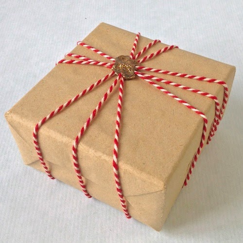


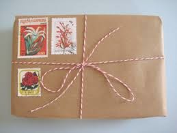
The use of the brown craft card reminded me of the traditional way of wrapping presents in which brown parcel paper is used with red ribbon or red and white string. I felt that this colour combination was both festive but subtle. I also felt that implementing this traditional colour pallet used on old parcels worked perfectly with the use of a more ’traditional’ print process as well.
In terms of separating the two layers of the card (illustration and type) by colour I felt that the text, as the main element of the card should be in the most colourful of the two shades, Therefore I plan to print the illustrations underneath in white and the text over the top in red.
I tested this out in illustrator.


The size of each card varies across the range of three as it is determined by the size of the quote. For example, the Elf card uses the smallest quote and therefore the card can be much smaller than the Grinch one, which uses a much longer quote. I wanted to try and keep readability equal for each of the cards, using similar size type across all three. I also wanted to keep consistency across the lines of cards by giving them similar border sizes round the edges. Therefore the only way to house the longer quotes, is to make the cards larger.
The polar express card is the smallest card measuring W147mm x H159mm.
Followed by the Elf card measuring W147mm x H155mm.
and lastly the grinch measuring W147 x H178mm.
I don’t think that the differentiation in size of the cards is an issue, due to the consistency of other aspects I have implemented to keep the designs relatable to one another and working as a set.
Happy with the design, I created the designs ready to process onto screens for thursday.
Friday, 23 January 2015
OUGD603 / Extended Practice - Christmas stationary: closing in on a design idea.
OUGD603.
CHRISTMAS STATIONARY.
FINAL DESIGN IDEAS.

CHRISTMAS STATIONARY.
FINAL DESIGN IDEAS.
I knew that I wanted to screen print but I was struggling to think of how I could combine both image and text together into a screen print using only two colours of ink. When looking at movie themed prints I came across this great piece inspired by the film elf in which the designer had made a simple design that combined both image and text together.
The image and type had been separated into two separate layers, the illustration/ image underneath in one colour and the type on top on a separate colour. As I had previously mentioned I wanted the quotes to be the most prominent parts of the piece and I felt that by making the illustrations almost part of the background it would allow the typography to do so.
Based upon this new aesthetic based Idea, I began to think of what simple illustrations I could link with my three memorable quotes. I looked to inspiration from main visuals I had taken earlier from each film.
Polar express:
The most prominent visual from the polar express is the bell, the bell is a representation of the belief in santa clause. ‘The bell rings for me, as it does for all who truly believe.’ The bell is a great recognisable symbol for the film and fits perfectly with the quote I am incorporating into my card design, 'Sometimes the most real things in the world are the things we can't see.’ which describes the realness of Santa.
I think it is also going to be important to keep the illustrations as simple as possible, as of course they will be overlaid by text, so something as symbolic and simple as the bell will fit in well with the decided aesthetic.

The Grinch:
Most of the main visuals I collected from this film were of the character and the set, and looking at my quote they don’t particularly fit.
‘Maybe Christmas he thought doesn’t come from a store, maybe Christmas perhaps means a little bit more.’ With this in mind, I went back to the section of the film to gather new inspiration for the illustration.
Instanly after the quote has been communicated there is a turning point in the film in which the Grinch switches from bad to good. At this point his heart ‘grows three sizes bigger'. I feel that a visual of his heart growing three times in size would in reflection be simple in aesthetic and directly represent the idea communicated by the quote. The idea of the card is to communicate that at christmas time it is not always about presents, gifts and shopping but about spending time together and giving love.

Elf:
The elf quote is not what is thought of as one of the main quotes in the film, however I thought it was a really great themed card for a girl to get for one of her close friends, or that a guy could pick up for his girlfriend. I was quite puzzled about how I would illustrate the message ‘you’re so pretty, you should be on a christmas card’. As the quote was a passing comment in the film, I knew that their wasn’t particularly any visuals that I could grab from the film, and so I began to think of visuals that I could like with pretty, vanity etc.
There were obvious visuals that came to mind, such as make up, brushes etc. However I felt that such Items were too cliche, and would also communicate the idea that pretty is associated with make up. Therefore I thought about looking at ones self as you are, contriving the idea of a mirror.

Tuesday, 9 December 2014
OUGD603 / Extended Practice - Christmas staionary: Visuals from films.
OUGD603.
CHRISTMAS STATIONARY.
VISUALS FROM THE FILMS.
POLAR EXPRESS:
Polar express train.

Golden ticket.

Mountain.

Bell.

Boy.

THE GRINCH:
Lit up house.
The grinch.

The grinches dog.

Mount crumpit.

Bauble.

Cindy Lou who.

Whoville

ELF:
Buddy makes breakfast with his favourite maple syrup.


CHRISTMAS STATIONARY.
VISUALS FROM THE FILMS.
POLAR EXPRESS:
Polar express train.
Golden ticket.
Mountain.
Bell.
Boy.
THE GRINCH:
Lit up house.
The grinch.
The grinches dog.
Mount crumpit.
Bauble.
Cindy Lou who.
Whoville
ELF:
Buddy makes breakfast with his favourite maple syrup.
Subscribe to:
Posts (Atom)