DESIGN PUBLICATION
TRANSFERRING THE DESIGN
Today I worked on transferring the design for the publications from luxury to fit both the sustainable and low cost editions from the series. I am transferring the design instead of making a new one as elements such as layout, typography and size will help keep consistency across the range whilst other components differ to fit the design solutions understood throughout the books for low cost and sustainable design.
Elements that I will change in the design aesthetic are following those listed in the book.
- Colour
- Finishing
- Printing
- Stock
- Binding
Low cost edition:
Colour:


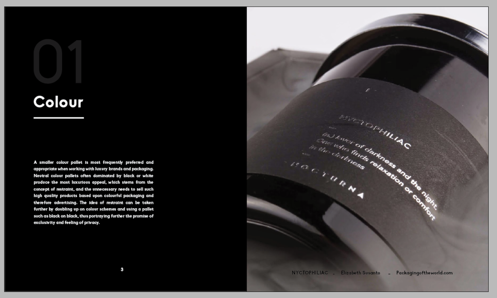
In terms of colour for the low cost edition my focus was to have the pages dominated by less ink, the front cover features only title details printed in ink, whilst the inside spreads are dominated mainly by white pages also. Not only does this minimise on ink and therefore cost, it also offers the simplicity frequently spoken of within low cost design. The inside pages are also very stripped back in terms of colour where the text pages are dominated by solely black text on the stock background. The front cover is injected with a small detail of bright blue. As spoken about in my research often low cost packaging always revolve around a simple mainly white dominate pallet with a pop of colour.
Finishing:
In terms of finishing its important that I am strict and use no extra details such as foiling etc as these add value. Finishing should use one production process that is as low cost as possible. For this reason the only method I will use to produce the book is digital print.
Printing:
Speaking of digital print it is important that I consider the type of digital printing that will take place in order to produce the book. Although I printed via ink jet for the last book, this is much too luxurious for low cost packaging. Cost is increased by ink jet printing due to more ink and time taken to print. Therefore I will be printing via laser, it is much cheaper to do this in the print room at college and so out of the options this is going to be the lowest cost I can get.
Stock:
For stock options I tried to find a stock that was low cost, yet functions well such as, being able to print double sided without being able to see the print through the paper. All though I must consider the low cost, Low cost products and packaging still have a basic functionality to them and so it is important I stick with this. Looking at stock choices I found bulky news print to be my strongest option. at 5p a sheet for a size I can get 2 a3's out of it is ridiculously low cost. I also asked James if it was functional to print double sided on this through the laer printer and he said it will be no problem.
Binding:
Lastly my binding options also strip back to basics - In my crit with Tony Broomhead we discussed binding options and although I originally wanted to go with saddle stitch for the low cost appeal, I was advised that in order to be truly honest to the style I must again pick the most low cost, mass produceable and least time taking process to bind the book. For this reason I am instead choosing to go with a simple staple bind. By having a staple bind I will need to make the pages as double spreads that will be folded down the middle.


From luxury to low cost:


- Finishing
- Printing
- Stock
- Binding
Sustainable edition:
Colour:
There is no particular set pallet of colours to use for sustainable packaging, or branding for that matter. Often neutral more 'natural' colours are used laced with tones of green. However it is quickly became apparent in my research for my dissertation that sustainable should be so in its purpose, function and production, but to catch the eye of the 21st century consumer should look just as 'normal' as the other products on the shelf. It is however good to have an aesthetic that slightly points towards 'green' and have some kind of recognition so that people intently looking for 'sustainable' products can spot them easily. The publication therefore intends on having white based pages again to save ink with small hints of a fluro green which I am aiming to screen print. Having a colour such as fluro green helps point the product to the 'aesthetic' of green products, but also allows it to be non traditional and mesh with other 'non' green products on the shelf.
Finishing + Printing:
Finishing all very much depends on function in terms of green packaging in relation to the binding and such which is purely based on function over aesthetic. The book will be finished using two print processes. Laser print will be used again as the main choice being more sustainable than inkjet. Screen print will be used for details as it is known to be another sustainable print process.

Stock:
For the book I wanted to try and at least use and FSC paper, however when speaking to James in the print room he informed me that none of the papers in there were actually certified sustainable and therefore I would need to look outside of college for such stock. I found a really great sustainable paper site called arjowiggins and I discovered a great type of 100% sustainable paper made from FSC recycled pulp, the paper 'cyclus jet premium' can be used for both laser and screen printing which makes it the perfect choice. I noticed that you can order samples which was also great for my small order, however when looking at delivery I found that there would not be enough time to recieve the paper and do both the laser printing + screen printing +bind. Instead I would have to find a paper that appeared like sustainable. I choose catridge paper due to its grain like feel and its price. sustainability isn't just about the environment its about being economically sound. The price of the paper was 20p for an a1, meaning each a4 page costs about 2.5p, very economically viable.
Binding:
I have already decided that for the bind i'm going to be doing a screw post. Screw post allows the bind to be re used when it is no longer needed as the screws can be reused minimising material waste. The bind also uses minimal if not, no glue which is also an added bonus. For the bind I will be using grey board for front and back covers as it is a sturdy, strong low cost material.
No comments:
Post a Comment