OUGD603
DBA CAPITAL NORTH
SUBMISSION BOARDS
Showing posts with label Brief 6 - DBA. Show all posts
Showing posts with label Brief 6 - DBA. Show all posts
Sunday, 26 April 2015
OUGD603 / Extended Practice - DBA Capital North: Final pieces and Evaluation.
OUGD603
DBA CAPITAL NORTH
FINAL PIECES + EVALUATION
As a group according to our set of skills and interests we also decided to work on the train livery and environmental design out of the list of optional choices. Mel and Daisy worked on the Train Livery and interior whilst Sarah came up with some ideas for possible environmental design.
Train Livery:

My opinion on the train livery was very 50/50, I felt that more so with the outside designed by Mel, although it fit in with the brand as far as colours went, it was very basic and lacked any kind of character. The only acknowledgement that the train was a part of Capital North is a logo at the front of the train. Otherwise the design is block purple. I definitely feel with how exciting our campaign and slogan was that the train livery could have been a lot more exciting. As a train is a mobile piece of advertising, people may only see it for up to a minute as it pulls into a station before it pulls back out, therefore the design needs to be exciting and catch attention. I think creating a livery that was more exciting and integrated some of the illustrations and slogan we had would have been much more interesting, and inspirational.


Environmental design:
Sarah Heal worked on the designs for the environmental design in which she created a few different situations where we could apply different brand elements that we already had.
In the airport:


An animated poster:


DBA CAPITAL NORTH
FINAL PIECES + EVALUATION
As a group according to our set of skills and interests we also decided to work on the train livery and environmental design out of the list of optional choices. Mel and Daisy worked on the Train Livery and interior whilst Sarah came up with some ideas for possible environmental design.
Train Livery:
My opinion on the train livery was very 50/50, I felt that more so with the outside designed by Mel, although it fit in with the brand as far as colours went, it was very basic and lacked any kind of character. The only acknowledgement that the train was a part of Capital North is a logo at the front of the train. Otherwise the design is block purple. I definitely feel with how exciting our campaign and slogan was that the train livery could have been a lot more exciting. As a train is a mobile piece of advertising, people may only see it for up to a minute as it pulls into a station before it pulls back out, therefore the design needs to be exciting and catch attention. I think creating a livery that was more exciting and integrated some of the illustrations and slogan we had would have been much more interesting, and inspirational.
Daisy worked on the interiors of the train which I think helped to push the train design further, as she made subtle references to brand points we made. These were existent in elements such as the chair covers in which she created a repetitive pattern using the arrow from the logo. There was also a lot more consideration towards contrasting colours to make the arrangement look more interesting, and towards the form in which a more modern interior set up was created. She also considered how to take the HS2 and HS3 trains further, making the brand more special or 'luxury' by adding and designing facilities such as a built in coffee machine. I think that this, if paired with a more experimental outer shell would have been a great combination.
Environmental design:
Sarah Heal worked on the designs for the environmental design in which she created a few different situations where we could apply different brand elements that we already had.
In the airport:
Firstly Sarah created a little set up in which the logo was implemented to become part of the escalator. I thought that this was a really cool and subtle idea to communicate the brand, however I noticed that the logo had been somewhat flipped. The logo is supposed to appear like a compass point, pointing north at the N. Here it points down at the letter, therefore the characters should have switched places, this must be something that was forgotten in the final stages. She also created a floor sticker seen at the front of the image. Again, alike to the train livery I felt it was much too plain and didn't express anything inspirational or exciting about the North.
On/Inside the lift:
When thinking about objects that travel North, I suggested to Sarah that she should consider applying the brand to a lift, often found in city centres, car parks and train stations, and so easily seen by travellers. She cleverly applied the concept of Daisy's poster to the lift. She used the same floor sticker as seen previously, I think it works more so in this situation as it complements the illustrative details seen on the lift.
On the escalator:
She also designed a subtle but well thought out design in relation to an escalator which also travels 'north' and would be seen in pretty much all travel centres. The design features the shortened logo in which the arrow 'compass points' travel upwards towards the N at the top of the escalators. I think subtle designs such as these really nod towards our brand which sites Less is more, more is North, Sarah has seemingly reflected this in a lot of the designs which I think works well.
In the toilet:
Lastly, she created quite a humous design that again works well. Considering the movement alike to a compass, Sarah placed the logo sections onto a toilet roll dispenser un which the compass point spins to meet the N completing the logo. Again although subtle I think the concept of the design works really well.
Work I inputed:
Creating an initial brand style: I created the brand style that we would use throughout the rest of the brand/ campaign.
Both logo designs:
A 48 sheet billboard:
An animated poster:
Refining mels poster:
Mels poster was supposed to be for a bus stop format, and was to combine the first and second phase of her moving animation into one bus stop poster sized image. Below is the format Mel sent her her poster in:
What I changed the poster to:
5 illustrated mock ups:
DBA EVALUATION.
Working with the group:
I think the group worked well together, with most of the progress and success coming towards the end of the project. I found it quite frustrating in the beginning as I seemed to be taking on most of the work, creating a set of logos and coming up with the brand/illustration style by myself. I felt that the work we presented to the 5 different studios could have been a lot better if there was a lot more differentiation and input in the beginning from the rest of the group members. However I feel that in terms of hard work, my group were prepared to put the work in where it counts, towards the end of the project where other peoples work schedules freed up. There were members which I thought were more frustrating with others, in which I had to fix work they had sent, not formatting it in the way that had been asked, aswell as minimal work and input being given.
Our outcomes:
In the end I was quite happy with the outcomes and know that I have given as much as I could towards the project. I feel that the work produced ticked the boxes of what DBA were looking for. I think the results were engaging and thoughtful, and really tried to bring something new and refreshing to the table. I really liked our campaign idea of 'less is more, less is North' and felt that this really helped to set us apart from the other projects, communicating what the North is less of, but in a positive way. I also think that our range of outcomes was really appropriate for the brief and the design team I was working within. Together we created 5 posters (4 were required) which we then also animated to display in cities that had opportunities for moving posters - I think this really helped to distinguish us as a team and also allowed myself and a couple of other members of the group the opportunity to developed our Adobe After effects skills. I was also really pleased with the mock ups that I created for each of the printed posters and felt that these really helped to relate the posters which we had created back to the cities in Capital North. A panelist from DBA commented that at first they thought the illustrated mock ups were part of the poster and that, that was somewhat charming. I also think looking back at the designs that I created for the mock ups that they would have worked well as part of the posters, and if I could redo the project I would probably include the backgrounds as part of the poster designs.
What could we improve on?
I think as a group we could have definitely worked on timing a lot better as this was off towards the start with everyone having different things to tend to. I also think that although our 'campaign' was very strong and successful, backing this with a more concrete brand would have taken the outcomes even further. Whereas I feel other groups had more of a branding focus, our work was more so centred around marketing. I think that with more research we could have established a strong brand to go alongside our campaign, but I also understand it was very difficult working on a project with such a vague subject, to brand the whole North of England together when all the locations are extremely different. I also think we could have improved a bit more on planning, as previously mentioned I felt like a carried a lot of the project at the start, whereas looking back on hindsight, I could have probably dedicated myself to other projects and we could have tackled Capital North from the beginning as a group. But overall although we did a lot of research into what makes the North a great place, I feel that more research into the North as a whole would have provided us with a base for a 'North' brand which would have boosted our campaign.
What did I learn?
Personally and practise I learnt that in order to try and lead a group in projects I need to change my approach and attitude. I have learnt that as of right now, I do not like to take on leadership roles and much prefer working as an equal within the team. However I was also able to pick up some really great skills throughout the project, one of them being talking to industry professionals. This was something I really enjoyed throughout the project, and helped to make the brief seem that little bit more real. We worked with Ian from Arris, and he provided us with some great help and advice, and allowed me to realised that Industry designers are people just like me. I was also able to better my technical skills involving Adobe after effects where I produced my own animation. Animation is something I would like to work with, within my design career and so having the opportunity to work on bettering these skills is always useful. Again I learnt about how to work on and apply critique especially within this project working with a large group of designers and the DBA panel.
Friday, 20 February 2015
OUGD603 / Extended Practice - DBA Capital North: Group meet up and development.
OUGD603.
DBA CAPITAL NORTH.
GROUP MEET UP AND DEVELOPMENT.
Today we had a short group meeting where we reviewed progress so far. We were happy with the illustration style I had done as It is easy for everyone to replicate and fits the brief well. However as a team we were a bit skeptical about the colours and felt that they were still too bright for the brief. Danielle indicated that we should look at Adobe cc colour schemes. From here Danielle approached us with a colour scheme that she felt would help lift the brand from looking too childish and young, to something much more professional. Collectively as a group we agreed.
The new colour scheme features three neutral colours and one bright pop of colour.
I liked the new colour scheme and thought it was much more appropriate for the North. However I also felt that it needed a slight bit more colour. So I looked to add another bright pop of colour.
I added a blue as not only was it a bright colour, I thought it would also help to contrast the orange colour, bringing more dimension to the colour scheme. Danielle suggested off white as a background colour which I thought also worked well and was complementary.
Tonight I will re colour my animation to see how it works using the new colour scheme.
we have set the deadline to have this done by the following wednesday.
However on Monday we will be meeting up to discuss ideas for the other elements including train livery and environmental design which we are all to create ideas for.
Campaign development:
We edited the communication of the campaign 'Less is more, Less is North' ever so slightly. After working and preogressing with the campaign idea, we still feared that many would take the idea literally and it would backfire. Sarah came up with an idea of how to keep the same theme, but shine it in a more positive light. She tweaked the strapline slightly taking out less, and putting in more, from:
'Less is more, Less is North' to 'Less is more, More is North'. I think in reflection that this works much better and is much more appropriate as the phrase still has the same underlying meaning 'less is more', the North has less of (space, commuting, former/past) and therefore is is more. However it is now communicated more literally. Instead of saying Less is more, and therefore the North is less, we now say the North has less of these things and therefore it is more.
'Less is more, Less is North' to 'Less is more, More is North'. I think in reflection that this works much better and is much more appropriate as the phrase still has the same underlying meaning 'less is more', the North has less of (space, commuting, former/past) and therefore is is more. However it is now communicated more literally. Instead of saying Less is more, and therefore the North is less, we now say the North has less of these things and therefore it is more.
Motion poster Development:
Me and Danielle worked with each other correcting the colour scheme, and also readjusting the structure of the moving posters.
We worked closely together in the Mac suite insuring that we created a program of timing and entrances and exits for illustrations that would be consistent across all the motion posters. We started by working on the animation that I had currently made.
The new structure:
Logo is in bottom right of screen full time
First enters 'Less former' followed by illustration.
Fact enters.
Illustration slides to left and enters new illustration.
Illustration slides to left and enters new illustration.
'More future' then appears in tom left to describe illustration.
Illustration then animates. (Lights turn on and sun rises)
Shot is still for a couple of seconds allowing people to finish reading the facts.
Shot is still for a couple of seconds allowing people to finish reading the facts.
finishing logo animation appears on screen.
'Less is more, more is North'
'Less is more, more is North'
Shortened and lengthen logo.
Not only did the reworked order give the video more structure it also provided a consistent framework and allowed for improved readability. Creating a better flow and more fluidity, the eye could now easily follow and expect what was to come next. The constant logo allows viewers to frequently refer back to the brand, and the prolonging appearance of the quote from start to finish, now allows for a larger amount of reading time so that the viewers don't miss any of the information.
Danielle also found a selection of music that we could pair with the videos for presentation purposes. A selection of positive instrumentals from youtube. We wanted to find something royalty free that we could use free of charge when no money was being made from the project. We listened to the selection of songs as a group and picked our final three. We wanted something that would be proffessional, but fun, friendly and positive, and obciously that complimented the video style.
We all agreed on one song and added this to the compositions.
Old video:
New Structure and video:
With the motion video completed I progressed onto making the static version of my poster.
When working with still, I had to consider how I would combine both visuals from the poster, Less formal and More future in one place, where in the video they were separated into two different shots.
I came up with the idea to create a long 48 sheet billboard that would allow me to have both landscapes on, next to each other. On the left would be the illustrations of mills and factories, and on the right the new developments of hotels, shops and residential areas. However the opacity of the mills would be lowered so that the new developments are a lot brighter and make much more of an impact.
In terms of text positioning and layout, I knew that any text would have to be very horizontally emphasised due to the format of a 48 sheet billboard. Therefore the header text like my animation would have to be horizontally justified on one line.
Underneath the title and the illustration I need to add the factual information regarding the slogan and the campaign message and logo. I will justify one piece of information to the left and one to the right for better balance.
Final static poster design:
My groups posters:
After creating my motion and still poster my last job within the group was to create a set of backdrops for the posters each person has created. We have chosen as a group to illustrate these as we cannot find billboard mock ups to adhere to all the sizes of our posters / billboards, especially danielle's whose is a rare format.
Instead I digitally illustrated each of the backdrops for the poster so this wasn't an issue.
I tried to keep within the same illustrative style I had created for the rest of the campaign. I also thought it would be good presentation wise to try and display the posters in the cities which are listed in the brief.
Therefore I took the time to create mock up designs using landmarks and signposts that refer to the four cities targeted on the brief:
Sarah Heal's Bus stop format poster, in which I created a back drop inspired by manchester and the big wheel:
Mel Hardcastle's Bus stop format poster in which is based in Hull with a backdrop of the Humber bridge and sign posts to other Hull attractions.
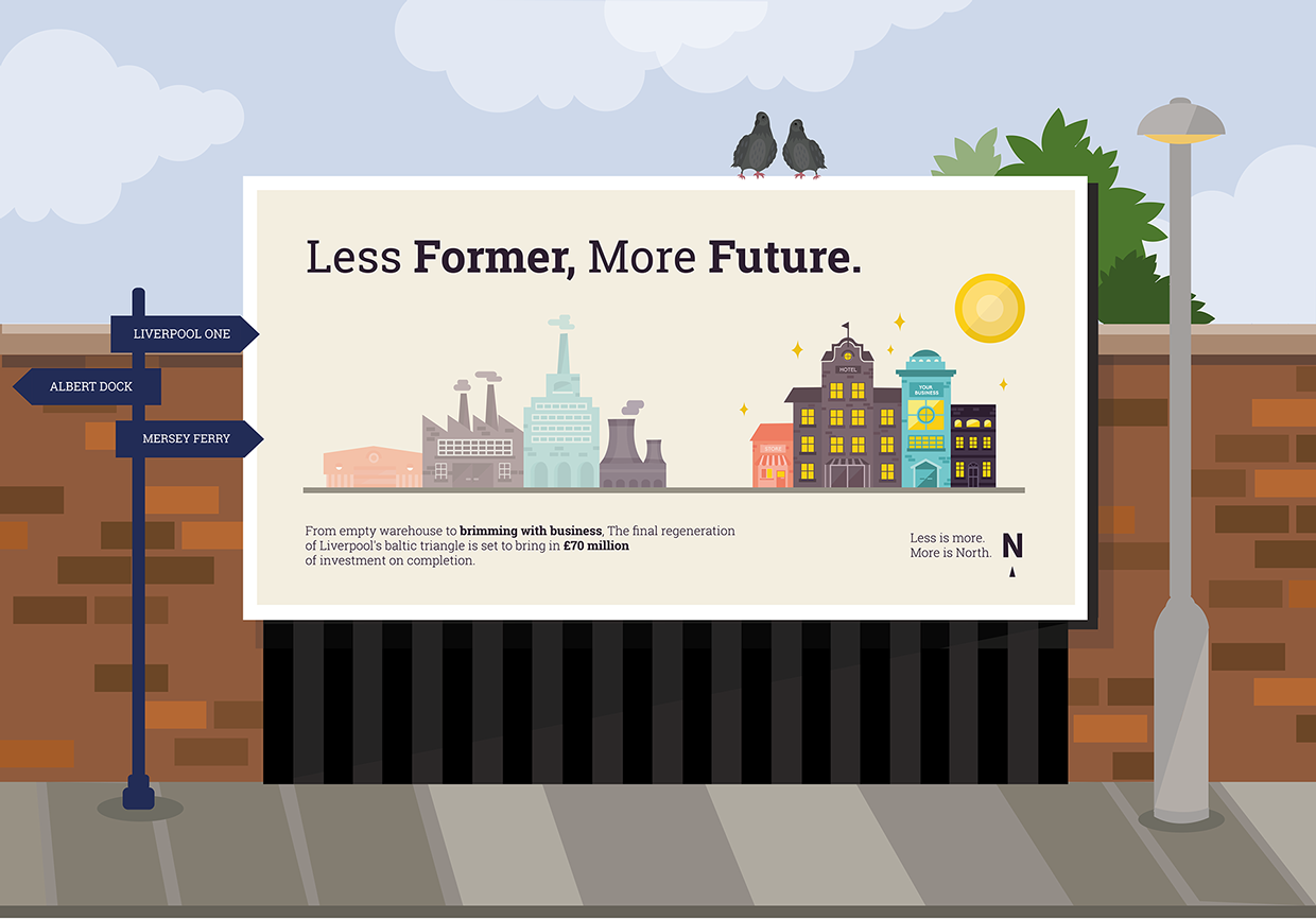
My Poster (48 sheet format) which I placed in Liverpool, inspired by the red brick and signposting attractions such as Liverpool One and Albert Dock.
Daisy's Poster which I placed into Leeds Train station, with the train livery produced by Mel in the background.
Danielle Harrison's poster which is vertically focused for placement on tall buildings features a city scape backdrop.
OUGD603 / Extended Practice - DBA Capital North: Digital development.
OUGD603.
DBA CAPITAL NORTH.
DIGITAL DEVELOPMENT.
With influence from the illustrations I found, I began drawing up my sketches one by one. I produced them in a minimalist fashion, keeping in mind my range of audiences as I did them. The aim is to create something eye catching but genuine and honest.


DBA CAPITAL NORTH.
DIGITAL DEVELOPMENT.
With influence from the illustrations I found, I began drawing up my sketches one by one. I produced them in a minimalist fashion, keeping in mind my range of audiences as I did them. The aim is to create something eye catching but genuine and honest.
Once I had finished the illustrations of mills and factories, I pitched them against a 'realistic' blue sky colour to give the feel of a landscape.
I also added in the green line which would act as a conveyor belt where the two landscapes (mills and new developments) would move across.
Next I moved on to create the illustrations for the second section of the motion poster in the same style.
I placed this against the matching blue background and against the constant green line.
I then began to implement the idea of making all the windows light up as if brightening up the north, putting the building into business and filling it with great potential. In order to make sure when animated that the rows of lights would come in one by one, I put them on separate lines which I will stagger in After effects and they will come in one by one.
I also aim to have the sun moving and rising from the bottom left hand corner to the top right, further instigating the idea of a bright future.
In terms of typography Danielle suggested a typeface. We were originally planning to go with a sans serif typeface as to keep clearness and clarity but also promote friendliness. We wanted to avoid serif fonts for the fear of the brand becoming too corporate. However Danielle suggested that in order to marry friendliness with a sense of formality ( to target business) we should consider a slab serif, which tends to lie in between sans serif and serif in formality. In particular she suggested Roboto slab. I tried implementing the typeface into the text sections needed as both headings using the bold weight, and body copy using light for the most part, and bold for important pieces of information.
I felt that the typeface was working well as it represented itself as both authoritative by friendly. Therefore I continued to use it for the next section which consisted of the Less is more, Less is North catchphrase. When using the typeface, It helped to create a bold and memorable statement.
Finally I moved onto simply illustrating the final logo section a simple sequence of the smaller logo transitioning into the larger. Again I have created the sequence in 3 layers ready to be transported into After effects so that I can manipulate the N, compass arrow and 'Capital orth' separately, altering the positioning and opacity of each element.
With the illustrative work done, I imported the files, retaining the layers into After effects.
As stated I replicated the simple transitions, creating 4 different 'slides' and rendering them into one video.
I wanted to try and keep the pace up as much as possible to make sure that people would not loose interest. I also wanted to make sure that the pace was continuos through out all 4 clips.
The music chosen for the animation is not related to the subject at all and will be replaced at a later date. However it is useful to build the animation up with music to work with pace, and understand how it with combine with a song.
I will take the animation with me to the next group meeting to get feedback from the rest of my group.
Subscribe to:
Posts (Atom)