OUGD603
DESIGN PUBLICATION
CRIT
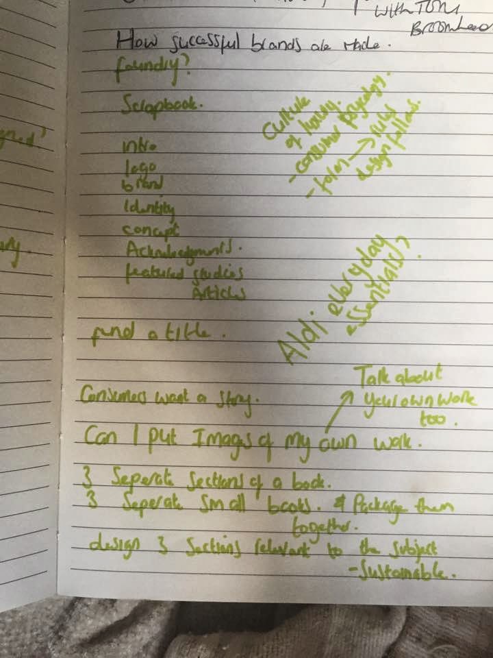
We just had a crit with Amber to help solidify our ideas for the design publication. I have just recently thought of my new idea that involves creating 3 books based upon packaging. (I was originally doing a book on just luxury packaging but i realised the book needs to be a book of research that can be applied to most of your practice.
I made notes about what was discussed in the crit regarding my project.
Find the answers for each type of packaging for my own methodology.
What colours to use.
What tone of voice.
what do the customers want from the brand/ packaging etc.
Mel G in Basic packaging:
'If i'm looking for something for something cheap, I'll look for something thats badly designed'
Does cheap have to be badly designed? is this always the case?
Is it going to look odd having 3 books that belong to the same collection but are produced with all different materials/ finishes etc? How can I keep consistency?
Things suggested:
- Layout
- Same typeface
- Same scale imagery
- Same size
- Same shape
- Will be successful if own work is included in the books to show how I have applied what I am learning to my own practice.
Number the components in the books eg.
01 colour
02 tone of voice
Have the same amount of sections in each book for consistency.
- Makes sense to package the books together as they are about packaging.
How can 3 books that are so different to each other be packaged together?
Im definately going to take the advice that I've gained from the crits, the main thing I was concerned about was how to keep the books consistent throughout the sets, especially if they have different binds. I will experiment with the components suggested in order to create consistency across the books.
I also want to question a few things discussed in the crit such as Mels opinion on low cost design, and try t o understand whether this is true.
OUGD603
EXTENDED PRACTICE
BECKETT BECCARI
We recently had crits organised however I am at a point in time where I am leaving old projects and starting new ones however I had one project that I really wanted to get some feedback on some of the design elements for my florist branding 'Beckett Beccari' before I start any production work.
One design component I was indecisive about was the logo, I was stuck between whether to use a serif or sans serif font. The florists is based upon a long standing relationship between two families whom combined in business and in last names to create 'Beckett Beccari'. This pushed me more towards the serif typeface as it implies tradition and formality. However I also tried at a sans serif font to bring the brand from tradition into a more contemporary era, creating a clean, polished logo and therefore something very luxurious.
Although some thought that the serif typeface was better due to its roots in tradition, this was outweighed by people who though the sans serif typeface was going to be more suited towards the contemporary audience. They also implied that the brand, being luxurious needs to be as clean and minimalist as possible, and the sans serif typeface offers this more so than the other.
Chosen:
OUGD603.
ARCHITECT BRANDING.
PRODUCTION DISCUSSION W/ ANDY LODGE.
In terms of production I was planning to laser print (for low cost) and emboss the branding onto a textured white paper, to play on Bradley's practice of experimenting with texture. I also felt that white would be the best colour for across the brand as elements such as the photographs on the portfolio part of the CV need to be as clear as possible.
I got some short but valuable feedback from Andy lodge in terms of materials and stock. Something interesting that he suggested was differentiating the stock across the range of printed collateral, I informed him that I was hesitant to use different colour stocks due to the photographs however he suggested differentiating the stocks across a couple elements such as the business cards and envelopes - keeping the white for elements such as the CV, letters and postal tube labels. I thought this was a really great and inventive way to represent both Bradley's natural and neutral colour pallet and also his practice of combining different materials.
For the colour pallet I was inspired by Bradley's work itself picking out a pale grey and muted yellow based brown from the selection of images he has provided me with.
I decided that in order to keep consistency across the brand I going to order 6 different sets of colourplan, so that all the elements can be created using the same type of stock, this will give a much more quality finish.
I have ordered the stock in three colours:

Natural (an ever so slightly off white)
Pale grey
Harvest ( a 'crafty' brown)
I have also ordered the paper in two different weights, a thicker weight for elements such as business cards, and lower gsm for collateral such as the CV which needs to be easy and clean to fold, the envelopes, letters and tube labels.
I have also laser cut my embossing plates using bendy plywood ready to emboss once the pieces have been laser printed. Only a thin material such as bendy plywood was used because it was thicker than the stock.
OUGD603
CRIT
DESIGN WORK
We recently had crits on the work that we have done so far, and I found the feedback that I got really useful. I was able to get opinions on two projects I am currently working on and one that I am about to start.
BRREW:
Firstly I asked for some feedback on BRREW - I had some logos drawn up and I wanted some help on which it was thought was most appropriate for the brand. I showed my four logos I have drawn up and my peers suggested that due to the high illustrative but simple packaging I was planning to create, they suggested that I use the most simple of my logos so that it doesn't clash and fight for attention with the rest of the design. I felt that this feedback makes sense and so instead I will search for other ways to represent that the drink is an iced beverage.
Logos:
Chosen:
I also asked the other students how they thought would be the best way for me to represent other flavours of tea throughout the packaging, i suggested possibilities of editing the illustration, or changing the colour. Again they thought it was best to continue with the theme of simplicity and have a colour key for the flavours that allows the box design to stay consistent throughout the whole collection. The alternating of bright colours to represent different flavours might also help the product to appear to a younger audience.
MAC x Alice In Wonderland:
I also took my MAC cosmetics illustrations to the CRIT to ask which they though would be most appropriate for the packaging. I showed everyone my 5 designs I had sketched up. It was a really great eye opener to see what everyone thought as some people had seen the film and some people hadn't. From the general consensus the most popular design seemed to be the one with the mad hatter on. People who had and hadn't seen the film were able to associate the mad hatter from film posters with the film. I agreed with this feedback as I also liked the Mad hatter design, due it being the most dramatic make up look of the film, which relates to the actualisation that the packaging designs are for a make up brand.
Christmas cards:
Lastly I asked for opinions on my christmas card designs. I was trying to find out what kind of illustration and type combination I should go ahead with. I was contemplating whether to create a detailed design that was predominantly image based supported by a quote, or a simple combination in which the quote was emphasised and supported by a simple illustration. The feedback I got was to emphasise the quote as this is the focal point and where the inspiration for the collection of christmas cards has come from. People also generally thought that the more simple aesthetic might look better screen printed, and the minimalism would help to highlight the process more.