OUGD603
INTERFLORA
SUBMISSION BOARDS
Showing posts with label Brief 7 - Interflora. Show all posts
Showing posts with label Brief 7 - Interflora. Show all posts
Wednesday, 20 May 2015
Saturday, 16 May 2015
OUGD603 / Extended Practice - YCN Interflora: Evaluation.
OUGD603.
YCN INTERFLORA
EVALUATION
What did I learn?
I think I have learnt quite a lot throughout this project. I originally took up the opportunity to enter YCN via this brief based upon my interest in floristry which I thought who help inspire me and keep me motivated throughout the project. I also thought that the idea of doing a campaign and working with marketing was something quite different and that as it is my last year on the course it is really the last chance I would have to experiment with something new. I found that marketing came quite natural to me, and I particularly found that working with the copy was a fun new experience and would, if the opportunity was given to me, work with it in the future. I didn't overly enjoy the project and I think this is due to the fact that the paper quilling didn't work out which I had high hopes for, and i think really would have given the campaign great impact. Therefore I think that I have learnt process wise from now on when undertaking a project I should stick to what I am used to and know i am good at, unless for future reference I am working in a team with someone who is good at the process. Another thing I learnt a lot about this project is that really getting to know your audience is invaluable which is something I think that made my concept and the copy I wrote so successful, because it was 100% tailored to the new audience Interflora wanted to target. I did this through involving the audience in my every descision, from asking them survey questions, to creating designs for their most trafficked platforms (bus shelter, city centre posters and social media) and considering how to adhere a classic brand to this new audience.
YCN INTERFLORA
EVALUATION
The outcomes:
At the end of the project I was quite happy with the final outcomes however the project had not turned out how I had hoped with the implementation of paper quilling as my media not being successful. However I think that I was able to pull through with my strengths in illustration based work, creating something that shared the same image of paper quilling that I had. I also think the end pieces I created work well as a set and have a clear coherency which is something I really wanted to achieve. I also think that the resolutions delivered work well to take a strong brand such as Interflora whom already has a specific demographic, and transform it into something that a younger audience can relate with. I think a lot of the strength within this project also lies within the concept and particularly the subject of each material taking the time to research and understand what my age audience want to be thankful for, and working to match the USP's and help the audience understand how the brand can relate to them. For example being thankful for little things such as your grandma making you personalised costumes, is responded to with one of the brand unique selling points in which Interflora can produce one of a kind personalised bouquets of your choice with a made to order service. I thought careful consideration of such elements helped to make the campaign really strong.
At the end of the project I was quite happy with the final outcomes however the project had not turned out how I had hoped with the implementation of paper quilling as my media not being successful. However I think that I was able to pull through with my strengths in illustration based work, creating something that shared the same image of paper quilling that I had. I also think the end pieces I created work well as a set and have a clear coherency which is something I really wanted to achieve. I also think that the resolutions delivered work well to take a strong brand such as Interflora whom already has a specific demographic, and transform it into something that a younger audience can relate with. I think a lot of the strength within this project also lies within the concept and particularly the subject of each material taking the time to research and understand what my age audience want to be thankful for, and working to match the USP's and help the audience understand how the brand can relate to them. For example being thankful for little things such as your grandma making you personalised costumes, is responded to with one of the brand unique selling points in which Interflora can produce one of a kind personalised bouquets of your choice with a made to order service. I thought careful consideration of such elements helped to make the campaign really strong.
What could we improve on?
I think to improve, I could have prepared myself a bit better and taken the time to research more and learn the techniques of paper quilling straight off the bat. I think given a second chance to work on the project I would have out aside more time to do so, or attempted other similar options such as paper craft where I could have achieved comparable results. However I feel that my strengths will illustration helped to successfully pull the project through. I would have also of liked to take the animation a bit further and work on something that appears as personal as the posters themselves. I think I found it hard to match the format of the posters with the video and so working with the animation a bit more, I could have created something more coherent, but also independent of the posters rather than just a animated version of these.
I think to improve, I could have prepared myself a bit better and taken the time to research more and learn the techniques of paper quilling straight off the bat. I think given a second chance to work on the project I would have out aside more time to do so, or attempted other similar options such as paper craft where I could have achieved comparable results. However I feel that my strengths will illustration helped to successfully pull the project through. I would have also of liked to take the animation a bit further and work on something that appears as personal as the posters themselves. I think I found it hard to match the format of the posters with the video and so working with the animation a bit more, I could have created something more coherent, but also independent of the posters rather than just a animated version of these.
What did I learn?
I think I have learnt quite a lot throughout this project. I originally took up the opportunity to enter YCN via this brief based upon my interest in floristry which I thought who help inspire me and keep me motivated throughout the project. I also thought that the idea of doing a campaign and working with marketing was something quite different and that as it is my last year on the course it is really the last chance I would have to experiment with something new. I found that marketing came quite natural to me, and I particularly found that working with the copy was a fun new experience and would, if the opportunity was given to me, work with it in the future. I didn't overly enjoy the project and I think this is due to the fact that the paper quilling didn't work out which I had high hopes for, and i think really would have given the campaign great impact. Therefore I think that I have learnt process wise from now on when undertaking a project I should stick to what I am used to and know i am good at, unless for future reference I am working in a team with someone who is good at the process. Another thing I learnt a lot about this project is that really getting to know your audience is invaluable which is something I think that made my concept and the copy I wrote so successful, because it was 100% tailored to the new audience Interflora wanted to target. I did this through involving the audience in my every descision, from asking them survey questions, to creating designs for their most trafficked platforms (bus shelter, city centre posters and social media) and considering how to adhere a classic brand to this new audience.
Sunday, 22 March 2015
OUGD603 / Extended Practice - YCN Interflora: Submission boards.
OUGD603.
YCN INTERFLORA.
SUBMISSION BOARDS.
YCN INTERFLORA.
SUBMISSION BOARDS.
OUGD603 / Extended Practice - YCN Interflora: Online - Social media, Web banner + animation.
OUGD603.
YCN INTERFLORA.
ONLINE.
As a last port of call, I noticed for all campaigns that Interflora do they have a corresponding web banner. Where as a web banner for Interflora's regular audience might help to persuade them into making a purchase, I think that this web banner's role would be for efficiency. As there is little knowledge about grand parents day among young adults stated in the brief pack, it is doubtful that they would be visiting the site out of interest, but more so have been directed to the site from elsewhere such as the posters/advertisements or Instagram.
Therefore again the web banner needs to as a priority reflect the rest of the campaign taking on the same aesthetic and the same message.
I looked at how the current web banners are used, in particular how text and image are laid out and used in combination. Although I want to keep consistency within the campaign I also want to take into consideration Interfloras brand and how they use the web banner.


I noticed when looking at the banners that although I wouldn't say Interflora are being commanding, they are instructing the visitor of their site to uptake an action. I want to mirror the function of Interflora's current web banners using my own campaign and aesthetic.
In relation to the call for action Interflora uses to get browsers involved I came up with the slogan of 'Give in return this Grandparents day' to back the campaign I have created. I want to place this into the same position as the title text on Interflora's current web banners.
I then added the text 'say thank you with Interflora' that in result directs young adults not only to 'give in return this Grandparents day' but also to say thank you with Interflora. Here I injected the handwritten typeface that is seen across the rest of the campaign for coherency.
Lastly I wanted to add two gold banners, one informed by Interflora's current web banners in which they have an arrow 'pointing' them towards the special occasion flowers and where to view these. Here I have incorporated the same shape onto my banner using the colours uniform to my campaign and the Interflora brand.
The last written detail alike to the Interflora Instagram image I created reveals a celebratory ribbon shape banner reminding the audience of the date for grandparents day, increasing efficiency and connivence for an era of young adults in a fast paced society.

However as web banners are very horizontally focused I knew that I did not have enough content yet for a full design. Although I still want to incorporate the flower vectors I have created onto the banner for consistency, I know that unlike the Instagram image this is not enough.
I noticed on the Interflora web banners that they often have imagery of the floral arrangements or people based imagery in relation to the special occasion. I thought that to really get the message across linking young adults to grandparents day I should recognise this connection through imagery - partcularly photography.
Unfortunately I found it hard to find images of what I was looking for, an interaction between a young adult and their grandparents - or if I could the exchanging of flowers.
Instead I decided to produce my own in scene photography.

Animation:
Lastly I moved onto creating an animation in which I wanted to combine all 3 posters for a 'movement' campaign, I felt that the animation would be a great place to be shared online via social media to spread the message of the campaign to young adults but also, reiterate the campaign shown on Instagram on another social media platform such as twitter or Facebook. The opening frames introduce the campaign which is followed by animated versions of the posters and ends will the message 'What would you like to say thank you for' just like the Instagram campaign.
OUGD603 / Extended Practice - YCN Interflora: Social Media.
OUGD603.
YCN INTERFLORA.
SOCIAL MEDIA.
I also felt that Interflora could use one of their less used social platforms to their advantage. Interflora do have an instagram, and this is a platform used very frequently by young adults.
'53 percent of young adults between the ages 18 and 29 prefer the photo-sharing social network.' Source
'12% of online adults use Instagram, which is dominated by young adults. Some 27% of the Internet users between ages 18-29 use Instagram, which is a photo-sharing service built around a smartphone app that allows users to filter and tint photos they’ve taken and then share them with those they are connected to through the service on a photo feed. Facebook recently bought the service.' Source
'Most notably, 53% of young adults ages 18-29 now use the service, compared with 37% who did so in 2013.' Source

I felt that Interflora could use this as well as possibly their Facebook page to create a simple image based campaign. When thinking about an Instagram campaign I really wanted to reiterate and support the aesthetic already created in the advertisements. I wanted it to be consistent with these, but I also want the image to stand alone, have its own presence and make sense to those who haven't seen the magazine ads or posters.
I also wanted to keep the image much more simpler than the previous designs. Whereas within a city or standing in a bus shelter, people are more prone to stand and read the poster, images on Instagram can be quickly scrolled past and forgotten.
As Instagram is a platform for sharing photos I decided the theme of the campaign to grab young adults attention should be to share their own experiences, after all this is why everyone, and mostly young adults are on Instagram because they want to visually share their life. Therefore I came up with the idea using the Campaign name 'What would you like to say Thank you for' to involve the followers in the campaign. Using this concept not only works well in conjunction with the slogans on the posters, but it also makes 100% sense by itself.
To create the image to upload on Instagram I used the same typographic pieces as used on the posters, however when It came to illustrations I stripped these back so that the image not only appears much more simple but the campaign title would also stand out much more on someones feed. I also added the classic date banner at the top for efficiency measures.

I also submitted the image along with a make shift campaign where Interflora could give people who choose to involve themselves with the campaign the chance to win a bouquet of flowers for their grandparents. This would act as another incentive for people to get involved, however once they share their photo with the tags provided their friends who see the image on their feed may want to get involved also and interest and knowledge of the campaign would grow.
'Upload a photo of you and your grandparents with #Thankyoufor and why you want to say thank you for the chance to win them a personalised bouquet created by one of our expert florists.'

OUGD603 / Extended Practice - YCN Interflora: Advertisements & Magazines.
OUGD603.
YCN INTERFLORA.
ADVERTISEMENTS.
Now that I have the text layout and image work for the advertising section of the campaign I can add these together to create the advertising via magazine and city bilboard/bus shelters. I have chosen these specific locations due to the audience. Although a lot of the audience (18-25 years) will drive, a lot will still probably make use of public transport, whether it will be for social reasons, going to work or even university. Bus shelters and city centre billboards will see a lot of traffic from my intended audience.
I have also chosen magazines as a platform to print the advertisement as it is another place also highly trafficked by my audience age, whether reading them on commutes to work, on the way to work or just as a hobby.
Text Layout:


Images:


Flat designs:


Magazine advertisement:

posters:


Thursday, 12 March 2015
OUGD603 / Extended Practice - YCN Interflora: Design development.
OUGD603.
YCN INTERFLORA.
DESIGN DEVELOPMENT.
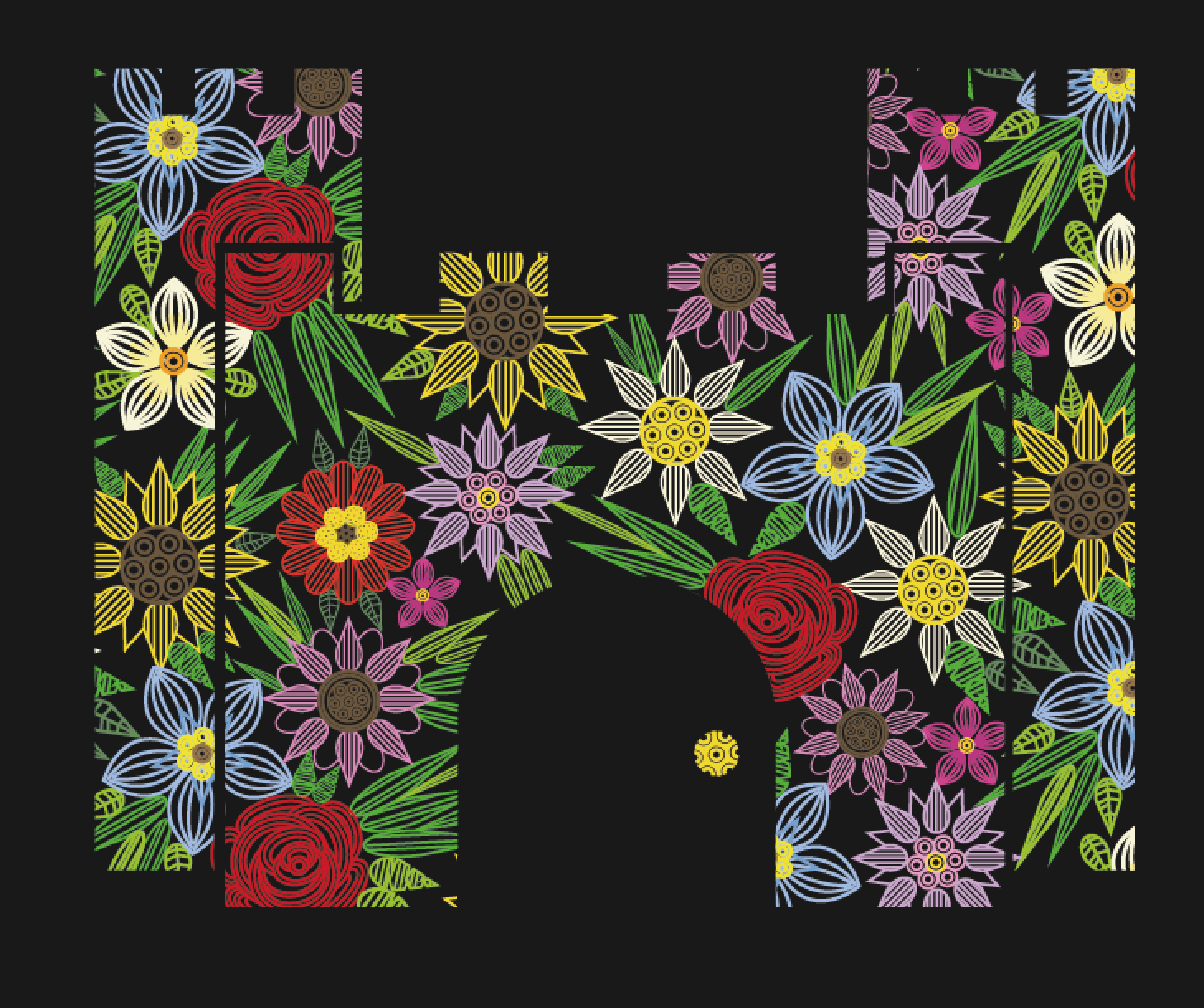
Today I carried on creating a collection of floral illustrations in the same style as the sunflower I previously created. As I am no longer paper quilling, I am aiming to create a large vector illustration pattern of floral and leaf illustrations that I can then mask using the video calling, costume and castle illustrations, to produce an aesthetic similar to paper quilling.

In doing so, I took inspiration from photographs of flowers so that the pattern appears authentic, and does not look like a combination of made up flowers.


YCN INTERFLORA.
DESIGN DEVELOPMENT.
Today I carried on creating a collection of floral illustrations in the same style as the sunflower I previously created. As I am no longer paper quilling, I am aiming to create a large vector illustration pattern of floral and leaf illustrations that I can then mask using the video calling, costume and castle illustrations, to produce an aesthetic similar to paper quilling.
In doing so, I took inspiration from photographs of flowers so that the pattern appears authentic, and does not look like a combination of made up flowers.
My Line illustrations:
I also created a small selection of greenery to break up the pattern of flowers. Greenery in floristry is what helps the flowers to be accentuated and creates a flow. It is always used and seen in nature and so it is very important that again for authenticity reasons that I incorporate this important element into my work.
With my selection of flowers and greenery vectors created a began to create a pattern randomly encoporating the flowers and leaves.
Once I was finished with the pattern and happy with it, I masked the illustrations and shapes, to create the video call, castle and needle and thread image using flowers.
Video call:
Castle:
Costumes:
I was worried that the illustrations would have as much of an impact as the planned paper quilling but i think that they have worked out really well. Although they don't have the desired 3d effect, they look bright and bold against the black backdrop and crisp and elegant much like the rest of the brand, thus appealing to the younger audience but also staying in tune with the brand style.
Wednesday, 4 March 2015
OUGD603 / Extended Practice - YCN Interflora: Learning to Paper quill.
OUGD603.
YCN INTERFLORA.
LEARNING TO PAPER QUILL.


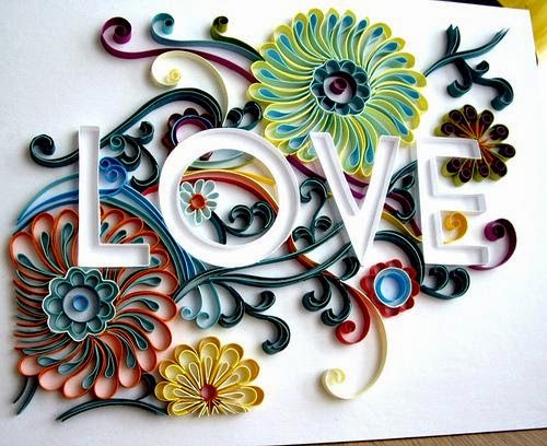


I began messing around with a few different flower shapes playing around with repetitive line work, trying to achieve a similar aesthetic to the images of paper craft above.


YCN INTERFLORA.
LEARNING TO PAPER QUILL.
Today I wanted to begin experimenting and creating the outline structure for each design ready to begin quilling. Before I began playing with shapes, I created the paper outlines for each designs that would barrier off the sections that needed to be quilled.
In order to do this I drew up the 3 designs onto black card. i chose black as a background base as the posters I am creating digitally are on a black background, meaning that when it comes to editing the photos of each paper quilling piece in this transition will be easier as the background will be black.
After drawing each design up, I then began cutting up strips of green paper to form the edges of each shape. i picked green as an outline colour as I felt this would match for all the designs. The most consistent colour throughout all three designs will be green, the colour of the flower leaves. After seeing the above designs, I saw that picking a colour for the background that was already highly dense within the design worked really well, for example in the typographic piece joy blue is used heavily through and for the outline.
Once I had cut the strips of paper, I ran thin layers of glue along the outline and began to stick the strips of paper I had cut along the glue lines, marking and folding them where appropriate.
However I found that when sticking larger strips of the paper down, the lack of tensions between the edge of the green paper and the black base, caused it to wilt, go wavy and not adhere the straight lines to the shape. I tried to fix this by physically creating tension between the two surfaces but I couldn't get the paper to straighten out.
Therefore knowing that I could not create the design via paper quilling to the best of my ability, as I was struggling in the begining stages.
I made the descision to therefore keep the designs that I had been working on, but change the production process. My strongest skill within design is illustration and so I began to think about how I could mimic the style of paperquilling and the repetitive line style.
I began messing around with a few different flower shapes playing around with repetitive line work, trying to achieve a similar aesthetic to the images of paper craft above.
I liked how the illustrations were working out and felt that aesthetic wise it was turning out just as well as paper quilling. I continued to create a series of both flower and greenery line illustrations.
Subscribe to:
Posts (Atom)