OUGD603
DESIGN PUBLICATION
SUBMISSION BOARDS
Showing posts with label Design Publication. Show all posts
Showing posts with label Design Publication. Show all posts
Wednesday, 20 May 2015
OUGD603 / Extended Practice - PART 2 Design Publication: Production.
OUGD603
DESIGN PUBLICATION
PRODUCTION
Over the next few days I worked on producing the 3 books according to the directions and components researched within the books.
Low cost packaging:


To keep the low cost book the lowest cost out of the set the books were printed on only one type of stock including front and back covers. The material that I printed on is bulky newsprint, at only 5p per large sheet I was able to get 4 double page spreads per sheet. with 12 double page spreads in the book I was able to buy the stock for the book for only 15p.
I then chose to laser print the book as this is the most low cost printing available in college and only cost me around £3 to print the full book. The staple bind was free, used in college meaning that the book costed me just £3.15 to produce, the cheapest of the collection.
Luxury Packaging:


The luxury packaging book was produced with what I had learnt in mind, the pages were printed with inkjet creating a matte, rich, luxe finish that had an increased tactility. Details were printed on each page in the process of foil finishing, adding a polished and well crafted feel in an exclusive colour pallet of black on black. Unfortunately the foil front didn't come out do well as the screen I was using must have been blocked, as both times I tried to foil the front cover on the second pull the glue didn't go through properly. I was told it must have been an issue with a blocked screen. the book is binded via perfect soft bind, creating a streamlined finish that appears smooth and clean.
Sustainable book:


The sustainable book was printed again with a laser printer as this uses less ink and is cheaper in cost meaning it is more sustainable in terms of less ink and less economically harmful. Details have been added in fluorescent green screen print to subtly reference the green roots of the book, but to also communicate that screen printing is also a well sustained root of printing. The bind is the most sustainable element of the whole book secured with a screw post. Screw post requires minimal, if not, no glue depending on the type of bind, it lasts for a long time, and the screws are reusable when they are no longer needed.
Packaging:

The packaging is lasercut from a sturdy material that will hold all the books as a set. Made from a low cost easily recycled material, that together when engraved has a well crafted look. The packaging also references the use of colour within the book series, injecting a small amount of fluorescent green.
Friday, 15 May 2015
OUGD603 / Extended Practice - PART 2 Design Publication: Transferring the design.
OUGD603
DESIGN PUBLICATION
TRANSFERRING THE DESIGN
Today I worked on transferring the design for the publications from luxury to fit both the sustainable and low cost editions from the series. I am transferring the design instead of making a new one as elements such as layout, typography and size will help keep consistency across the range whilst other components differ to fit the design solutions understood throughout the books for low cost and sustainable design.
Elements that I will change in the design aesthetic are following those listed in the book.
- Colour
- Finishing
- Printing
- Stock
- Binding
Low cost edition:
Colour:


In terms of colour for the low cost edition my focus was to have the pages dominated by less ink, the front cover features only title details printed in ink, whilst the inside spreads are dominated mainly by white pages also. Not only does this minimise on ink and therefore cost, it also offers the simplicity frequently spoken of within low cost design. The inside pages are also very stripped back in terms of colour where the text pages are dominated by solely black text on the stock background. The front cover is injected with a small detail of bright blue. As spoken about in my research often low cost packaging always revolve around a simple mainly white dominate pallet with a pop of colour.
Finishing:
In terms of finishing its important that I am strict and use no extra details such as foiling etc as these add value. Finishing should use one production process that is as low cost as possible. For this reason the only method I will use to produce the book is digital print.
Printing:
Speaking of digital print it is important that I consider the type of digital printing that will take place in order to produce the book. Although I printed via ink jet for the last book, this is much too luxurious for low cost packaging. Cost is increased by ink jet printing due to more ink and time taken to print. Therefore I will be printing via laser, it is much cheaper to do this in the print room at college and so out of the options this is going to be the lowest cost I can get.
Stock:
For stock options I tried to find a stock that was low cost, yet functions well such as, being able to print double sided without being able to see the print through the paper. All though I must consider the low cost, Low cost products and packaging still have a basic functionality to them and so it is important I stick with this. Looking at stock choices I found bulky news print to be my strongest option. at 5p a sheet for a size I can get 2 a3's out of it is ridiculously low cost. I also asked James if it was functional to print double sided on this through the laer printer and he said it will be no problem.
Binding:
Lastly my binding options also strip back to basics - In my crit with Tony Broomhead we discussed binding options and although I originally wanted to go with saddle stitch for the low cost appeal, I was advised that in order to be truly honest to the style I must again pick the most low cost, mass produceable and least time taking process to bind the book. For this reason I am instead choosing to go with a simple staple bind. By having a staple bind I will need to make the pages as double spreads that will be folded down the middle.


From luxury to low cost:


- Colour
- Finishing
- Printing
- Stock
- Binding
Sustainable edition:
Colour:
There is no particular set pallet of colours to use for sustainable packaging, or branding for that matter. Often neutral more 'natural' colours are used laced with tones of green. However it is quickly became apparent in my research for my dissertation that sustainable should be so in its purpose, function and production, but to catch the eye of the 21st century consumer should look just as 'normal' as the other products on the shelf. It is however good to have an aesthetic that slightly points towards 'green' and have some kind of recognition so that people intently looking for 'sustainable' products can spot them easily. The publication therefore intends on having white based pages again to save ink with small hints of a fluro green which I am aiming to screen print. Having a colour such as fluro green helps point the product to the 'aesthetic' of green products, but also allows it to be non traditional and mesh with other 'non' green products on the shelf.
Finishing + Printing:
Finishing all very much depends on function in terms of green packaging in relation to the binding and such which is purely based on function over aesthetic. The book will be finished using two print processes. Laser print will be used again as the main choice being more sustainable than inkjet. Screen print will be used for details as it is known to be another sustainable print process.

Stock:
For the book I wanted to try and at least use and FSC paper, however when speaking to James in the print room he informed me that none of the papers in there were actually certified sustainable and therefore I would need to look outside of college for such stock. I found a really great sustainable paper site called arjowiggins and I discovered a great type of 100% sustainable paper made from FSC recycled pulp, the paper 'cyclus jet premium' can be used for both laser and screen printing which makes it the perfect choice. I noticed that you can order samples which was also great for my small order, however when looking at delivery I found that there would not be enough time to recieve the paper and do both the laser printing + screen printing +bind. Instead I would have to find a paper that appeared like sustainable. I choose catridge paper due to its grain like feel and its price. sustainability isn't just about the environment its about being economically sound. The price of the paper was 20p for an a1, meaning each a4 page costs about 2.5p, very economically viable.
Binding:
I have already decided that for the bind i'm going to be doing a screw post. Screw post allows the bind to be re used when it is no longer needed as the screws can be reused minimising material waste. The bind also uses minimal if not, no glue which is also an added bonus. For the bind I will be using grey board for front and back covers as it is a sturdy, strong low cost material.
DESIGN PUBLICATION
TRANSFERRING THE DESIGN
Today I worked on transferring the design for the publications from luxury to fit both the sustainable and low cost editions from the series. I am transferring the design instead of making a new one as elements such as layout, typography and size will help keep consistency across the range whilst other components differ to fit the design solutions understood throughout the books for low cost and sustainable design.
Elements that I will change in the design aesthetic are following those listed in the book.
- Colour
- Finishing
- Printing
- Stock
- Binding
Low cost edition:
Colour:


In terms of colour for the low cost edition my focus was to have the pages dominated by less ink, the front cover features only title details printed in ink, whilst the inside spreads are dominated mainly by white pages also. Not only does this minimise on ink and therefore cost, it also offers the simplicity frequently spoken of within low cost design. The inside pages are also very stripped back in terms of colour where the text pages are dominated by solely black text on the stock background. The front cover is injected with a small detail of bright blue. As spoken about in my research often low cost packaging always revolve around a simple mainly white dominate pallet with a pop of colour.
Finishing:
In terms of finishing its important that I am strict and use no extra details such as foiling etc as these add value. Finishing should use one production process that is as low cost as possible. For this reason the only method I will use to produce the book is digital print.
Printing:
Speaking of digital print it is important that I consider the type of digital printing that will take place in order to produce the book. Although I printed via ink jet for the last book, this is much too luxurious for low cost packaging. Cost is increased by ink jet printing due to more ink and time taken to print. Therefore I will be printing via laser, it is much cheaper to do this in the print room at college and so out of the options this is going to be the lowest cost I can get.
Stock:
For stock options I tried to find a stock that was low cost, yet functions well such as, being able to print double sided without being able to see the print through the paper. All though I must consider the low cost, Low cost products and packaging still have a basic functionality to them and so it is important I stick with this. Looking at stock choices I found bulky news print to be my strongest option. at 5p a sheet for a size I can get 2 a3's out of it is ridiculously low cost. I also asked James if it was functional to print double sided on this through the laer printer and he said it will be no problem.
Binding:
Lastly my binding options also strip back to basics - In my crit with Tony Broomhead we discussed binding options and although I originally wanted to go with saddle stitch for the low cost appeal, I was advised that in order to be truly honest to the style I must again pick the most low cost, mass produceable and least time taking process to bind the book. For this reason I am instead choosing to go with a simple staple bind. By having a staple bind I will need to make the pages as double spreads that will be folded down the middle.


From luxury to low cost:


- Finishing
- Printing
- Stock
- Binding
Sustainable edition:
Colour:
There is no particular set pallet of colours to use for sustainable packaging, or branding for that matter. Often neutral more 'natural' colours are used laced with tones of green. However it is quickly became apparent in my research for my dissertation that sustainable should be so in its purpose, function and production, but to catch the eye of the 21st century consumer should look just as 'normal' as the other products on the shelf. It is however good to have an aesthetic that slightly points towards 'green' and have some kind of recognition so that people intently looking for 'sustainable' products can spot them easily. The publication therefore intends on having white based pages again to save ink with small hints of a fluro green which I am aiming to screen print. Having a colour such as fluro green helps point the product to the 'aesthetic' of green products, but also allows it to be non traditional and mesh with other 'non' green products on the shelf.
Finishing + Printing:
Finishing all very much depends on function in terms of green packaging in relation to the binding and such which is purely based on function over aesthetic. The book will be finished using two print processes. Laser print will be used again as the main choice being more sustainable than inkjet. Screen print will be used for details as it is known to be another sustainable print process.

Stock:
For the book I wanted to try and at least use and FSC paper, however when speaking to James in the print room he informed me that none of the papers in there were actually certified sustainable and therefore I would need to look outside of college for such stock. I found a really great sustainable paper site called arjowiggins and I discovered a great type of 100% sustainable paper made from FSC recycled pulp, the paper 'cyclus jet premium' can be used for both laser and screen printing which makes it the perfect choice. I noticed that you can order samples which was also great for my small order, however when looking at delivery I found that there would not be enough time to recieve the paper and do both the laser printing + screen printing +bind. Instead I would have to find a paper that appeared like sustainable. I choose catridge paper due to its grain like feel and its price. sustainability isn't just about the environment its about being economically sound. The price of the paper was 20p for an a1, meaning each a4 page costs about 2.5p, very economically viable.
Binding:
I have already decided that for the bind i'm going to be doing a screw post. Screw post allows the bind to be re used when it is no longer needed as the screws can be reused minimising material waste. The bind also uses minimal if not, no glue which is also an added bonus. For the bind I will be using grey board for front and back covers as it is a sturdy, strong low cost material.
Thursday, 14 May 2015
OUGD603 / Extended Practice - PART 2 Design Publication: Design development.
OUGD603
DESIGN PUBLICATION
DESIGN DEVELOPMENT
I felt that the most simple layout is going to be the most successful across the series. Where the low cost section demands simplicity in its aesthetic, the same simple layout can be made luxurious by adding extra print process details such as foiling.
I began creating the double page spreads based upon my sketch:

Creating the publication layouts with the previously discussed dimensions which allowed the pages to be a slightly more square version of a5, I created a set of 3 columns and rows across the spreads. I very rarely work with editorial and so working with the rule of thirds allows me to create successful layouts that read well and look aesthetically pleasing.

I started with the luxury book as this is going to be foiled and will take the most time to produce, and will therefore need printing first. I took my first pieces of information and placed them into the layout inspired by my sketch.

I have learnt when designing for luxury packaging that restraint in colour is really important, therefore it seemed to make sense that I should change the page colour to black. The photos shown on the right of each double page spread are mostly dominate by black, and so it will appear most luxurious if I match this.

Taking the appeal of luxury one step further I decided to play with colour further in relation to what I have learned in my research and add foil finishing elements that experiment with a black on black colour scheme. The foil will not only appear clean and well crafted contrasting against the matt black backdrop, it will also add moments of privacy and exclusivity just as luxury packaging should.

Lastly I experimented with my guides of 3 columns again and I felt that I needed to add a small piece of information that would some up the whole paragraphs of my understanding. Often when researching I take the information and narrow this down until I have a simple statement that reflects the original information. Alike to the composition below I have given every paragraph a simple statement that sums up the information.

I continued to use the same design/layout applying it to all of the double page spreads.
I think that the heavy use of black with punches of white and black on black foil details really represents the restraint and simplicity needed within luxury branding and packaging. The full bleed colour photos that will be printed via inkjet on a heavy paper will also add to the luxury by dramatically increasing the quality.


I also applied the format to text heavy pages such as the contents and introduction for consistency. I aim finding due to the simplicity and format of the layout that it is easy to transfer from page to page. Therefore I think that by changing elements across the spread design such as stock and colours etc, according to the research I have found in my publications that the double page spread composition will be easily transferable across the series.


Today in the AM I made progress by printing the book. As previously decided I have chosen to print the publication via inkjet, although it is more money and time consuming, ink jet printing gives a much more luxurious finish than laser printing. I produced the book on a pure white stock, I felt that the stark and crisp contrast of this would allow the book to look well polished, and therefore more expensive.
I had previously prepared my screens and so for the latter half of the day I foiled the number details onto each page.
applying the glue:

Finished result from different angles:


Overall im really happy with the way in which the pages have turned out. I think the stock and printing processes work well in the favour of luxury, however there are elements such as the printer quality, leaving marks on the stock that might take away from the design, but working in house sometimes issues such as this cannot be avoided.
Binding update:
I was previously wanting to do a case/perfect bind as I thought this would be most luxurious. However to do so I need to bind the book with book ram and I don't have enough time to bind the book and collect bookram, to transport it up to Blenheim for foiling, to then go back down to vernon and bind the book with it.
I considered other avenues such as creating the front and back covers from mount board as I could measure this up and take it down to vernon with me, however I don't think that this will be very luxurious.
I was under the impression that in order for the book to appear the most luxurious out of the set of three that it must appear the thickest, however looking at the binding style i am beginning to realise that craftsmanship is a lot more important and this is a deeply considered component of luxury design, the book needs to look smooth and sleek and this should take priority over its thickness.

Therefor I plan on doing a soft perfect bind instead of hard back using the high quality card stock they have at vernon street for book binding. Unfortunately this means the book wont be anywhere near as thick due to the lack of material such as mount board or grey board, but I think the outcome will look much more refined and polished.
Saturday, 9 May 2015
OUGD603 / Extended Practice - PART 2 Design Publication: Content Development.
OUGD603
DESIGN PUBLICATION
CONTENT DEVELOPMENT
Now That I have a lot of the aesthetic decisions down I wanted to move onto creating the content. For the double page spreads I am creating I will be using the left hand page to talk about one of my methodology components and what I have learnt about this - For example what I have learnt about colour and luxury packaging. And the right will show an image overlaid with text from the designer/studio of the work shown in the image.
I began putting what I had learned into my own words for each component across all 3 types of packaging.
Luxury:
Colour:
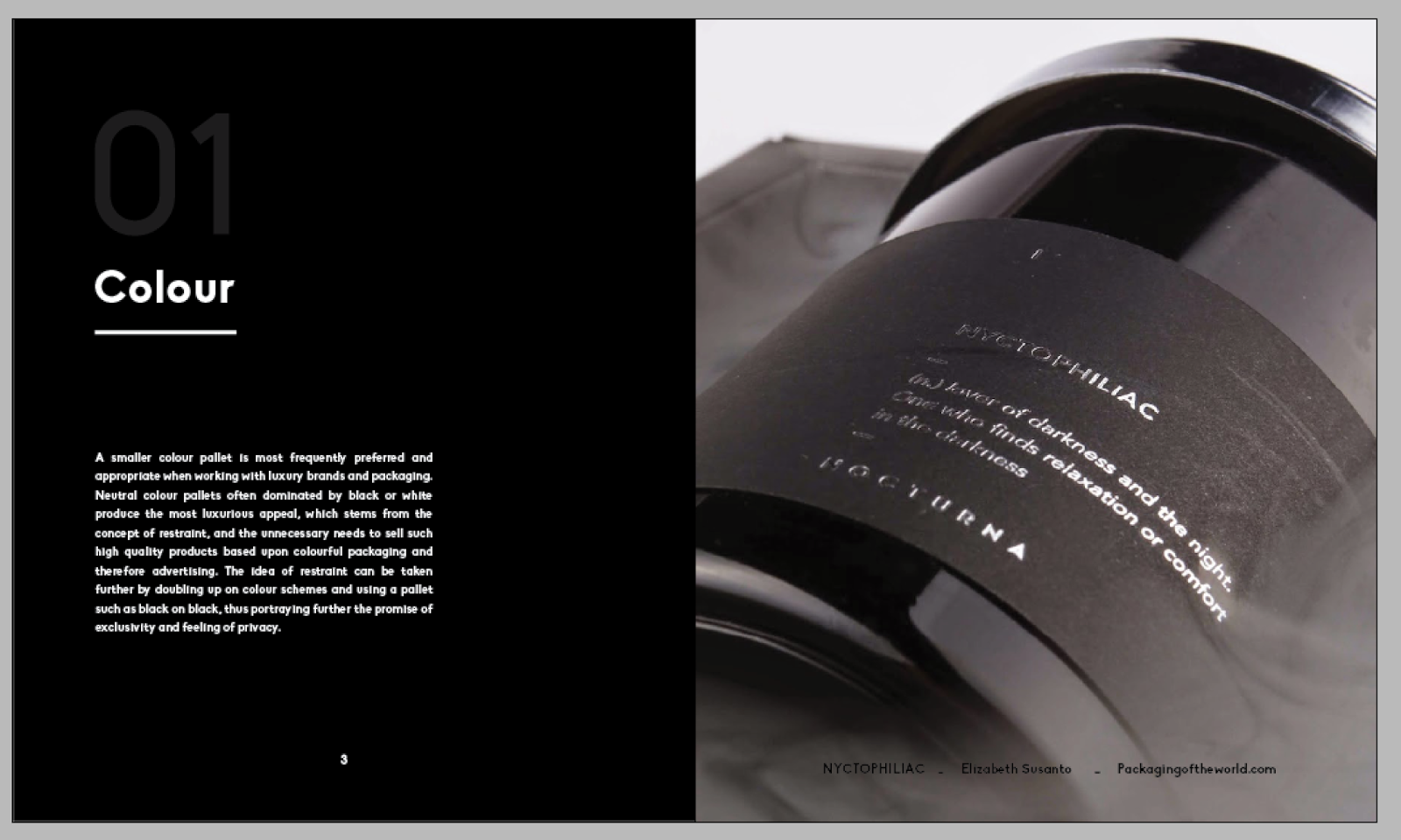
A smaller colour pallet is most frequently preferred and appropriate when working with luxury brands and packaging. Neutral colour pallets often dominated by black or white produce the most luxurious appeal, which stems from the concept of restraint, and the unnecessary needs to sell such high quality products based upon colourful packaging and therefore advertising. The idea of restraint can be taken further by doubling up on colour schemes and using a pallet such as black on black, thus portraying further the promise of exclusivity and feeling of privacy.
Shape:
When working with shape and packaging the brand owners and customers spectate heavily. Luxury brands look to shape their packaging so that it appears strong and exudes power. Luxury packaging is always well crafted and often features bold angles and smooth curves. It is very frequently found that the shape of the packaging is dominated by the brand story.
Context:
The background and context of a product often determines its luxury and this can be heightened through packaging. Consumers of luxury products like to understand the journey of the product, and telling the unique story of a product increases is quality and exclusivity. Storytelling is an important feature that can be communicated via packaging through both image and type.
Texture:
Texture and overall feel of the packaging is something that can be experimented with to increase its luxury appeal. Processes such as embossing increase the perception of effort and craftsmanship and therefore quality. Production methods alike to embossing or letterpress for example, are seen more rarely which boosts the impression of individuality.
Sustainable:
It is often understood that for something so heavily reliant on mass production such as packaging that luxury and sustainability is not something that can be achieved. Materials often associated with sustainable packaging have an aesthetic of heavily grain or come in colours from cream to brown. However through careful research into and choice of stock, printing and production techniques packaging can be certified sustainable and appear luxury.
Finishing:
Production and finishing is the cherry on top of luxury packaging, and experimenting with such processes can dramatically increase the quality and worth of both the product and the packaging itself. Finishing techniques such as foiling are extremely popular within the luxury arena due it its glossy, clean and crisp aesthetic, especially when used against smooth and imperfection less stock. Using finishing techniques that appear clean and elegant in all different types of lighting and contrast the stock raise the understanding of meticulous and thorough care for craft.
Haptic:
The routine of opening the packaging should be well considered when designing for luxury products, as the journey to the product should attempt to create just as much excitement as the end product itself. Hand positioning and how many times the user has to rotate, or undo sections to get to the product can increase its quality. However ease must also be considered, the ease of moving from one place to the other directly links to packaging quality, although exciting and requiring effort, luxury packaging must always be smooth to open.
Anticipation:
Relating to Haptic qualities the building of excitement through the journey of packaging boosts the promise of exclusivity. Having packaging that requires the user to unveil layers heightens the users want to acquire the product. However Anticipation is easy to over do, and so the layers must be well considered, creating only a short interruption. Over anticipation can cause the consumer to hesitate and reconsider the purchase, which may result in its return.
My Interpretation:
Becket Beccari.
Floral packaging.
Beckett Beccari is a brand created for a luxury florist based in Chester, England. The touch points and introduction of luxury extend from its logo, to its flower carriers in which act as packaging for the brand. The brand utilises components such as finishing, colour, shape and texture to promote a luxury brand. The overall colour scheme of Beckett Beccari is dominated by black, with only a small but strong punch of white. The black on black pallet created via smooth black matte black stock and black foil printed logo, appears crisp and clean reflecting the light, but also projects exclusivity and privacy, when the logo is hidden in certain lights. Tactility and texture is heightened through layering of materials used to wrap the flowers, tulle and tissue paper encases the flowers inside a matte black card carrier with textured black ribbon handles. The power and uniqueness of the brand is extended through small details such as the message card holders which are produced in the shape of the brand logo, increasing rarity and adding details which no other will have.
My Interpretation:
MAC Cosmetics.
Make up packaging.
The MAC cosmetic packaging plays upon the luxury stance that the brand has already captured, using a colour scheme lead with black, printed with inkjet that is rich dense and imperfection free. Although the colour pallet is very broad due to the illustrations, they are injected carefully into the design, and the contrast against the dense black back drop allows them to also appear luxurious. The foil finishing conflicting and shimmering against the opaque black back drop appears clean and reflective logo that shines from some angles and disappears in others, reflecting both the privacy of a luxury brand and mystery from the films atmosphere.
Sustainable:
Honest:
Honesty in sustainable packaging is a great tool to use, visualising the purity of the product in a clean and uncomplicated design is a simple but effective way to allow consumers to understand the clarity of the product. A utilitarian approach towards the packaging using ink and materials only where definitely needed helps to reduce waste and unnecessary substances.
Simple:
Simplicity is key when executing the message and green or sustainable values of a product. Over complicating the message can lead to lack of customer interest and so adorning packaging with lengthy messages about the sustainable aspects of a product or company. When designing packaging for a sustainable brand the designer should seek to communicate such information in a simple and direct format that will be easily understood.
Friendly:
Sustainable packaging should always seek just like the brand to be friendly, approachable and welcoming. Sustainability should be communicated in a positive way. People are born with fight or flight mechanisms, and when sustainability is communicated through a negative outlet creating a stressful situation,consumers will run away rather than support the product. The packaging should communicate self empowerment and inspire the consumer to purchase, trying to lead the consumer in on sympathy will only have a negative outcome.
Production:
Wherever possible certified sustainable packaging should seek to be produced with as little impact as possible. This includes monitoring and implementing appropriate stock choice, considering print and production methods and what is a necessary amount of packaging for the product in question.
Fun:
Sustainable packaging should be fun, just like any other product on the market, sustainable products should aim to draw people in by how great the product is, not how green it is. Consumers like to pick products according to quality and function and so this should be at the forefront of the packaging, which also acts as advertising for the product. Sustainable product packaging also doesn't have to only be produced in brown or green, using an array of colours and making the product appear bright, fun and positive can help to draw the consumer in.
Post packaging:
Post packaging is also an important consideration for sustained packaging. The impact of packaging after primary use is crucial in its green stance, as it must make as little impact as possible. After life of a product can include making sure that as much as possible, if not all materials can be recycled when the packaging no longer has a use. Other successful methods of cradle to cradle is giving the packaging a secondary use or other uses so that it does not have to be discarded as waste.
Luxurious:
Sustainable products can be luxurious right from design through to production. Stocks can be chosen carefully according to the brand to match the luxurious identity that the brand has already captured. Options such as starch-based laminates are available to match the aesthetically of foiling, which is often used in luxury packaging for its glossy appeal.
Tactile:
Tactility can help to improve the attraction between the consumer and the product, die cuts, letterpress and embossing are become widely used by sustainable brands to create another relationship between the customer and the product that relies on other senses instead of sight. Traditional processes such as embossing have low impact using a plate to repeatedly stamp a design wastes no ink and is reusable for as many times as the emboss plate lasts.
My Interpretation:
John Lewis.
Delivery packaging.
Something that John Lewis prescribed within their delivery packaging D&AD redesign was that the production and afterlife of the packaging would be considered from a well sustained point of view. Working in collaboration with Caitlin, we decided that as well as giving the boxes a second purpose such as storage, we made sure to create a packaging system that used only recyclable and sustainable materials such as FSC paper and corrugated card. The boxes are also highly tactile due to their unique opening in which reflects that of a gift. Other parts of the packaging have the ability to be torn away and recycled whilst the remaining leaves a box in which can be used for other needs.
My Interpretation:
Heavenly Chocolate.
The main aim of Heavenly chocolate was really focused on the design and communication strategy over production, although it was produced using FSC card. The brand was made to sell Heavenly on the product itself rather than the cause in which it supported which was to acquire palm oil sustainably. The aesthetic of the packaging and name of the brand was based upon the chocolate itself, regarding the taste and aesthetic. Foil details were added to contrast the brown backdrop and allow the product to stand out from its counterparts on the stand. It is only after the purchase of the product that consumers really learn about the brands sustainable story which is told in a simple, positive and self-empowering way.
Low cost:
Colour pallet:
When designing packaging for lower budget brands colour is a very important component of the design and can be used to help distinguish the product from its competition on the shelf. Colour can also be used as a key and coding system within the design. As other aesthetic qualities don't dramatically differentiate across product types, for example with basic lines and supermarkets, colour can help the consumer to distinguish the type of product.
White space:
White space is another aesthetic tool used by designers of low cost packaging, not only does reducing the amount of ink reduce the cost but it also allows the visual information to be easily readable and distinguishable. A white background also allows a clean slate for illustration and photograph application to take place, and makes the necessary information on the product such as name or flavour easy to find.
Basic illustration and photography:
Basic illustration and photography is often used across more value ranges, whilst small doses of illustration allow the packaging to still appeal somewhat unique, the addition of photography gives the customer the transparency and visual they want of the more 'value' product before they purchase. Consumers like to be able to see what they are purchasing, more so if it originates from a more low cost range.
Simple:
Customers expect and look for simplicity when shopping for lower cost products, and it has more so become a trademark of more value ranges. Where more luxury items express stories such as the journey of ingredients, low cost packaging should aim to keep information a simple as possible. When shopping for budget items shoppers go to purchase with the intention of already knowing what they want, this needs to be simply represented to them so that they find such products with ease, they do not need to be sold by stories about the product itself.
Friendly and approachable:
Low cost packaging should aim to be friendly and approachable, and unlike its luxury counterpart which aims for exclusivity and a select audience, should welcome all. It can do this by tone of voice in which the packaging in its communication can take on a more conversational and informal tone of voice, projecting that the product is good enough for everyone rather than a select few.
Human aesthetic:
Some packaging designers when working on more value ranges like to further their approach to a more welcoming brand by adding human value to the aesthetic of a product and not just a message. Elements such as hand written type can convey a vision of everyday conversation and also honesty. Rather than being sold and persuaded into buying a product from a more luxury range through a sequence of cues, value brands sell based on honesty that is often derived of excessive adjectives.
Low cost print:
Lower cost packaging not only denominates from more simple design work but also lower costs in production. Whereas for luxury packaging extra steps such as foil blocking, embossing or other rare and more costly production techniques may be used, Low cost budget aims to keep production costs as low as possible. Therefore lower cost printing is usually produced using less printing processes and often just one such as digital print over others such as screen printing where a variety of colours can be printed for a low cost.
Cheaper materials:
Materials can also be thoroughly considered in order to keep costs down, and it can be seen by viewing cheaper packaging that materials are based solely upon function rather than decoration. Within the budget packaging arena, stock should be chosen based upon its ability to remain sealed and satisfactorily protect the item, from which materials price will then be considered.
My Interpretation:
Value Packaging should aim to be simple and identifiable in comparison to its counterparts. The composition should be laid out so that the vital information is easy to find. Colour should be used to allow the packaging to stand out from its competitors, and make the products easy to navigate whether by a key system or simply east to recognise on the shelf. The packaging should aim to be friendly and approachable and take on a product for everyone attitude over exclusivity. Whilst It should still boast an appearance that people fell proud to put into their basket or home and it should seek to be as low cost as possible without compromising function in relation to both printing and materials.
DESIGN PUBLICATION
CONTENT DEVELOPMENT
Now That I have a lot of the aesthetic decisions down I wanted to move onto creating the content. For the double page spreads I am creating I will be using the left hand page to talk about one of my methodology components and what I have learnt about this - For example what I have learnt about colour and luxury packaging. And the right will show an image overlaid with text from the designer/studio of the work shown in the image.
I began putting what I had learned into my own words for each component across all 3 types of packaging.
Luxury:
Colour:
A smaller colour pallet is most frequently preferred and appropriate when working with luxury brands and packaging. Neutral colour pallets often dominated by black or white produce the most luxurious appeal, which stems from the concept of restraint, and the unnecessary needs to sell such high quality products based upon colourful packaging and therefore advertising. The idea of restraint can be taken further by doubling up on colour schemes and using a pallet such as black on black, thus portraying further the promise of exclusivity and feeling of privacy.
Shape:
When working with shape and packaging the brand owners and customers spectate heavily. Luxury brands look to shape their packaging so that it appears strong and exudes power. Luxury packaging is always well crafted and often features bold angles and smooth curves. It is very frequently found that the shape of the packaging is dominated by the brand story.
Context:
The background and context of a product often determines its luxury and this can be heightened through packaging. Consumers of luxury products like to understand the journey of the product, and telling the unique story of a product increases is quality and exclusivity. Storytelling is an important feature that can be communicated via packaging through both image and type.
Texture:
Texture and overall feel of the packaging is something that can be experimented with to increase its luxury appeal. Processes such as embossing increase the perception of effort and craftsmanship and therefore quality. Production methods alike to embossing or letterpress for example, are seen more rarely which boosts the impression of individuality.
Sustainable:
It is often understood that for something so heavily reliant on mass production such as packaging that luxury and sustainability is not something that can be achieved. Materials often associated with sustainable packaging have an aesthetic of heavily grain or come in colours from cream to brown. However through careful research into and choice of stock, printing and production techniques packaging can be certified sustainable and appear luxury.
Finishing:
Production and finishing is the cherry on top of luxury packaging, and experimenting with such processes can dramatically increase the quality and worth of both the product and the packaging itself. Finishing techniques such as foiling are extremely popular within the luxury arena due it its glossy, clean and crisp aesthetic, especially when used against smooth and imperfection less stock. Using finishing techniques that appear clean and elegant in all different types of lighting and contrast the stock raise the understanding of meticulous and thorough care for craft.
Haptic:
The routine of opening the packaging should be well considered when designing for luxury products, as the journey to the product should attempt to create just as much excitement as the end product itself. Hand positioning and how many times the user has to rotate, or undo sections to get to the product can increase its quality. However ease must also be considered, the ease of moving from one place to the other directly links to packaging quality, although exciting and requiring effort, luxury packaging must always be smooth to open.
Anticipation:
Relating to Haptic qualities the building of excitement through the journey of packaging boosts the promise of exclusivity. Having packaging that requires the user to unveil layers heightens the users want to acquire the product. However Anticipation is easy to over do, and so the layers must be well considered, creating only a short interruption. Over anticipation can cause the consumer to hesitate and reconsider the purchase, which may result in its return.
My Interpretation:
Becket Beccari.
Floral packaging.
Beckett Beccari is a brand created for a luxury florist based in Chester, England. The touch points and introduction of luxury extend from its logo, to its flower carriers in which act as packaging for the brand. The brand utilises components such as finishing, colour, shape and texture to promote a luxury brand. The overall colour scheme of Beckett Beccari is dominated by black, with only a small but strong punch of white. The black on black pallet created via smooth black matte black stock and black foil printed logo, appears crisp and clean reflecting the light, but also projects exclusivity and privacy, when the logo is hidden in certain lights. Tactility and texture is heightened through layering of materials used to wrap the flowers, tulle and tissue paper encases the flowers inside a matte black card carrier with textured black ribbon handles. The power and uniqueness of the brand is extended through small details such as the message card holders which are produced in the shape of the brand logo, increasing rarity and adding details which no other will have.
My Interpretation:
MAC Cosmetics.
Make up packaging.
The MAC cosmetic packaging plays upon the luxury stance that the brand has already captured, using a colour scheme lead with black, printed with inkjet that is rich dense and imperfection free. Although the colour pallet is very broad due to the illustrations, they are injected carefully into the design, and the contrast against the dense black back drop allows them to also appear luxurious. The foil finishing conflicting and shimmering against the opaque black back drop appears clean and reflective logo that shines from some angles and disappears in others, reflecting both the privacy of a luxury brand and mystery from the films atmosphere.
Sustainable:
Honest:
Honesty in sustainable packaging is a great tool to use, visualising the purity of the product in a clean and uncomplicated design is a simple but effective way to allow consumers to understand the clarity of the product. A utilitarian approach towards the packaging using ink and materials only where definitely needed helps to reduce waste and unnecessary substances.
Simple:
Simplicity is key when executing the message and green or sustainable values of a product. Over complicating the message can lead to lack of customer interest and so adorning packaging with lengthy messages about the sustainable aspects of a product or company. When designing packaging for a sustainable brand the designer should seek to communicate such information in a simple and direct format that will be easily understood.
Friendly:
Sustainable packaging should always seek just like the brand to be friendly, approachable and welcoming. Sustainability should be communicated in a positive way. People are born with fight or flight mechanisms, and when sustainability is communicated through a negative outlet creating a stressful situation,consumers will run away rather than support the product. The packaging should communicate self empowerment and inspire the consumer to purchase, trying to lead the consumer in on sympathy will only have a negative outcome.
Production:
Wherever possible certified sustainable packaging should seek to be produced with as little impact as possible. This includes monitoring and implementing appropriate stock choice, considering print and production methods and what is a necessary amount of packaging for the product in question.
Fun:
Sustainable packaging should be fun, just like any other product on the market, sustainable products should aim to draw people in by how great the product is, not how green it is. Consumers like to pick products according to quality and function and so this should be at the forefront of the packaging, which also acts as advertising for the product. Sustainable product packaging also doesn't have to only be produced in brown or green, using an array of colours and making the product appear bright, fun and positive can help to draw the consumer in.
Post packaging:
Post packaging is also an important consideration for sustained packaging. The impact of packaging after primary use is crucial in its green stance, as it must make as little impact as possible. After life of a product can include making sure that as much as possible, if not all materials can be recycled when the packaging no longer has a use. Other successful methods of cradle to cradle is giving the packaging a secondary use or other uses so that it does not have to be discarded as waste.
Luxurious:
Sustainable products can be luxurious right from design through to production. Stocks can be chosen carefully according to the brand to match the luxurious identity that the brand has already captured. Options such as starch-based laminates are available to match the aesthetically of foiling, which is often used in luxury packaging for its glossy appeal.
Tactile:
Tactility can help to improve the attraction between the consumer and the product, die cuts, letterpress and embossing are become widely used by sustainable brands to create another relationship between the customer and the product that relies on other senses instead of sight. Traditional processes such as embossing have low impact using a plate to repeatedly stamp a design wastes no ink and is reusable for as many times as the emboss plate lasts.
My Interpretation:
John Lewis.
Delivery packaging.
Something that John Lewis prescribed within their delivery packaging D&AD redesign was that the production and afterlife of the packaging would be considered from a well sustained point of view. Working in collaboration with Caitlin, we decided that as well as giving the boxes a second purpose such as storage, we made sure to create a packaging system that used only recyclable and sustainable materials such as FSC paper and corrugated card. The boxes are also highly tactile due to their unique opening in which reflects that of a gift. Other parts of the packaging have the ability to be torn away and recycled whilst the remaining leaves a box in which can be used for other needs.
My Interpretation:
Heavenly Chocolate.
The main aim of Heavenly chocolate was really focused on the design and communication strategy over production, although it was produced using FSC card. The brand was made to sell Heavenly on the product itself rather than the cause in which it supported which was to acquire palm oil sustainably. The aesthetic of the packaging and name of the brand was based upon the chocolate itself, regarding the taste and aesthetic. Foil details were added to contrast the brown backdrop and allow the product to stand out from its counterparts on the stand. It is only after the purchase of the product that consumers really learn about the brands sustainable story which is told in a simple, positive and self-empowering way.
Low cost:
Colour pallet:
When designing packaging for lower budget brands colour is a very important component of the design and can be used to help distinguish the product from its competition on the shelf. Colour can also be used as a key and coding system within the design. As other aesthetic qualities don't dramatically differentiate across product types, for example with basic lines and supermarkets, colour can help the consumer to distinguish the type of product.
White space:
White space is another aesthetic tool used by designers of low cost packaging, not only does reducing the amount of ink reduce the cost but it also allows the visual information to be easily readable and distinguishable. A white background also allows a clean slate for illustration and photograph application to take place, and makes the necessary information on the product such as name or flavour easy to find.
Basic illustration and photography:
Basic illustration and photography is often used across more value ranges, whilst small doses of illustration allow the packaging to still appeal somewhat unique, the addition of photography gives the customer the transparency and visual they want of the more 'value' product before they purchase. Consumers like to be able to see what they are purchasing, more so if it originates from a more low cost range.
Simple:
Customers expect and look for simplicity when shopping for lower cost products, and it has more so become a trademark of more value ranges. Where more luxury items express stories such as the journey of ingredients, low cost packaging should aim to keep information a simple as possible. When shopping for budget items shoppers go to purchase with the intention of already knowing what they want, this needs to be simply represented to them so that they find such products with ease, they do not need to be sold by stories about the product itself.
Friendly and approachable:
Low cost packaging should aim to be friendly and approachable, and unlike its luxury counterpart which aims for exclusivity and a select audience, should welcome all. It can do this by tone of voice in which the packaging in its communication can take on a more conversational and informal tone of voice, projecting that the product is good enough for everyone rather than a select few.
Human aesthetic:
Some packaging designers when working on more value ranges like to further their approach to a more welcoming brand by adding human value to the aesthetic of a product and not just a message. Elements such as hand written type can convey a vision of everyday conversation and also honesty. Rather than being sold and persuaded into buying a product from a more luxury range through a sequence of cues, value brands sell based on honesty that is often derived of excessive adjectives.
Low cost print:
Lower cost packaging not only denominates from more simple design work but also lower costs in production. Whereas for luxury packaging extra steps such as foil blocking, embossing or other rare and more costly production techniques may be used, Low cost budget aims to keep production costs as low as possible. Therefore lower cost printing is usually produced using less printing processes and often just one such as digital print over others such as screen printing where a variety of colours can be printed for a low cost.
Cheaper materials:
Materials can also be thoroughly considered in order to keep costs down, and it can be seen by viewing cheaper packaging that materials are based solely upon function rather than decoration. Within the budget packaging arena, stock should be chosen based upon its ability to remain sealed and satisfactorily protect the item, from which materials price will then be considered.
My Interpretation:
Value Packaging should aim to be simple and identifiable in comparison to its counterparts. The composition should be laid out so that the vital information is easy to find. Colour should be used to allow the packaging to stand out from its competitors, and make the products easy to navigate whether by a key system or simply east to recognise on the shelf. The packaging should aim to be friendly and approachable and take on a product for everyone attitude over exclusivity. Whilst It should still boast an appearance that people fell proud to put into their basket or home and it should seek to be as low cost as possible without compromising function in relation to both printing and materials.
OUGD603 / Extended Practice - PART 2 Design Publication: Design development.
OUGD603
DESIGN PUBLICATION
DESIGN DEVELOPMENT
Today I worked more so on the aesthetic of the book and possible packaging which ill hold the books as a set. I currently have quite a clear idea about how the inside spreads will keep consistency, however I need to think about how the books will link aesthetically cover to cover especially with different bind and printing techniques - and overall how to represent all three in one piece of packaging.
I started by trying to think of a name for my book and came up with a few different ideas. I was unsure whether I should call it something that would apply to everyone, or just me as it reflects my practice.
Possible names:
I started playing around with the idea of Packaging 1, 2, 3 as it created a way to organise the three books and almost give them a code, the three numbers referring to each of the 3 packaging types.


DESIGN PUBLICATION
DESIGN DEVELOPMENT
Today I worked more so on the aesthetic of the book and possible packaging which ill hold the books as a set. I currently have quite a clear idea about how the inside spreads will keep consistency, however I need to think about how the books will link aesthetically cover to cover especially with different bind and printing techniques - and overall how to represent all three in one piece of packaging.
I started by trying to think of a name for my book and came up with a few different ideas. I was unsure whether I should call it something that would apply to everyone, or just me as it reflects my practice.
Possible names:
my packaging approach
my packaging procedure
my packaging process
the packaging routine.
the packaging framework
the packaging strategy
the packaging pattern
the pattern of packaging
Packaging method(s)odology
Packaging 123
- Luxury packaging
- sustainable packaging
- cost effective packaging
I started playing around with the idea of Packaging 1, 2, 3 as it created a way to organise the three books and almost give them a code, the three numbers referring to each of the 3 packaging types.

I did think however that the book didn't seem very personal to me and so I experimented with something else. I asked others their opinions and they said they liked the idea of packaging Method(s)ology as it suggests that the information described in the books can be followed by others to create successful packaging, but the information has been drawn from my methodology.
I did however Like the idea of giving the books a key or a code and so I continued to play with this idea.
How the outside packaging could appear to explain that it is a set of packaging methodoligies and there are three in the collection.
I also thought I could do a small overview or recap what the 3 books entail. However I could also have this on the back of the packaging as a mini blurb.

I then thought I could apply the same kind of layouts to the covers of the books creating some coherency.
However I thought that instead of having the 3 - referring to the amount of books which isn't relevant to the cover of the book, I could create a key of icons. One icon for each book that represents what type of packaging the book is talking about.

I also thought that underneath the title where the mini caption about the books as a set was positioned on the packaging that this could be transferable to each book cover where it would instead, state information about the book for example all about sustainability.

I created a set of three symbols which I thought would apply the the three types of packaging.

Shape and size:
Next I worked on size and shape of the book, I felt that this would be dominated by the binds, particularly the screw post bind which requires extra margin room.
I thought about the different shapes - so far I had been working with something that was about a5 size and format. It is a good idea that I keep them smaller rather than large. Sustainability requires as little materials to be used as possible such as stock, as so keeping waste to a minimum is a decision to follow.

If an a5 type format is used a chunk of the format will be unusable due to the screw post bind and will make the page format very slim. Therefore I should work to use a winder format that will allow space for this.

I feel that the format of height larger than width works better and the above possibility is too wide. I want something that when the margin is taken away, leaves an a5 format type behind. For this reason I will take an a5 paper size dimensions and add to the width to make room for a screw post bind.

Size of the book:
178mm width x 210mm height.
Subscribe to:
Posts (Atom)