DBA CAPITAL NORTH
FINAL PIECES + EVALUATION
As a group according to our set of skills and interests we also decided to work on the train livery and environmental design out of the list of optional choices. Mel and Daisy worked on the Train Livery and interior whilst Sarah came up with some ideas for possible environmental design.
Train Livery:

My opinion on the train livery was very 50/50, I felt that more so with the outside designed by Mel, although it fit in with the brand as far as colours went, it was very basic and lacked any kind of character. The only acknowledgement that the train was a part of Capital North is a logo at the front of the train. Otherwise the design is block purple. I definitely feel with how exciting our campaign and slogan was that the train livery could have been a lot more exciting. As a train is a mobile piece of advertising, people may only see it for up to a minute as it pulls into a station before it pulls back out, therefore the design needs to be exciting and catch attention. I think creating a livery that was more exciting and integrated some of the illustrations and slogan we had would have been much more interesting, and inspirational.


Daisy worked on the interiors of the train which I think helped to push the train design further, as she made subtle references to brand points we made. These were existent in elements such as the chair covers in which she created a repetitive pattern using the arrow from the logo. There was also a lot more consideration towards contrasting colours to make the arrangement look more interesting, and towards the form in which a more modern interior set up was created. She also considered how to take the HS2 and HS3 trains further, making the brand more special or 'luxury' by adding and designing facilities such as a built in coffee machine. I think that this, if paired with a more experimental outer shell would have been a great combination.
Environmental design:
Sarah Heal worked on the designs for the environmental design in which she created a few different situations where we could apply different brand elements that we already had.
In the airport:

Firstly Sarah created a little set up in which the logo was implemented to become part of the escalator. I thought that this was a really cool and subtle idea to communicate the brand, however I noticed that the logo had been somewhat flipped. The logo is supposed to appear like a compass point, pointing north at the N. Here it points down at the letter, therefore the characters should have switched places, this must be something that was forgotten in the final stages. She also created a floor sticker seen at the front of the image. Again, alike to the train livery I felt it was much too plain and didn't express anything inspirational or exciting about the North.
On/Inside the lift:

When thinking about objects that travel North, I suggested to Sarah that she should consider applying the brand to a lift, often found in city centres, car parks and train stations, and so easily seen by travellers. She cleverly applied the concept of Daisy's poster to the lift. She used the same floor sticker as seen previously, I think it works more so in this situation as it complements the illustrative details seen on the lift.
On the escalator:

She also designed a subtle but well thought out design in relation to an escalator which also travels 'north' and would be seen in pretty much all travel centres. The design features the shortened logo in which the arrow 'compass points' travel upwards towards the N at the top of the escalators. I think subtle designs such as these really nod towards our brand which sites Less is more, more is North, Sarah has seemingly reflected this in a lot of the designs which I think works well.
In the toilet:

Lastly, she created quite a humous design that again works well. Considering the movement alike to a compass, Sarah placed the logo sections onto a toilet roll dispenser un which the compass point spins to meet the N completing the logo. Again although subtle I think the concept of the design works really well.
Work I inputed:
Creating an initial brand style: I created the brand style that we would use throughout the rest of the brand/ campaign.
Both logo designs:

A 48 sheet billboard:

An animated poster:
Refining mels poster:
Mels poster was supposed to be for a bus stop format, and was to combine the first and second phase of her moving animation into one bus stop poster sized image. Below is the format Mel sent her her poster in:

What I changed the poster to:

5 illustrated mock ups:


DBA EVALUATION.
Working with the group:
I think the group worked well together, with most of the progress and success coming towards the end of the project. I found it quite frustrating in the beginning as I seemed to be taking on most of the work, creating a set of logos and coming up with the brand/illustration style by myself. I felt that the work we presented to the 5 different studios could have been a lot better if there was a lot more differentiation and input in the beginning from the rest of the group members. However I feel that in terms of hard work, my group were prepared to put the work in where it counts, towards the end of the project where other peoples work schedules freed up. There were members which I thought were more frustrating with others, in which I had to fix work they had sent, not formatting it in the way that had been asked, aswell as minimal work and input being given.
Our outcomes:
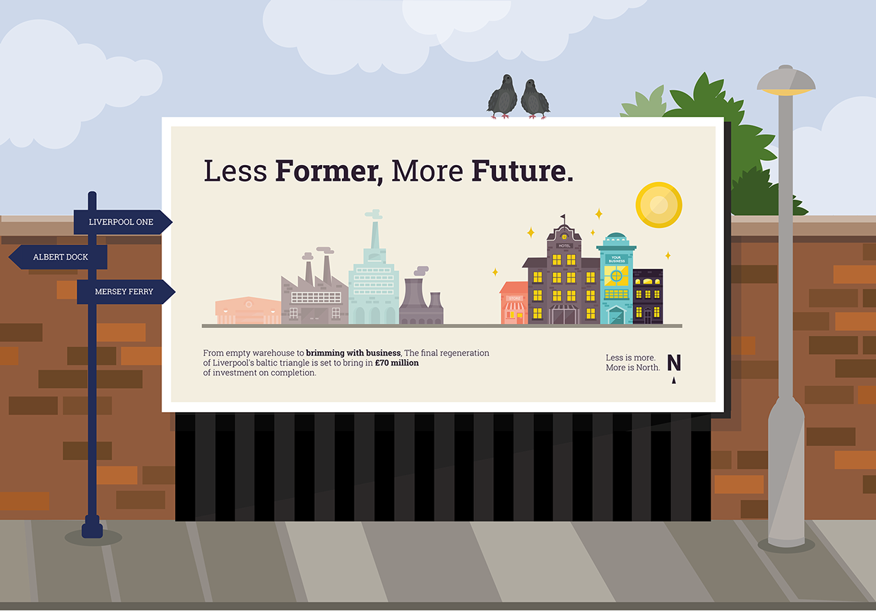
In the end I was quite happy with the outcomes and know that I have given as much as I could towards the project. I feel that the work produced ticked the boxes of what DBA were looking for. I think the results were engaging and thoughtful, and really tried to bring something new and refreshing to the table. I really liked our campaign idea of 'less is more, less is North' and felt that this really helped to set us apart from the other projects, communicating what the North is less of, but in a positive way. I also think that our range of outcomes was really appropriate for the brief and the design team I was working within. Together we created 5 posters (4 were required) which we then also animated to display in cities that had opportunities for moving posters - I think this really helped to distinguish us as a team and also allowed myself and a couple of other members of the group the opportunity to developed our Adobe After effects skills. I was also really pleased with the mock ups that I created for each of the printed posters and felt that these really helped to relate the posters which we had created back to the cities in Capital North. A panelist from DBA commented that at first they thought the illustrated mock ups were part of the poster and that, that was somewhat charming. I also think looking back at the designs that I created for the mock ups that they would have worked well as part of the posters, and if I could redo the project I would probably include the backgrounds as part of the poster designs.
What could we improve on?
I think as a group we could have definitely worked on timing a lot better as this was off towards the start with everyone having different things to tend to. I also think that although our 'campaign' was very strong and successful, backing this with a more concrete brand would have taken the outcomes even further. Whereas I feel other groups had more of a branding focus, our work was more so centred around marketing. I think that with more research we could have established a strong brand to go alongside our campaign, but I also understand it was very difficult working on a project with such a vague subject, to brand the whole North of England together when all the locations are extremely different. I also think we could have improved a bit more on planning, as previously mentioned I felt like a carried a lot of the project at the start, whereas looking back on hindsight, I could have probably dedicated myself to other projects and we could have tackled Capital North from the beginning as a group. But overall although we did a lot of research into what makes the North a great place, I feel that more research into the North as a whole would have provided us with a base for a 'North' brand which would have boosted our campaign.
What did I learn?
Personally and practise I learnt that in order to try and lead a group in projects I need to change my approach and attitude. I have learnt that as of right now, I do not like to take on leadership roles and much prefer working as an equal within the team. However I was also able to pick up some really great skills throughout the project, one of them being talking to industry professionals. This was something I really enjoyed throughout the project, and helped to make the brief seem that little bit more real. We worked with Ian from Arris, and he provided us with some great help and advice, and allowed me to realised that Industry designers are people just like me. I was also able to better my technical skills involving Adobe after effects where I produced my own animation. Animation is something I would like to work with, within my design career and so having the opportunity to work on bettering these skills is always useful. Again I learnt about how to work on and apply critique especially within this project working with a large group of designers and the DBA panel.
No comments:
Post a Comment