DBA CAPITAL NORTH.
GROUP MEET UP AND DEVELOPMENT.
Today we had a short group meeting where we reviewed progress so far. We were happy with the illustration style I had done as It is easy for everyone to replicate and fits the brief well. However as a team we were a bit skeptical about the colours and felt that they were still too bright for the brief. Danielle indicated that we should look at Adobe cc colour schemes. From here Danielle approached us with a colour scheme that she felt would help lift the brand from looking too childish and young, to something much more professional. Collectively as a group we agreed.
The new colour scheme features three neutral colours and one bright pop of colour.

I liked the new colour scheme and thought it was much more appropriate for the North. However I also felt that it needed a slight bit more colour. So I looked to add another bright pop of colour.

I added a blue as not only was it a bright colour, I thought it would also help to contrast the orange colour, bringing more dimension to the colour scheme. Danielle suggested off white as a background colour which I thought also worked well and was complementary.
Tonight I will re colour my animation to see how it works using the new colour scheme.
we have set the deadline to have this done by the following wednesday.
However on Monday we will be meeting up to discuss ideas for the other elements including train livery and environmental design which we are all to create ideas for.
Campaign development:
We edited the communication of the campaign 'Less is more, Less is North' ever so slightly. After working and preogressing with the campaign idea, we still feared that many would take the idea literally and it would backfire. Sarah came up with an idea of how to keep the same theme, but shine it in a more positive light. She tweaked the strapline slightly taking out less, and putting in more, from:
'Less is more, Less is North' to 'Less is more, More is North'. I think in reflection that this works much better and is much more appropriate as the phrase still has the same underlying meaning 'less is more', the North has less of (space, commuting, former/past) and therefore is is more. However it is now communicated more literally. Instead of saying Less is more, and therefore the North is less, we now say the North has less of these things and therefore it is more.
'Less is more, Less is North' to 'Less is more, More is North'. I think in reflection that this works much better and is much more appropriate as the phrase still has the same underlying meaning 'less is more', the North has less of (space, commuting, former/past) and therefore is is more. However it is now communicated more literally. Instead of saying Less is more, and therefore the North is less, we now say the North has less of these things and therefore it is more.
Motion poster Development:
Me and Danielle worked with each other correcting the colour scheme, and also readjusting the structure of the moving posters.
We worked closely together in the Mac suite insuring that we created a program of timing and entrances and exits for illustrations that would be consistent across all the motion posters. We started by working on the animation that I had currently made.
The new structure:
Logo is in bottom right of screen full time
First enters 'Less former' followed by illustration.
Fact enters.
Illustration slides to left and enters new illustration.
Illustration slides to left and enters new illustration.
'More future' then appears in tom left to describe illustration.
Illustration then animates. (Lights turn on and sun rises)
Shot is still for a couple of seconds allowing people to finish reading the facts.
Shot is still for a couple of seconds allowing people to finish reading the facts.
finishing logo animation appears on screen.
'Less is more, more is North'
'Less is more, more is North'
Shortened and lengthen logo.
Not only did the reworked order give the video more structure it also provided a consistent framework and allowed for improved readability. Creating a better flow and more fluidity, the eye could now easily follow and expect what was to come next. The constant logo allows viewers to frequently refer back to the brand, and the prolonging appearance of the quote from start to finish, now allows for a larger amount of reading time so that the viewers don't miss any of the information.
Danielle also found a selection of music that we could pair with the videos for presentation purposes. A selection of positive instrumentals from youtube. We wanted to find something royalty free that we could use free of charge when no money was being made from the project. We listened to the selection of songs as a group and picked our final three. We wanted something that would be proffessional, but fun, friendly and positive, and obciously that complimented the video style.
We all agreed on one song and added this to the compositions.
Old video:
New Structure and video:
With the motion video completed I progressed onto making the static version of my poster.
When working with still, I had to consider how I would combine both visuals from the poster, Less formal and More future in one place, where in the video they were separated into two different shots.
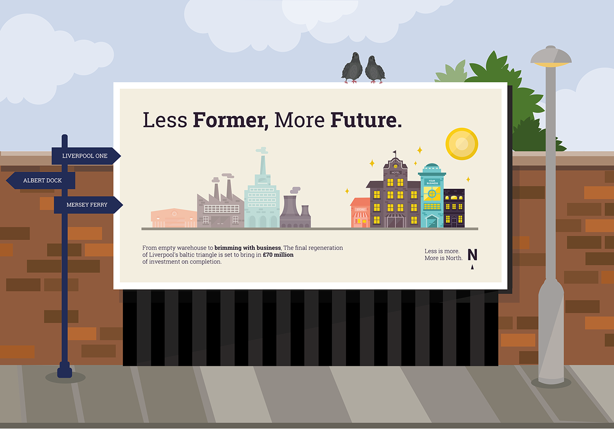
I came up with the idea to create a long 48 sheet billboard that would allow me to have both landscapes on, next to each other. On the left would be the illustrations of mills and factories, and on the right the new developments of hotels, shops and residential areas. However the opacity of the mills would be lowered so that the new developments are a lot brighter and make much more of an impact.
In terms of text positioning and layout, I knew that any text would have to be very horizontally emphasised due to the format of a 48 sheet billboard. Therefore the header text like my animation would have to be horizontally justified on one line.
Underneath the title and the illustration I need to add the factual information regarding the slogan and the campaign message and logo. I will justify one piece of information to the left and one to the right for better balance.
Final static poster design:

My groups posters:
After creating my motion and still poster my last job within the group was to create a set of backdrops for the posters each person has created. We have chosen as a group to illustrate these as we cannot find billboard mock ups to adhere to all the sizes of our posters / billboards, especially danielle's whose is a rare format.
Instead I digitally illustrated each of the backdrops for the poster so this wasn't an issue.
I tried to keep within the same illustrative style I had created for the rest of the campaign. I also thought it would be good presentation wise to try and display the posters in the cities which are listed in the brief.
Therefore I took the time to create mock up designs using landmarks and signposts that refer to the four cities targeted on the brief:
Sarah Heal's Bus stop format poster, in which I created a back drop inspired by manchester and the big wheel:

Mel Hardcastle's Bus stop format poster in which is based in Hull with a backdrop of the Humber bridge and sign posts to other Hull attractions.

My Poster (48 sheet format) which I placed in Liverpool, inspired by the red brick and signposting attractions such as Liverpool One and Albert Dock.
Daisy's Poster which I placed into Leeds Train station, with the train livery produced by Mel in the background.

Danielle Harrison's poster which is vertically focused for placement on tall buildings features a city scape backdrop.

No comments:
Post a Comment