OUGD603
DESIGN PUBLICATION
SUSTAINABLE PACKAGING
COST - 55% of people prepared to pay more for eco friendly packaging.
'Such is the value put on sustainable packaging by consumers that a recent survey by IPSOS found that 55% of people would pay more for eco-packaging. Just as interesting is the fact that those in South Africa, Malaysia and India were most likely to say this, as people in developing economies start to put greater emphasis on sustainable living.'
AESTHETIC - No longer about 'looking' sustainable
Sustainable design cues are also moving away from cliché uses of brown paper and card, with a refocusing on packaging being more intelligent, self-regulatory and adaptive to the market. Neo-Eco packaging has become about the addition of technology, not just the reduction of materials.
Tuesday, 28 April 2015
OUGD603 / Extended Practice - PART 2 Design Publication Sustainable packaging.
OUGD603
DESIGN PUBLICATION
SUSTAINABLE PACKAGING
BURO - Stripped back / Honesty.
Designed by: SocioDesign
Featured on: lovelypackage.com
'We created a new brand name, identity and packaging system that focused on the utility of Büro, removing the prettification and emotion that is more typically found in the branding of cosmetic and fragrance products. The use of unprocessed materials in the packaging helped to communicate the purity of the ingredients, thereby embodying its essence in our brand concept.'

IMPOSSIBLE - Simplicity.
Designed by: Jessica Alley and Laura Courtright.
Featured on: lovelypackage.com
“The packaging is part of a larger campaign which is based on the word I’mpossilble (read as I’m possible or Impossible) The call to action is to build awareness and fundraising for building sustainable education in Nicaragua, Laos, and Guatemala. The countries are all differentiated by color and have a di-cut of their country on the packaging. When you purchase the pencils the proceeds go to the country of you choice.”

MATSU wine - Friendly and Personable.
Designed by: Jessica Alley and Laura Courtright.
Featured on: lovelypackage.com

Alton Brown - Sustainable production.
Designed by: Hampus Jageland.
Featured on: lovelypackage.com

Rahal Farms - Fun and Lighthearted.
Designed by: Anderson Design group.
Featured on: lovelypackage.com
The goal of our branding was to suggest artful, healthy, earthy farm-fresh goodness while keeping the happy animals at the forefront. With his hens producing 400 eggs a day, we scrambled (no pun intended) to create an egg carton label so he could start selling his delicious farm-fresh eggs. He was looking for something that would really set his eggs apart on the store shelves and elevate his product above all others in the same category. We achieved this by choosing a colored carton with a wrap-around label that featured custom typography and illustration in complementary colors. The final label was printed on French Speckletone Paper in Cream Cordtone.”

Designed by: Gerardot & Co.
Featured on: lovelypackage.com


Heavenly chocolate - My Interpretation.
Designed by: Sarah Goldthorpe
Featured on: None


White Artisan playing cards - Under the radar / the norm.
Designed by: Simon Frouws
Featured on: lovelypackage.com
"The Artisan White Edition playing cards, like the previous Black Edition, were designed by South African artist Simon Frouws and feature elegant gold foil hot stamped onto ultra-lux white paper. They were produced using FSC-certified papers derived from sustainable forests, vegetable-based inks and starch-based laminates. These are also available in a collector’s set with two White Edition Decks and two Black Edition decks in a beautiful laser etched wooden box.”

John Lewis - My Interpretation.
Designed by: Sarah Goldthorpe and Caitlin Walsh.
Featured on: none.


Method - Tactile.
Designed by: Method.
Featured on: dieline.com

DESIGN PUBLICATION
SUSTAINABLE PACKAGING
BURO - Stripped back / Honesty.
Designed by: SocioDesign
Featured on: lovelypackage.com
'We created a new brand name, identity and packaging system that focused on the utility of Büro, removing the prettification and emotion that is more typically found in the branding of cosmetic and fragrance products. The use of unprocessed materials in the packaging helped to communicate the purity of the ingredients, thereby embodying its essence in our brand concept.'
Designed by: Jessica Alley and Laura Courtright.
Featured on: lovelypackage.com
“The packaging is part of a larger campaign which is based on the word I’mpossilble (read as I’m possible or Impossible) The call to action is to build awareness and fundraising for building sustainable education in Nicaragua, Laos, and Guatemala. The countries are all differentiated by color and have a di-cut of their country on the packaging. When you purchase the pencils the proceeds go to the country of you choice.”
Designed by: Jessica Alley and Laura Courtright.
Featured on: lovelypackage.com
The solution adopted is faithful to Matsu’s philosophy, his image has been stripped from all sorts of tricks to link directly with nature and with the people who cares about it. Thus, the Matsu’s wine triology, ‘El Pícaro’, ‘El Recio’ and ‘El Viejo’ are represented by a portraits series of three generations that devote their lives to the field. Each one personality’s embodies the characteristics of the wine that gets its name.
Designed by: Hampus Jageland.
Featured on: lovelypackage.com
“Alton Brown is a spice range for blind and visually impaired people. The range also includes olive oil and balsamic vinegar. Together with these liquids a special spoon is provided which makes it easier to pour and measure them, it’s the measure of a tablespoon. The text is placed on the exact same place on all the products and all the braille is embossed. The tubes are made out of PLA to make them sustainable and the refill bags are made out of recycled paper. The logo is communicating the exact same thing for blind as for the non blind since A is one dot and B is two.”
Designed by: Anderson Design group.
Featured on: lovelypackage.com
The goal of our branding was to suggest artful, healthy, earthy farm-fresh goodness while keeping the happy animals at the forefront. With his hens producing 400 eggs a day, we scrambled (no pun intended) to create an egg carton label so he could start selling his delicious farm-fresh eggs. He was looking for something that would really set his eggs apart on the store shelves and elevate his product above all others in the same category. We achieved this by choosing a colored carton with a wrap-around label that featured custom typography and illustration in complementary colors. The final label was printed on French Speckletone Paper in Cream Cordtone.”
Torché Wine - Post packaging / Afterlife
- Fun and Lighthearted.Designed by: Gerardot & Co.
Featured on: lovelypackage.com
Torché is a sustainable wine that cares about the earth. So of course the box and bottle labels were designed to be printed on 100% post-consumer paper. But what really makes this wine unique is what you can do when the bottle is empty. Each bottle of wine includes hardware to create a mountable tiki torch for your back yard. Sustainability can be so cool.
Designed by: Sarah Goldthorpe
Featured on: None
Designed by: Simon Frouws
Featured on: lovelypackage.com
"The Artisan White Edition playing cards, like the previous Black Edition, were designed by South African artist Simon Frouws and feature elegant gold foil hot stamped onto ultra-lux white paper. They were produced using FSC-certified papers derived from sustainable forests, vegetable-based inks and starch-based laminates. These are also available in a collector’s set with two White Edition Decks and two Black Edition decks in a beautiful laser etched wooden box.”
Designed by: Sarah Goldthorpe and Caitlin Walsh.
Featured on: none.
Designed by: Method.
Featured on: dieline.com
Method ‘Ocean Plastic’ range that uses bottles created from blend of recycled plastic and plastic collected from the oceans. Although this execution is undoubtedly sustainable, it also clearly highlights the millions of tons of plastic that make its way into our oceans. Using tactile cues, like the ridges usually found on sea urchins, also help reinforce the message. Not only does this type of packaging have a positive effect on the brand perception, but also uses structural packaging to tell a story and educate the consumer.

Sunday, 26 April 2015
OUGD603 / Extended Practice - DBA Capital North: Submission boards.
OUGD603
DBA CAPITAL NORTH
SUBMISSION BOARDS
DBA CAPITAL NORTH
SUBMISSION BOARDS
OUGD603 / Extended Practice - DBA Capital North: Final pieces and Evaluation.
OUGD603
DBA CAPITAL NORTH
FINAL PIECES + EVALUATION
As a group according to our set of skills and interests we also decided to work on the train livery and environmental design out of the list of optional choices. Mel and Daisy worked on the Train Livery and interior whilst Sarah came up with some ideas for possible environmental design.
Train Livery:

My opinion on the train livery was very 50/50, I felt that more so with the outside designed by Mel, although it fit in with the brand as far as colours went, it was very basic and lacked any kind of character. The only acknowledgement that the train was a part of Capital North is a logo at the front of the train. Otherwise the design is block purple. I definitely feel with how exciting our campaign and slogan was that the train livery could have been a lot more exciting. As a train is a mobile piece of advertising, people may only see it for up to a minute as it pulls into a station before it pulls back out, therefore the design needs to be exciting and catch attention. I think creating a livery that was more exciting and integrated some of the illustrations and slogan we had would have been much more interesting, and inspirational.


Environmental design:
Sarah Heal worked on the designs for the environmental design in which she created a few different situations where we could apply different brand elements that we already had.
In the airport:


An animated poster:


DBA CAPITAL NORTH
FINAL PIECES + EVALUATION
As a group according to our set of skills and interests we also decided to work on the train livery and environmental design out of the list of optional choices. Mel and Daisy worked on the Train Livery and interior whilst Sarah came up with some ideas for possible environmental design.
Train Livery:
My opinion on the train livery was very 50/50, I felt that more so with the outside designed by Mel, although it fit in with the brand as far as colours went, it was very basic and lacked any kind of character. The only acknowledgement that the train was a part of Capital North is a logo at the front of the train. Otherwise the design is block purple. I definitely feel with how exciting our campaign and slogan was that the train livery could have been a lot more exciting. As a train is a mobile piece of advertising, people may only see it for up to a minute as it pulls into a station before it pulls back out, therefore the design needs to be exciting and catch attention. I think creating a livery that was more exciting and integrated some of the illustrations and slogan we had would have been much more interesting, and inspirational.
Daisy worked on the interiors of the train which I think helped to push the train design further, as she made subtle references to brand points we made. These were existent in elements such as the chair covers in which she created a repetitive pattern using the arrow from the logo. There was also a lot more consideration towards contrasting colours to make the arrangement look more interesting, and towards the form in which a more modern interior set up was created. She also considered how to take the HS2 and HS3 trains further, making the brand more special or 'luxury' by adding and designing facilities such as a built in coffee machine. I think that this, if paired with a more experimental outer shell would have been a great combination.
Environmental design:
Sarah Heal worked on the designs for the environmental design in which she created a few different situations where we could apply different brand elements that we already had.
In the airport:
Firstly Sarah created a little set up in which the logo was implemented to become part of the escalator. I thought that this was a really cool and subtle idea to communicate the brand, however I noticed that the logo had been somewhat flipped. The logo is supposed to appear like a compass point, pointing north at the N. Here it points down at the letter, therefore the characters should have switched places, this must be something that was forgotten in the final stages. She also created a floor sticker seen at the front of the image. Again, alike to the train livery I felt it was much too plain and didn't express anything inspirational or exciting about the North.
On/Inside the lift:
When thinking about objects that travel North, I suggested to Sarah that she should consider applying the brand to a lift, often found in city centres, car parks and train stations, and so easily seen by travellers. She cleverly applied the concept of Daisy's poster to the lift. She used the same floor sticker as seen previously, I think it works more so in this situation as it complements the illustrative details seen on the lift.
On the escalator:
She also designed a subtle but well thought out design in relation to an escalator which also travels 'north' and would be seen in pretty much all travel centres. The design features the shortened logo in which the arrow 'compass points' travel upwards towards the N at the top of the escalators. I think subtle designs such as these really nod towards our brand which sites Less is more, more is North, Sarah has seemingly reflected this in a lot of the designs which I think works well.
In the toilet:
Lastly, she created quite a humous design that again works well. Considering the movement alike to a compass, Sarah placed the logo sections onto a toilet roll dispenser un which the compass point spins to meet the N completing the logo. Again although subtle I think the concept of the design works really well.
Work I inputed:
Creating an initial brand style: I created the brand style that we would use throughout the rest of the brand/ campaign.
Both logo designs:
A 48 sheet billboard:
An animated poster:
Refining mels poster:
Mels poster was supposed to be for a bus stop format, and was to combine the first and second phase of her moving animation into one bus stop poster sized image. Below is the format Mel sent her her poster in:
What I changed the poster to:
5 illustrated mock ups:
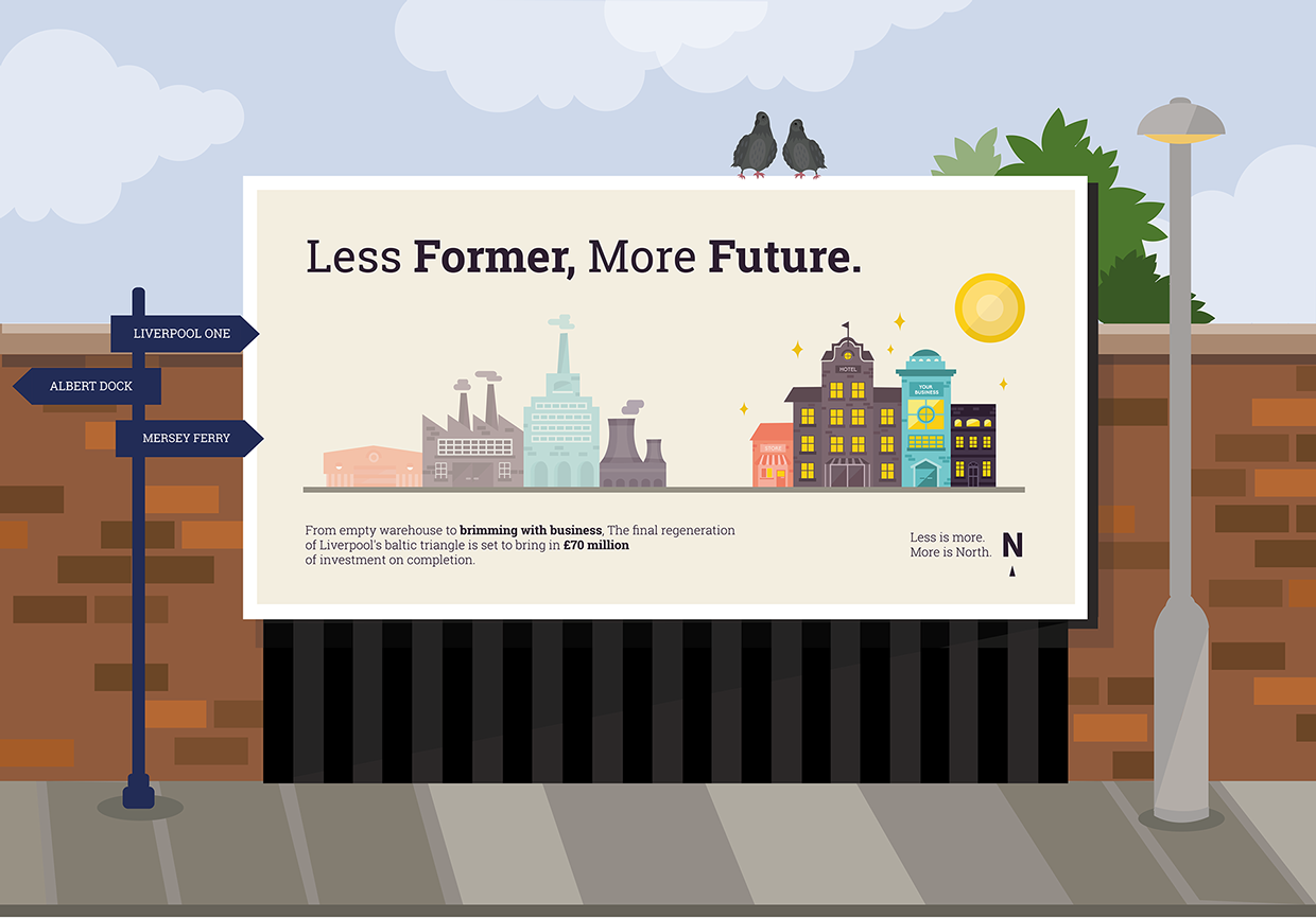
DBA EVALUATION.
Working with the group:
I think the group worked well together, with most of the progress and success coming towards the end of the project. I found it quite frustrating in the beginning as I seemed to be taking on most of the work, creating a set of logos and coming up with the brand/illustration style by myself. I felt that the work we presented to the 5 different studios could have been a lot better if there was a lot more differentiation and input in the beginning from the rest of the group members. However I feel that in terms of hard work, my group were prepared to put the work in where it counts, towards the end of the project where other peoples work schedules freed up. There were members which I thought were more frustrating with others, in which I had to fix work they had sent, not formatting it in the way that had been asked, aswell as minimal work and input being given.
Our outcomes:
In the end I was quite happy with the outcomes and know that I have given as much as I could towards the project. I feel that the work produced ticked the boxes of what DBA were looking for. I think the results were engaging and thoughtful, and really tried to bring something new and refreshing to the table. I really liked our campaign idea of 'less is more, less is North' and felt that this really helped to set us apart from the other projects, communicating what the North is less of, but in a positive way. I also think that our range of outcomes was really appropriate for the brief and the design team I was working within. Together we created 5 posters (4 were required) which we then also animated to display in cities that had opportunities for moving posters - I think this really helped to distinguish us as a team and also allowed myself and a couple of other members of the group the opportunity to developed our Adobe After effects skills. I was also really pleased with the mock ups that I created for each of the printed posters and felt that these really helped to relate the posters which we had created back to the cities in Capital North. A panelist from DBA commented that at first they thought the illustrated mock ups were part of the poster and that, that was somewhat charming. I also think looking back at the designs that I created for the mock ups that they would have worked well as part of the posters, and if I could redo the project I would probably include the backgrounds as part of the poster designs.
What could we improve on?
I think as a group we could have definitely worked on timing a lot better as this was off towards the start with everyone having different things to tend to. I also think that although our 'campaign' was very strong and successful, backing this with a more concrete brand would have taken the outcomes even further. Whereas I feel other groups had more of a branding focus, our work was more so centred around marketing. I think that with more research we could have established a strong brand to go alongside our campaign, but I also understand it was very difficult working on a project with such a vague subject, to brand the whole North of England together when all the locations are extremely different. I also think we could have improved a bit more on planning, as previously mentioned I felt like a carried a lot of the project at the start, whereas looking back on hindsight, I could have probably dedicated myself to other projects and we could have tackled Capital North from the beginning as a group. But overall although we did a lot of research into what makes the North a great place, I feel that more research into the North as a whole would have provided us with a base for a 'North' brand which would have boosted our campaign.
What did I learn?
Personally and practise I learnt that in order to try and lead a group in projects I need to change my approach and attitude. I have learnt that as of right now, I do not like to take on leadership roles and much prefer working as an equal within the team. However I was also able to pick up some really great skills throughout the project, one of them being talking to industry professionals. This was something I really enjoyed throughout the project, and helped to make the brief seem that little bit more real. We worked with Ian from Arris, and he provided us with some great help and advice, and allowed me to realised that Industry designers are people just like me. I was also able to better my technical skills involving Adobe after effects where I produced my own animation. Animation is something I would like to work with, within my design career and so having the opportunity to work on bettering these skills is always useful. Again I learnt about how to work on and apply critique especially within this project working with a large group of designers and the DBA panel.
Saturday, 25 April 2015
OUGD603 / Extended Practice - CRIT: Design Publication w/ Amber + Tony Broomhead.
OUGD603
DESIGN PUBLICATION
CRIT
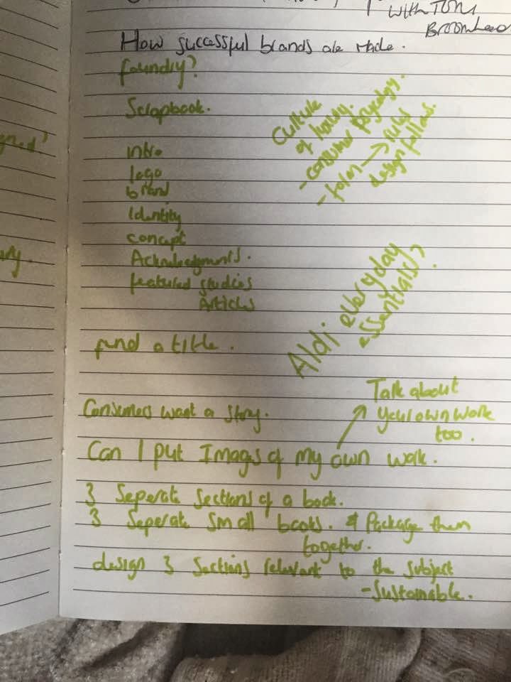
We just had a crit with Amber to help solidify our ideas for the design publication. I have just recently thought of my new idea that involves creating 3 books based upon packaging. (I was originally doing a book on just luxury packaging but i realised the book needs to be a book of research that can be applied to most of your practice.
I made notes about what was discussed in the crit regarding my project.


Find the answers for each type of packaging for my own methodology.
What colours to use.
What tone of voice.
what do the customers want from the brand/ packaging etc.
Mel G in Basic packaging:
'If i'm looking for something for something cheap, I'll look for something thats badly designed'
Does cheap have to be badly designed? is this always the case?
Is it going to look odd having 3 books that belong to the same collection but are produced with all different materials/ finishes etc? How can I keep consistency?
Things suggested:
- Layout
- Same typeface
- Same scale imagery
- Same size
- Same shape
- Will be successful if own work is included in the books to show how I have applied what I am learning to my own practice.
Number the components in the books eg.
01 colour
02 tone of voice
Have the same amount of sections in each book for consistency.
- Makes sense to package the books together as they are about packaging.
How can 3 books that are so different to each other be packaged together?
Im definately going to take the advice that I've gained from the crits, the main thing I was concerned about was how to keep the books consistent throughout the sets, especially if they have different binds. I will experiment with the components suggested in order to create consistency across the books.
I also want to question a few things discussed in the crit such as Mels opinion on low cost design, and try t o understand whether this is true.
DESIGN PUBLICATION
CRIT
We just had a crit with Amber to help solidify our ideas for the design publication. I have just recently thought of my new idea that involves creating 3 books based upon packaging. (I was originally doing a book on just luxury packaging but i realised the book needs to be a book of research that can be applied to most of your practice.
I made notes about what was discussed in the crit regarding my project.

Find the answers for each type of packaging for my own methodology.
What colours to use.
What tone of voice.
what do the customers want from the brand/ packaging etc.
Mel G in Basic packaging:
'If i'm looking for something for something cheap, I'll look for something thats badly designed'
Does cheap have to be badly designed? is this always the case?
Is it going to look odd having 3 books that belong to the same collection but are produced with all different materials/ finishes etc? How can I keep consistency?
Things suggested:
- Layout
- Same typeface
- Same scale imagery
- Same size
- Same shape
- Will be successful if own work is included in the books to show how I have applied what I am learning to my own practice.
Number the components in the books eg.
01 colour
02 tone of voice
Have the same amount of sections in each book for consistency.
- Makes sense to package the books together as they are about packaging.
How can 3 books that are so different to each other be packaged together?
Im definately going to take the advice that I've gained from the crits, the main thing I was concerned about was how to keep the books consistent throughout the sets, especially if they have different binds. I will experiment with the components suggested in order to create consistency across the books.
I also want to question a few things discussed in the crit such as Mels opinion on low cost design, and try t o understand whether this is true.
Wednesday, 22 April 2015
OUGD603 / Extended Practice - PART 2 Design Publication: Information sourced from my dissertation.
OUGD603.
DESIGN PUBLICATION.
DISSERTATION RESEARCH.
As previously mentioned for my dissertation I researched thoroughly into the attractiveness of green/ sustainable brands and packaging, focusing mainly on its aesthetics and consumer behaviour psychology towards green products and services. It is imperative as noted in my methodology that I fully understand my audience, and look at form/ aesthetic in depth, for this my dissertation will be a great source of information.
Context:
'development that meets the needs of the present without compromising the ability of future generations to meet their own needs' (Danone, 2014).
everyday consumption has such a critical effect on the planet.
'If they acknowledge it, recognise it, then the moral imperative, to make changes is inescapable.' (An inconvenient truth, 2006)
Some of society’s ignorance can be credited to the economic structure that society habituates notably in the western part of the world. It has occurred that the economic success has allowed western civilisation to act almost as if they live within a protective bubble. 'This was 'something new for America, but how in God's name could it happen here?' (An Inconvenient truth, 2006)
Audience:
People are interested in sustainable products - people need green packaging to be truthful as it is complex and confusing. Sustainable packaging needs to take an aesthetic nod from non ethical products as this is what consumers are used to and like.
He states that sustainable design is often unattractive because by many, beauty isn't considered essential to sustainability however he details that beauty is a necessity to sustainable products and their survival. 'Virtuous products don't have to equate with indifferent design.' (Behar in Hosey, n.d: 5) 'We don't love something because it is non -toxic and biodegradable - we love it because it moves the head and the heart.' (Hosey, n.d: 7)
Great design makes the heart beat faster, solves tricky problems creatively... makes things cool, can make lives better and more businesses richer.' (Sherwin, 2012)
DESIGN PUBLICATION.
DISSERTATION RESEARCH.
As previously mentioned for my dissertation I researched thoroughly into the attractiveness of green/ sustainable brands and packaging, focusing mainly on its aesthetics and consumer behaviour psychology towards green products and services. It is imperative as noted in my methodology that I fully understand my audience, and look at form/ aesthetic in depth, for this my dissertation will be a great source of information.
Context:
'development that meets the needs of the present without compromising the ability of future generations to meet their own needs' (Danone, 2014).
everyday consumption has such a critical effect on the planet.
'If they acknowledge it, recognise it, then the moral imperative, to make changes is inescapable.' (An inconvenient truth, 2006)
Some of society’s ignorance can be credited to the economic structure that society habituates notably in the western part of the world. It has occurred that the economic success has allowed western civilisation to act almost as if they live within a protective bubble. 'This was 'something new for America, but how in God's name could it happen here?' (An Inconvenient truth, 2006)
Audience:
People are interested in sustainable products - people need green packaging to be truthful as it is complex and confusing. Sustainable packaging needs to take an aesthetic nod from non ethical products as this is what consumers are used to and like.
'Thus,
there is an increasing body of evidence to suggest that shoppers take their
morals, in addition to their wallets, when they visit the high street.'
(Thogersen, 1999 in Freestone and McGoldrick, 2007: 446)
'We
know from asking people from China to the U.S that the vast majority of people
care about sustainability, after the day to day issues. The day-to-day issues
of how to I get my kids to school? Can I pay the bills at the end of the month?
Then they care about the big issues like climate change.' (Howard, 2014)
People are concerned that what is stated on the packaging is not 100% true.
'Green washing is the intersection of two firm
behaviours: poor environmental performance and positive communication about
environmental performance.' (Cuerel Burbano and Delmas, 2011: 4)
'If unscrupulous marketers continue to claim to
be environmentally friendly, companies true to their environmental mission lose
their competitiveness. In addition, overuse and misuse of the 'green' claims
can saturate the market to the point that the greenness of the product may
become meaningless to the consumer.' (Zimmer et. al, 1994 in Furlow, 2014)
'To cast everyday consumption as unequivocally unethical threatens to alienate ordinary people rather than recruit them... The basis for an ethical consumption is to be found in the morality of ordinary consumption.' (Harrison, Newholm and Shaw, 2005: 21)
Tone of voice:
A positive tone of voice is needed to communicate said information - people fight or flight in response to issues. Sustainability needs to be communicated to offer self empowerment and positivity not in a negative light as it is currently.
A positive tone of voice is needed to communicate said information - people fight or flight in response to issues. Sustainability needs to be communicated to offer self empowerment and positivity not in a negative light as it is currently.
'Everywhere
we look we are besieged by depressing facts and dire consequences. News of
destructive tornadoes, hurricanes and heat waves emerges almost daily.
Frightening footage of melting ice caps and drowning polar bears circulate
online... Consumer behaviour is only slowly changing.' (Clendaniel, 2013)
'Humans
are programmed to avoid what is uncomfortable, so why put
sustainability-related messaging in the downer category?' (Clendaniel, 2013)
'Changing peoples consumption practice's is
probably not best pursued by simply appealing to peoples sense of self
sacrifice or altruism, or by supposing that it requires wholesale abandonment
of self-interested concerns.' (Harrison, Newholm and Shaw, 2005: 15)
'You were reminded, sustainability was about
compromise.' (Howard, 2014)
'Brands that have inspired the most positive behaviour
change resist the urge to over-communicate. They boil complex issues down to
simple platforms that people can easily relate to. For example, Nike
"builds a better world."' (Clendaniel, 2013)
'More brands should do what Obama did in 2012.
He didn’t hinge his message on guilt or fear. He said: "you are the
change." He made millions of frustrated people feel personally empowered,
and won them over.' (Clendaniel, 2013)
Form:
Avoid typical green - grainy card and green colours, things don't have to look sustainable they just have to be sustainable. Sustainable packaging design should be in terms of aesthetics - business as usual, it should be in production where the thoughts differentiate.
Avoid typical green - grainy card and green colours, things don't have to look sustainable they just have to be sustainable. Sustainable packaging design should be in terms of aesthetics - business as usual, it should be in production where the thoughts differentiate.
'In the 21st century there is now an ability to
produce sustainable products with the same charming qualities that live inside
of 'unethical' commodities, such as replacing the old energy efficient light
bulbs with the much more attractive LED. (Howard, 2014) It is this that should
be celebrated in order to recruit consumers into the routine of green shopping.'
'Today we have choices. We can make products
that are beautiful or ugly, sustainable or unsustainable, affordable or
expensive, functional or useless. So lets make beautiful, functional,
affordable, sustainable products.' (Howard, 2014)
He states that sustainable design is often unattractive because by many, beauty isn't considered essential to sustainability however he details that beauty is a necessity to sustainable products and their survival. 'Virtuous products don't have to equate with indifferent design.' (Behar in Hosey, n.d: 5) 'We don't love something because it is non -toxic and biodegradable - we love it because it moves the head and the heart.' (Hosey, n.d: 7)
Great design makes the heart beat faster, solves tricky problems creatively... makes things cool, can make lives better and more businesses richer.' (Sherwin, 2012)
Sherwin
affirms that the process of producing/ branding/ marketing a sustainable
product should not differ in levels of positivity, fun, and attraction that exist
within the representation of non-ethical products. Inviting design is the
ultimate route to successful green marketing, thence 'When it comes to
aesthetics, sustainable design is business as usual.' (Hosey, n.d.: 5)
Subscribe to:
Posts (Atom)