YCN INTERFLORA.
DESIGN DEVELOPMENT.
After deciding that paper quilling is going to be the best method to use in attracting the customer and relating to the brand I began to think about how I would format the information, beginning with the three poster/ billboard/advertising designs.
I have 3 pieces of written information that need to go onto the poster including the campaign title 'Thankyou for' the personal thank you message and the piece of information that highlights the brand usps and values.
Other important information that should go on the poster is 'Grandparents day' the date, and the Interflora twitter and instagram tag. which people can search to take them to the online Interflora campaign.
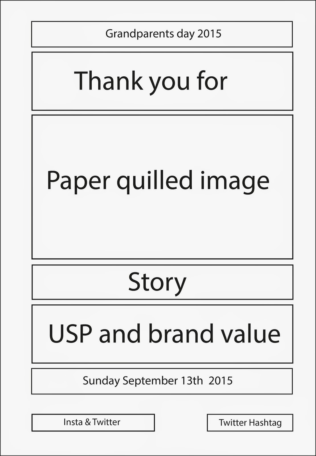
Centre at the top reads Granparents day, followed underneath with the name of the campaign 'Thank you for' underneath sits the visual, an image related to the 'story' created by paper quilling. Underneath follows the story that explains the visual image. This is then supported by the 'USP' and 'Brand values' paragraph, and then the date of Grandparents day. The last pieces of information on the poster are Interfloras handles for twitter and instagram as well as the campaign hashtags to support these.
I'm not sure looking back that this is the most appropriate layout as I think when having the story and going straight to the USP's there will be too much text to read and this will turn people off and disinterest them.

I therefore changed the layout so that the paper quilled image separates the 'story' from the USP's, breaking down the text and making it more visually appealing.
I again reflected on the order of the information and felt that it might be a bit disjointed to have the Grandparents day section and the date so far away from one another.

I moved grandparents day and the date to be together at the top, but I almost felt that it looked too top heavy and the main section of the advertisement, starting with 'Thank you for' would begin too far down the page. However I felt that the order is the most appropriate, attractive and easiest to read. In order to solve this issue I thought about changing the justification of the text of the top two pieces of information to lower it in the heirarchy. Firstly I tried it left justified but I found when skimming my eyes of the information it didn't feel very fluid to read.

Inside I switched the text to be right justified, i found this was must easier on the eye. I also felt that as assumed changing the justification of text allowed the information to be lower in the hierarchy and be less demanding.
This is the final layout of information I will use:

There are a few design elements that have already been decided by Interflora in terms of colour scheme and typeface choices.
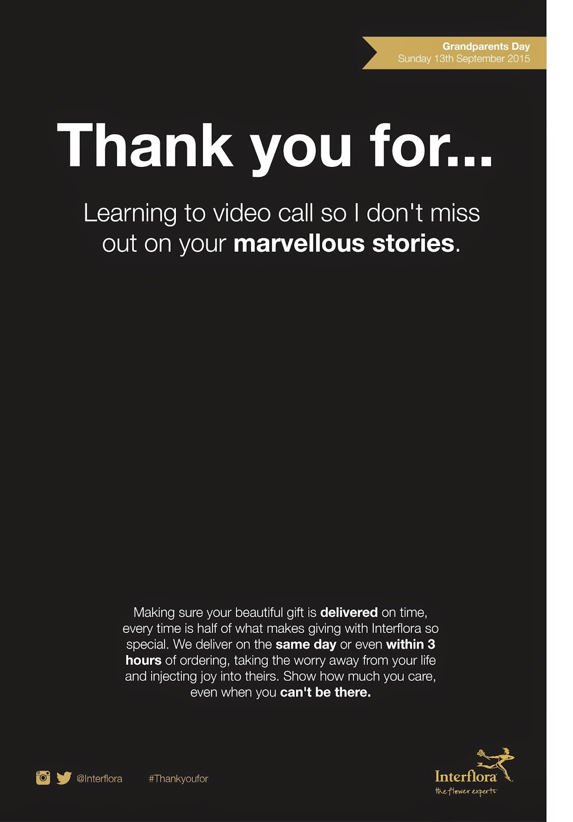
In the brief it is asked by Interflora that the gold logo on the black background is used. Therefore black is what I will opt to use for the background colour of all posters and other collateral.


Also prescribed by the brand is the use of the style guide typeface.


I will therefore use the typeface provided in white or the gold colour administered in the brand guidelines. The size of the type will vary for the media, but I will have to consider and bare in the mind the logo size, and not going beyond the minimum size provided.
I plan to use the colour scheme of Black, gold and white for all of the campaign elements apart from the paper quilled illustration in which I would like to use an array of bright colours, not only to stand out but to represent all the amazing colours of the flowers.
I am creating 3 bus shelter posters, 3 magazine advertisements, three videos and and a social media campaign image.
As I have the layout, written content, typeface and colour scheme I can now create formats for the printed ephemera; the 3 bus shelter advertisements and 3 magazine Advertisements.
Bus shelter ad size:
72" x 48"
Magazine advertisement size:
A4.
Formatting decisions:
From the colour scheme I have used white to highlight the main elements of the campaign / advertisements as their is a higher contrast with this colour against the black background. The supporting elements such as the logo, date, instagram and twitter handles are represented in the gold colour so that they don't stand out as much and compliment the main information.
I have used Helvetica Neue light for most of the text as Interflora have spoken about in the branding guidelines about how Light 45 should be used for most of the text, and bold 75 should be used sparingly for important pieces of information. Therefore within the top piece of writing, labelled the 'story' I have highlighted the most important words. These either refer to the illustration that will be paper quilled or a feeling created in the story.
In the larger piece of information towards the bottom which holds the information about Interflora and communicates brand value and USP's I have highlighted using bold 75 the most crucial piece of information to the Interflora business and its customers.
Castle poster:
- Trust us.
- Thoughtfully.
- Moments to remember.
Costume poster:
- Delivered.
- Same day.
- Within 3 hours.
- Can't be there.


Choosing header type:
As previously mentioned I want to separate the header of the posters/advertisements not only for reasons of hierarchy, but because this is also the name of the campaign, and is the visual aspect that links it to the advertising via social media.
Firstly I began trying to contrast the header from all other written elements by largely increasing the size and also using the bold type option prescribed by Interflora. I felt that this combination works really well, and aesthetically looks very pleasing, elegant and therefore very much in tune with the current Interflora branding. However I am having to remember that I am pitching these advertisements to a younger audience and so, it may appear too corporate to attract them. Therefore I want to try something that will create an even bigger contrast to surrounding written elements and therefore be more eye catching.
Next I tried out a script based typeface that aims to echo the visual of hand writing. I came across the idea of using a hand written typeface when thinking about personal gifts and thank you cards. I felt that a hand written script added a personal element to the advertisement, makes it more human, and creates a large contrast between the written elements whilst still appearing elegant and complimenting the already existing brand.

Having found the previous typeface very successful, I tried out another hand rendered typeface, that this time is much heavier and appears more painted rather than written. I almost feel when looking at the advertisement as a whole that the type is too heavy and also slightly too childish. I am undecided about this decision and so might ask for advice from other students in the student led crits in a couple of days.

I also tried using a slab serif font as I thought this could create an interesting contrast with the clean and minimalist lines of Helvetica Neue. However I feel that instead of complimenting each other the typefaces fight against one another making it hard for the eye to take in all the text. Interflora also emphasised the use of sans serif typefaces within the brand guidelines.

With the hand written/ script orientated font being the most successful so far, I looked to find some others that I could compare it to. I thought that the type below worked very well, but upon analysis, also seemed very feminine. I felt that the typeface would work well in a mother days campaign which only concerns females, However grandparents day encompasses both genders, and so It is important to find something that is not overtly feminine or masculine.

Therefore, Lastly I went in search for another script font, however one that emphasised the aesthetic of handwriting. I found the font below, which I think works well, it stands out from the surrounding written elements and gives a personal touch. However, I feel that the typeface also gives of an unauthentic hand written vibe, as if created on a computer. The brand is in need of something organic and genuine, where as the first hand written typeface was much more honest and genuine.
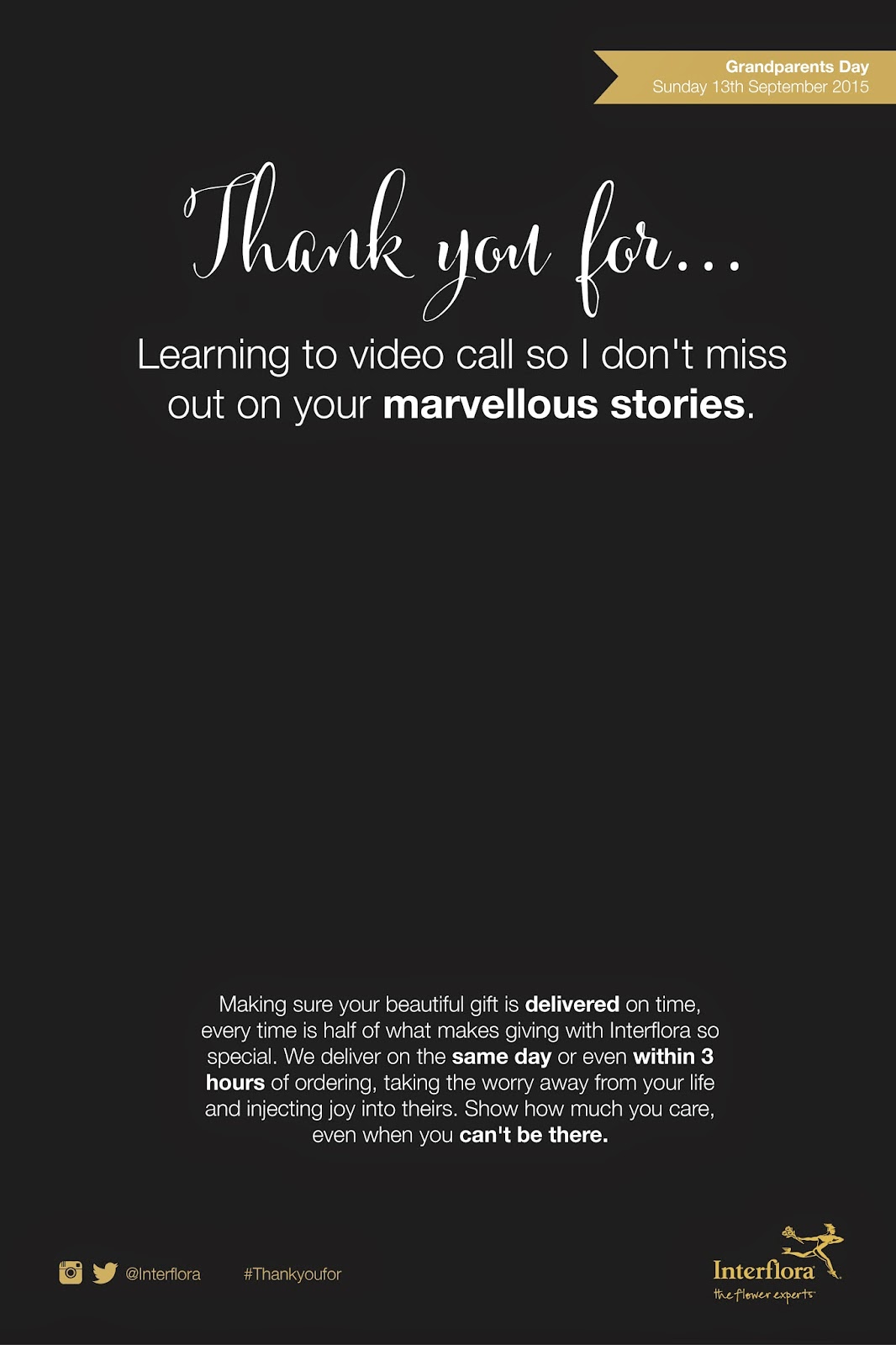
When looking back at the type options I feel that the most appropriate for the campaign is the hand written font. It works well to distinguish itself from the other written elements surrounding it, it is inline with the current branding that likes to be elegant and professional, but on a conversational level, and it gives that personal touch described in the brand values. It also echoes the idea of writing the message ones self, as you would in a car 'thank you for... (this)'. I have added this typeface to all current poster/advertisements ready for feedback at the student crits.


No comments:
Post a Comment