YCN INTERFLORA.
ILLUSTRATIONS.
With the written elements In place I need to brain storm the most appropriate paper quilling illustrations for each poster. These need to be eye catching but simple. I have never tried paper quilling before, However I think that the simpler the image, the better it will look as their is so much detail in the execution.
Costume:

Castle:

As the theme of this story has such a strong image there is only one visual that would be the most literal and make the most sense. Therefore I will try to build a minimalist and realistic image of a castle that I can use in the final stage as a guide for paper quilling.
Video call:


With the written elements In place I need to brain storm the most appropriate paper quilling illustrations for each poster. These need to be eye catching but simple. I have never tried paper quilling before, However I think that the simpler the image, the better it will look as their is so much detail in the execution.
Costume:
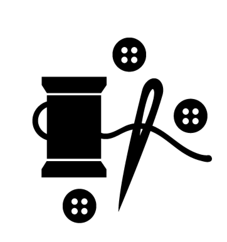
From the visuals I brainstormed for 'costume' the most appropriate for the production process, and the most realistic options seem to be the most minimal. Ideas that I want to try and play with as visuals are sewing needles, cotton bobbins, buttons and scissors. I prefer these elements over others that refer to the finished product such as the costume itself, a mask, top or pants etc, because these images don't point to something being home made and could in fact be seen as something bought in a shop. I feel therefore items such as sewing equipment, scissors and buttons etc refer to something being made by hand, truly reflecting the advertisements concept and pushing this further.
Castle:
As the theme of this story has such a strong image there is only one visual that would be the most literal and make the most sense. Therefore I will try to build a minimalist and realistic image of a castle that I can use in the final stage as a guide for paper quilling.
Video call:
Lastly I need to play with ideas for video calling. I want to experiment with literal translations of the phrase 'video call' and also look at how to use symbols associated with both videoing and calling to create a minimalist framework that will be realistic to quill.
Costume:
Out of the three different ideas I came up with for the costume advertisement I felt that the first in particular was the most fitting as with the combination of a cotton bobbin, needle and buttons, the visual concept of using the thread and the needle to sow the buttons. The illustration also has good balance between all the elements whereas the others seem slightly off in shape. Therefore I will use the top illustration as a basis for the paper quilling.
Castle:
As previously mentioned there was only one illustrative concept that I felt was logical and creatively obvious and appropriate to work with and this is the image of a castle. My main intention in this exercise was more so something that I felt would be easy to and realistic to quill with paper. I aimed to create simple shapes that would be easy to fill, yet something that wouldn't lack ornament and be too minimalist.
Video call:
Next I experimented with different ideas to visually represent 'videocalling', I thought of both symbolic visuals and literal visuals. The literal visual I interpreted is represented in the last illustration, however I felt that such a literal image is not representative of the company and instead the illustration needs to be based upon something more relatable, realistic and relative to the life of my young adult audience. I feel that the most relatable and appropriate ideas for my audience are shown in the first and third image in which a visual representation is made of face timing on a computer and on a mobile/tablet device. More so it can be assumed that the first image is most appropriate and relatable as a lot of busy people including young adults will also video call on the go, rather than in static situations when sat at a computer.
With illustrations set in stone, I next wanted to figure out the constants across the illustrations such as, which parts would be quilled or 'filled in' and which parts wouldn't.
Video calling:
Costume:
Castle:
No comments:
Post a Comment