D&AD John Lewis.
Design Development.
It is not long until we have a print slot coming up for both the card and stickers and so today we began to make design development progress on these two items.
We have decided to make the cards in an a6 type format, with the idea that the smallest box within the John Lewis delivery section will be of a5 size, meaning an a6 card would fit in neatly.
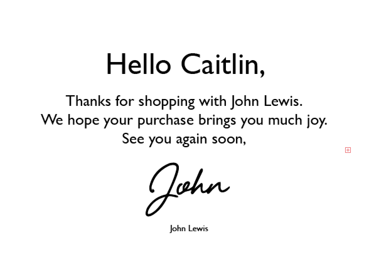
We began working with a design similar to what I had sketched up as a rough plan. We followed the idea that we want the card to be both personal to the shopper and personable in communicating. For this reason we will type the majority of the card in the typeface provided by John Lewis for use, but add a personal touch by signing the card of from 'John', a character created to represent John Lewis as a figure rather than a chain department store, in a hand written font.
We mocked up a short message along the lines of what we were considering to use and started to test out hand written typefaces. We liked the above typeface as we felt it looked very natural, and there wasn't too much emphasis on it being masculine or feminine. However when looking at the composition as a whole we felt that the balance was off and the handwritten type was had too much of an emphasis on the vertical. For this reason we want to try and look for something that is more horizontally focused to balance out the design.
We tried another font, which in terms of balance was more what we were looking for. However with this one we felt that it was too formal, and looked like it would put the brand almost up on a pedestal looking down at its customers. We want the John Lewis brand to appear as it is, friendly and approachable, and therefore we carried on looking.
We both really liked this font choice, and felt it suited the ethos of what we were looking for and the figure of John very well. The typeface, for a script font does appear quite masculine which we felt suited the character well, it isn't overly formal like the last typeface with reduced swashes which eliminates the barrier between John Lewis and shoppers.
Although we were both very happy with the font that we had selected we wanted to test out one last one to make sure that we were entirely happy. We found the typeface above and thought that it was also a very successful match for what we were looking for. We even thought that it was more appropriate than the previous because it looked more natural whereas the previous looked slightly more digitally created. Therefore this is the typeface that we will use to represent 'John'.
We continued to develop the design further and experimented a bit more with personality by removing even further the barrier between customer and store. However in the end we felt that this was crossing a line of professionalism and so removed the x character from the design.
Happy with the text sections, we moved onto experimenting with visuals to bring the card inline with the John Lewis brand. In doing this we played around with the John Lewis logo (geometric diagonal lines) to see how this could be reflected within the design.
Firstly we included the logo as a drop down icon at the top of the card, creating a strong stamp in the centre. We thought that this idea worked well, but we thought that the composition might work better if it was formatted portrait rather than landscape.
We swapped the Orientation of the card around and felt that having the text which was very horizontally focused against a portrait format worked much better. We also experimented further will the implementation of the logo placing it at the bottom of the composition. We really liked this development as we felt the aesthetic mimicked the look of the ribbon on the front of the box.
Caitlin experimented further with the composition and how the logo is incorporated. She considered separating this from the rest of the text so that it stood out more, however we both agreed that this took away from the aesthetic of the logos mimicking the ribbon.
She also experimented with the size of the motif, which again took away from the visual of the ribbon, however I felt that the concept worked really well and helped to bring the design to a more contemporary for front. It appears modern, strong and bold which is something I liked for the quite traditional, friendly english brand. I did however feel that it didn't look great with the opacity turned down and the colour almost looked grey.
Therefore I turned the opacity of the object back up to full. The visual that I really liked in result of this combination was the idea that the John Lewis logos looked like they could slot together in the centre, and that they were separating to reveal the message in between.
However Caitlin was not happy with the visual that she had created above and so instead we went back to the one which we both liked.
In terms of the back of the card which will be used as a place to encourage people to upload pictures of their packaging, or them unpacking the packaging, or if they want - even a video.
We have decided to set a task for the both of us to complete therefore next Caitlin will be working on the back of the card and I will be developing further on the aesthetic of the box.


No comments:
Post a Comment