Tuesday 24 March 2015

OUGD603 / Extended Practice CRIT: Beckett Beccari.

OUGD603
EXTENDED PRACTICE 
BECKETT BECCARI 

We recently had crits organised however I am at a point in time where I am leaving old projects and starting new ones however I had one project that I really wanted to get some feedback on some of the design elements for my florist branding 'Beckett Beccari' before I start any production work. 

One design component I was indecisive about was the logo, I was stuck between whether to use a serif or sans serif font. The florists is based upon a long standing relationship between two families whom combined in business and in last names to create 'Beckett Beccari'. This pushed me more towards the serif typeface as it implies tradition and formality. However I also tried at a sans serif font to bring the brand from tradition into a more contemporary era, creating a clean, polished logo and therefore something very luxurious. 


Although some thought that the serif typeface was better due to its roots in tradition, this was outweighed by people who though the sans serif typeface was going to be more suited towards the contemporary audience. They also implied that the brand, being luxurious needs to be as clean and minimalist as possible, and the sans serif typeface offers this more so than the other. 

Chosen:


Sunday 22 March 2015

OUGD603 / Extended Practice - Bradley Sykes Architect Branding: Production discussion w/ Andy Lodge.

OUGD603.
ARCHITECT BRANDING.

PRODUCTION DISCUSSION W/ ANDY LODGE.

In terms of production I was planning to laser print (for low cost) and emboss the branding onto a textured white paper, to play on Bradley's practice of experimenting with texture. I also felt that white would be the best colour for across the brand as elements such as the photographs on the portfolio part of the CV need to be as clear as possible. 

I got some short but valuable feedback from Andy lodge in terms of materials and stock. Something interesting that he suggested was differentiating the stock across the range of printed collateral, I informed him that I was hesitant to use different colour stocks due to the photographs however he suggested differentiating the stocks across a couple elements such as the business cards and envelopes - keeping the white for elements such as the CV, letters and postal tube labels. I thought this was a really great and inventive way to represent both Bradley's natural and neutral colour pallet and also his practice of combining different materials. 

For the colour pallet I was inspired by Bradley's work itself picking out a pale grey and muted yellow based brown from the selection of images he has provided me with. 

I decided that in order to keep consistency across the brand I going to order 6 different sets of colourplan, so that all the elements can be created using the same type of stock, this will give a much more quality finish. 

I have ordered the stock in three colours:


Natural (an ever so slightly off white)
Pale grey 
Harvest ( a 'crafty' brown)

I have also ordered the paper in two different weights, a thicker weight for elements such as business cards, and lower gsm for collateral such as the CV which needs to be easy and clean to fold, the envelopes, letters and tube labels.  

I have also laser cut my embossing plates using bendy plywood ready to emboss once the pieces have been laser printed. Only a thin material such as bendy plywood was used because it was thicker than the stock. 


OUGD603 / Extended Practice - Bradley Sykes Architect Branding: CV design.

OUGD603.
ARCHITECT BRANDING. 
CV DESIGN. 

There were specific requirements that Bradley wanted covered in his cv which would require the information to be divided into 3 sections. The three parts he wants to cover in his cv are:

- An extensive message about himself and his practice. 
- A section in which he can communicate his many varied skills. 
- A section that constitutes and acts as a mini portfolio. 

In my meeting with Bradley we discussed the function of his CV. At university he had attended a class in which the students were able to see how those of previous years had set out the information required for an architecture cv. He came to me with a format that someone else had used in which the cv began folded up with the logo on the front, unfolded to show the cv, then unfolded again to show the mini portfolio as a full a3 sheet.

Although I thought that the unfolding of the CV was a really great idea in terms of uncovering the information and being able to control the information that is seen first, I knew that looking at the format and proportions it wouldn't not work for Bradley's brand style and logo that we currently have. 


Whilst in the meeting with Bradley I began playing around with pieces of paper that focused on the same kind of folding mechanisms. I made a suggested to Bradley that we should slightly differ the way in which his CV is read. As he wants to have quite a large piece of writing describing himself and his practice I suggested that instead of the 3 sections shown above in his CV idea, that he should have 4 sections a front cover with the logo on, uncovers to show an opening 'message' about himself and a design, unfolding to show is cv and then uncovering lastly his mini portfolio across a full a3 sheet. Changing the format of the CV so that the smallest size is the equivalent of an a6, will both be better proportion wise for his logo and it will also mean that Bradley's cv can be easily mailed out in the envelopes I designed.  


Net for Bradley's CV:


When considering the unfolding of the cv, I realised that the 'front page' in which Bradley's logo would be embossed onto, backs onto the portfolio as it is double sided and would therefore disturb the portfolio in either image or text. 

I thought about other ways such as just printing the the logo on the front, but felt that this wasn't true or representative of the appropriate brand presence I had built, reflected in the embossing. 

Instead I considered the possibility of creating two small slits in the front cover which would leave the portfolio barely disrupted, and would allow the business card to be slotted in. This would allow for Bradley's contact details to also be keepable in a smaller format, incase the CV is discarded for any reason. 

Bradley really seemed to like the functionality of this idea and felt that the new format shape and scale that allowed the cv to be encase in his custom envelopes would be a great addition when applying for jobs via post. 

Lastly we talked more so about the aesthetic and the structure of the cv. Again Bradley mentioned simplicity and clarity. I mentioned the idea that apart from his opening message in which he introduces himself as a designer, that we try and keep the rest of the cv a little bit lighter with words and instead try to communicate the other details more simply and directly. 

I suggested that in order to keep the CV interesting, fluid and to keep the eye moving, we do a combination of simple text and minimalist line/ block illustrations. 

We also lastly in the meeting discussed the sections that would make up the CV and the content for these, I suggested a few sectional ideas that I had had for my own CV design. 


From the content we discussed we came up with 4 sections:

- Logo and contact details.
- Technical skills and work traits. 

- Education and past employment - architecture achievements.
- Interests outside of Architecture.   

With the theme of minimal pieces of text in place and simple block and line illustrations I began to build up the design for Bradley's cv. I was also inspired by the branding elements that I had already completed. 


I sent Bradley the design so far and asked him what he thought of the illustration text combinations. He really liked the ratio of text to image, and felt that the illustrations I was creating would help to set him apart from other architecture students with text heavy cvs applying for the same jobs, yet also adhered to the smooth and effortless brand style. 

I carried on constructing the cv within the same aesthetic. 


Full CV design:


Next I moved onto the opening message which is shown after opening the first fold and is featured on an a5 landscape format. After asking Bradley to send me the content I realised that there was quite a lot of text. With this being said, I wanted to make the opening message quite light hearted and welcoming, and so I went with the design of having the text as if Bradley was introducing himself to his possible employers. 

Again I used a colour combination of mainly charcoal to make the designs appear 'less harsh' and more natural. 


Lastly I worked on the reverse side a3 portfolio that would contain 3 of Bradley's projects as a taster of his full portfolio. In order to in keep with the uncluttered aesthetic of the brand, I took the obvious decision to have the portfolio separated into 3 columns, one for each piece of work. 


The main function of the design, aside from moulding to the already existing brand was to produce a layout that would allow the images and text to be easily readible/ viewable. I created clear columns to fulfil this function, created clear hierarchies between text sections for headings and body copy and played with increasing the leading so that the text appears less cluttered and has more clarity. 

Full CV design front + back:


I also produced a digital version of the CV which Bradley could use to attach to emails when applying for jobs online. The design features all of the same elements but also makes use of a continuos scroll for a more minimal, fluid and easy to read design. 


Online Portfolio:


OUGD603 / Extended Practice - YCN Interflora: Submission boards.

OUGD603. 
YCN INTERFLORA. 
SUBMISSION BOARDS. 


OUGD603 / Extended Practice - YCN Interflora: Online - Social media, Web banner + animation.

OUGD603. 
YCN INTERFLORA. 
ONLINE. 


As a last port of call, I noticed for all campaigns that Interflora do they have a corresponding web banner. Where as a web banner for Interflora's regular audience might help to persuade them into making a purchase, I think that this web banner's role would be for efficiency. As there is little knowledge about grand parents day among young adults stated in the brief pack, it is doubtful that they would be visiting the site out of interest, but more so have been directed to the site from elsewhere such as the posters/advertisements or Instagram.

Therefore again the web banner needs to as a priority reflect the rest of the campaign taking on the same aesthetic and the same message. 

I looked at how the current web banners are used, in particular how text and image are laid out and used in combination. Although I want to keep consistency within the campaign I also want to take into consideration Interfloras brand and how they use the web banner. 


I noticed when looking at the banners that although I wouldn't say Interflora are being commanding, they are instructing the visitor of their site to uptake an action. I want to mirror the function of Interflora's current web banners using my own campaign and aesthetic. 


In relation to the call for action Interflora uses to get browsers involved I came up with the slogan of 'Give in return this Grandparents day' to back the campaign I have created. I want to place this into the same position as the title text on Interflora's current web banners. 

I then added the text 'say thank you with Interflora' that in result directs young adults not only to 'give in return this Grandparents day' but also to say thank you with Interflora. Here I injected the handwritten typeface that is seen across the rest of the campaign for coherency. 

Lastly I wanted to add two gold banners, one informed by Interflora's current web banners in which they have an arrow 'pointing' them towards the special occasion flowers and where to view these. Here I have incorporated the same shape onto my banner using the colours uniform to my campaign and the Interflora brand. 

The last written detail alike to the Interflora Instagram image I created reveals a celebratory ribbon shape banner reminding the audience of the date for grandparents day, increasing efficiency and connivence for an era of young adults in a fast paced society.  


However as web banners are very horizontally focused I knew that I did not have enough content yet for a full design. Although I still want to incorporate the flower vectors I have created onto the banner for consistency, I know that unlike the Instagram image this is not enough. 

I noticed on the Interflora web banners that they often have imagery of the floral arrangements or people based imagery in relation to the special occasion. I thought that to really get the message across linking young adults to grandparents day I should recognise this connection through imagery - partcularly photography. 

Unfortunately I found it hard to find images of what I was looking for, an interaction between a young adult and their grandparents - or if I could the exchanging of flowers. 

Instead I decided to produce my own in scene photography.  


Animation:
Lastly I moved onto creating an animation in which I wanted to combine all 3 posters for a 'movement' campaign, I felt that the animation would be a great place to be shared online via social media to spread the message of the campaign to young adults but also, reiterate the campaign shown on Instagram on another social media platform such as twitter or Facebook. The opening frames introduce the campaign which is followed by animated versions of the posters and ends will the message 'What would you like to say thank you for' just like the Instagram campaign. 


OUGD603 / Extended Practice - YCN Interflora: Social Media.

OUGD603. 
YCN INTERFLORA. 
SOCIAL MEDIA. 


I also felt that Interflora could use one of their less used social platforms to their advantage. Interflora do have an instagram, and this is a platform used very frequently by young adults. 

'53 percent of young adults between the ages 18 and 29 prefer the photo-sharing social network.' Source

'12% of online adults use Instagram, which is dominated by young adults. Some 27% of the Internet users between ages 18-29 use Instagram, which is a photo-sharing service built around a smartphone app that allows users to filter and tint photos they’ve taken and then share them with those they are connected to through the service on a photo feed. Facebook recently bought the service.' Source

'Most notably, 53% of young adults ages 18-29 now use the service, compared with 37% who did so in 2013.' Source


I felt that Interflora could use this as well as possibly their Facebook page to create a simple image based campaign. When thinking about an Instagram campaign I really wanted to reiterate and support the aesthetic already created in the advertisements. I wanted it to be consistent with these, but I also want the image to stand alone, have its own presence and make sense to those who haven't seen the magazine ads or posters.

I also wanted to keep the image much more simpler than the previous designs. Whereas within a city or standing in a bus shelter, people are more prone to stand and read the poster, images on Instagram can be quickly scrolled past and forgotten. 


As Instagram is a platform for sharing photos I decided the theme of the campaign to grab young adults attention should be to share their own experiences, after all this is why everyone, and mostly young adults are on Instagram because they want to visually share their life. Therefore I came up with the idea using the Campaign name 'What would you like to say Thank you for' to involve the followers in the campaign. Using this concept not only works well in conjunction with the slogans on the posters, but it also makes 100% sense by itself. 


To create the image to upload on Instagram I used the same typographic pieces as used on the posters, however when It came to illustrations I stripped these back so that the image not only appears much more simple but the campaign title would also stand out much more on someones feed.  I also added the classic date banner at the top for efficiency measures. 


I also submitted the image along with a make shift campaign where Interflora could give people who choose to involve themselves with the campaign the chance to win a bouquet of flowers for their grandparents. This would act as another incentive for people to get involved, however once they share their photo with the tags provided their friends who see the image on their feed may want to get involved also and interest and knowledge of the campaign would grow. 

'Upload a photo of you and your grandparents with #Thankyoufor and why you want to say thank you for the chance to win them a personalised bouquet created by one of our expert florists.' 


OUGD603 / Extended Practice - YCN Interflora: Advertisements & Magazines.

OUGD603. 
YCN INTERFLORA. 
ADVERTISEMENTS. 


Now that I have the text layout and image work for the advertising section of the campaign I can add these together to create the advertising via magazine and city bilboard/bus shelters. I have chosen these specific locations due to the audience. Although a lot of the audience (18-25 years) will drive, a lot will still probably make use of public transport, whether it will be for social reasons, going to work or even university. Bus shelters and city centre billboards will see a lot of traffic from my intended audience. 

I have also chosen magazines as a platform to print the advertisement as it is another place also highly trafficked by my audience age, whether reading them on commutes to work, on the way to work or just as a hobby. 


Text Layout:


Images:


Flat designs:


Magazine advertisement:


posters:


Saturday 21 March 2015

OUGD603 / Extended Practice - D&AD John Lewis: Box development and experimentation.

OUGD603.
D&AD JOHN LEWIS. 
BOX DEVELOPMENT. 

With the inside card design well underway I wanted to work on the box design further so that It was more consistent with the card. Caitlin had originally wanted to do the box design on the outside of the box in black, as she didn't feel the green colour used across the brand was very appropriate and felt that it would make the box, which would look like a gift, quite charity looking. However I had to remind her that we are not able to change the brand and that we must do the best with what we have, as we are making the packaging according to the John Lewis brand. 


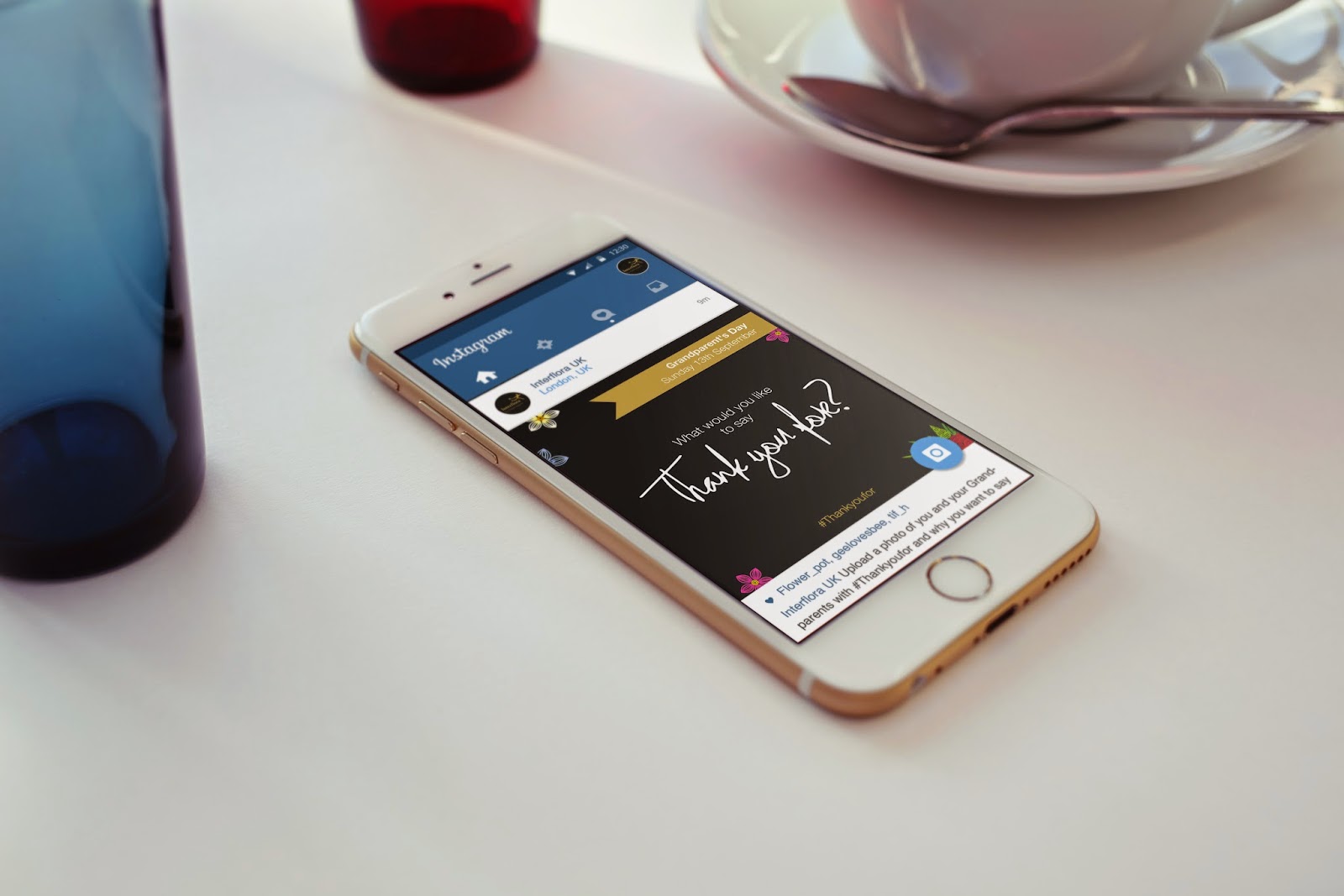
After creating the card design shown below, I looked at how we could incorporate the logo (aswell as the John lewis text logo already on the design) into the box design. 


The above design (top image: side view, bottom image: top view) shows the design that we have so far for the box. However I felt that for a department store who is wanting to make home delivery a special experience, the design was a bit too plain. I wanted to make it stand out, and be more noticeable and so I started thinking about how I could make the box more interesting and gift like. 


Firstly as mentioned previously I looked to find a way in which I could incorporate the logo onto the box design. In doing so I thought of the idea of using the stripe motif as a pattern to lay around the bottom of the box was a great way to subtly include the John Lewis logo and make the box aesthetic even more gift like. In particular I was trying to mimic the idea of gift boxes, creating a separation between top and bottom to make it seem as though there is a lid. 


I experimented a but further with the concept of mimicking a gift box by creating the bottom plain, i thought that this design was also successful, and better than the plain box, however It doesn't reflect the brand as much as the previous. 


I then began experiencing with the John Lewis logo instead, and came up with the idea to further improve the gift aesthetic we were pursuing by putting the logo on a gift tag attached to the bow. I felt that this furthered the concept and would increase the emotional response to the packaging as its likeliness to a gift box would also increase.  I tried doing the gift tag idea in two different colour combinations shown above and below in which I payed with silhouette, however it appears the above is the better out of the two as it has much more contrast, and also allows the John Lewis logo to be produced as it is across all other branding, in the signature John Lewis green.


I also tried the gift tag combination on the boxes that incorporate the John Lewis logo stripes and found that these also worked just as well. 


Lastly I experimented with the idea of using the logo, not in a subtle way as shown above through the use of diagonal stripes, but closer to its original form. Using the black green bottom from earlier, I played with increasing and decreasing the size of the logo and its positioning on the side of the box. From the designs I felt the middle worked best as the logo is most alike to the original logo used across the brand. The positioning of the logo on the left box felt off, and the rotation of the logo on the right box wasn't inline with the John Lewis brand. 


I asked Caitlin what she thought of the possible box design ideas that I had come up with, she was a lot more inclined to go towards the most minimal design, however she felt the tag design was really creative and it helped build towards the gift aesthetic we were going for. However she felt designs such as having a striped bottom on the box were perhaps taking the concept a bit too far, and that the most appropriate for the brand would be the simpler design. 

I think the striped bottom box could work really well for the brand as it subtly introduces John Lewis visual logo/icon. for this reason, I will produce designs using the simpler combination, but I will consider taking the design further for my own portfolio, depending on how the box design looks when printed. 


Collaborative box design:


Box design I might take further by myself: