Thursday 21 May 2015

OUGD603 / Extended Practice - Module Evaluation.

OUGD603
MODULE EVALUATION


There are a long list of Skills I have developed throughout the module referencing both technical and social improvement. I have developed vastly my skills and abilities to work with other people and was motivated from the beginning of the year to take on as many collaborations as possible. I have taken part in 4 collaborations throughout the year with 2 being mandatory (DBA + DR ME) and 2 self initiated (Peter and Paul + John Lewis YCN), doing so many collaborations has not only improved my ability to work with others in terms on communication, compromise and sharing the workloads but it has also reconfirmed my want to work within a studio surrounded by other creatives. My ability to research properly has definitely improved throughout the year with a focus on producing and following my own methodology. I have applied my methodology since building it at the start of the year to all my briefs and worked with it as a focal point for my design publication. I now feel ready to take my methodology and apply it to all future briefs I will work on, which will give me more appropriate outcomes in response to briefs. I have also improved my ability towards working for live clients, producing work that not only is relevant for them, but also work that has an ability to be produced when it leaves my hands. For example - The work I did for Bradley Sykes was produced with great consideration to his practice and resolutions he produces, but it was also considered how he can produce the branding elements himself after the design leaves my hands. in response I create a set of embossing plates for his elements that can be used in future. The remaining pieces of the design were simply laser printed.  

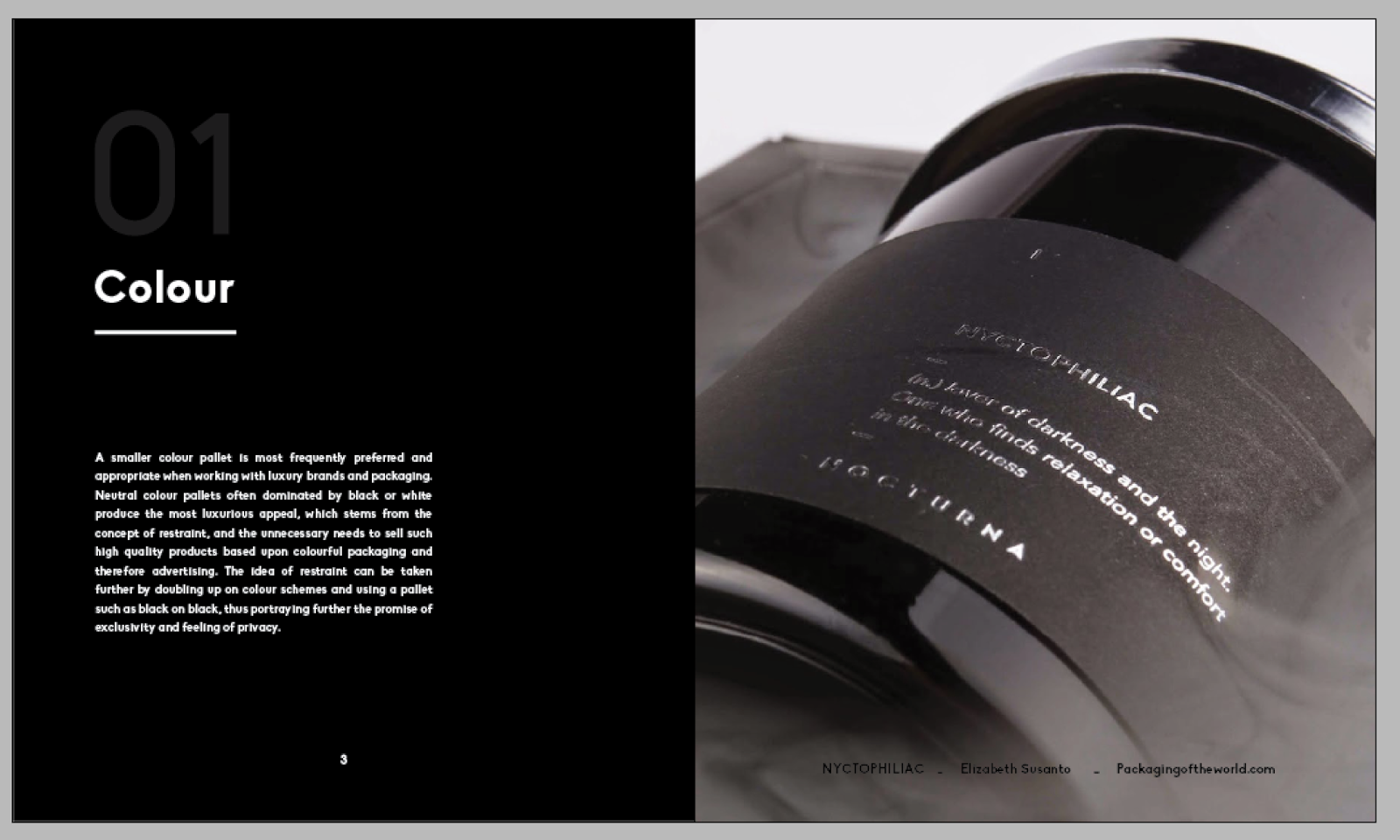
I have always been very craft based with my outcomes due to my roots in art and design, and so i have continued to deliver pieces of work that use traditional and alternate production processes. I have also used the extended practice module as a final opportunity that I will get to experiment with such processes. Throughout the module I have experimented with foiling, screen printing, embossing, laser and inkjet printing, lasercutting, crafting nets and packaging , working digitally and experimenting with different book binds including soft perfect, screw post and simple staple. However all of the experiments have been well considered and through thorough research creating an appropriate outcome for each brief. I have also spent a lot of time preparing and taking professional sets of photographs for the presentation side of my work in terms of portfolio. I have worked to create images that both look at my work technically through the photography studio, and those in context which will be valuable for my portfolio as i work with branding and packaging. 

I think that the strengths in my work are as previously stated are over arched by thorough consideration, and this all stems from  in depth and appropriate research, which creating my methodology has allowed me to do. I have also not been afraid to push the boundaries and commit myself to spending the time to create appropriate resolutions such as my design publication which in direct reflection of my research required me to laser, inkjet, screen print, foil and do 3 different types of binds, followed by lasercutting the packaging.  I have always had a go getter attitude in response to put in the effort to produce complex and time consuming outcomes, but I think doing this is what makes my work strong, and this is what I will continue to do where appropriate for the rest of my career. I have also worked this year to gather feedback from as many people as possible, whether this be live clients, student led crits or college ones, i have been self motivated to attend, and from doing so I have taken in valuable information which i have moulded into my designs. This has proved to be really beneficial for me as the feedback from others almost replicates a sense of working in a studio and getting feedback from colleagues. 


In terms of improving the outcomes I have produced, the main thing I can think of is extension. I took it upon myself at the start of the year to not include myself in so many college led briefs and instead work on briefs that I want to put in my portfolio, and the types of work my potential employers would be looking for and find attractive and thoughtful. For this reason I have ended up doing more larger briefs that have left me with a smaller amount of projects, completing 10 plus my design publication over the year. However for the ones towards the smaller side such as BRREW or my christmas cards, I would have liked to extend them where appropriate creating designs such as POS or further stationary for the latter. i also think more development and experimentation can always improve a project, such as BRREW where I would have liked to experiment a bit more with stock and colours to achieve a brighter more pigmented outcome. i am however happy with my briefs and feel that I have responded well to a wide range of branding and packaging briefs to put in my portfolio which was my original intention and focus when first starting the module. There are a couple of extra briefs I would have liked to have done throughout the year, however as a self motivated designer I feel no issue with doing these outside of college in the hopes of furthering my portfolio.   

OUGD603 / Extended Practice - John Lewis D&AD: 603 Submission boards.

OUGD603
JOHN LEWIS 
603 SUBMISSION BOARDS


OUGD603 / Extended Practice - DR ME Workshop: Submission boards.

OUGD603
DR ME WORKSHOP

SUBMISSION BOARDS


Wednesday 20 May 2015

OUGD603 / Extended Practice - Bradley Sykes Architect: Submission boards.

OUGD603 
BRADLEY SYKES ARCHITECT 
SUBMISSION BOARDS 

OUGD603 / Extended Practice - Beckett Beccari: Submission boards.

OUGD603
BECKETT BECCARI 
SUBMISSION BOARDS


OUGD603 / Extended Practice - Interflora: 603 submission boards.

OUGD603
INTERFLORA
SUBMISSION BOARDS


OUGD603 / Extended Practice - PART 2 Design Publication: Submission boards.

OUGD603 
DESIGN PUBLICATION 
SUBMISSION BOARDS


OUGD603 / Extended Practice - PART 2 Design Publication: Production.

OUGD603
DESIGN PUBLICATION 
PRODUCTION 

Over the next few days I worked on producing the 3 books according to the directions and components researched within the books. 


Low cost packaging:


To keep the low cost book the lowest cost out of the set the books were printed on only one type of stock including front and back covers. The material that I printed on is bulky newsprint, at only 5p per large sheet I was able to get 4 double page spreads per sheet. with 12 double page spreads in the book I was able to buy the stock for the book for only 15p. 


I then chose to laser print the book as this is the most low cost printing available in college and only cost me around £3 to print the full book. The staple bind was free, used in college meaning that the book costed me just £3.15 to produce, the cheapest of the collection. 


Luxury Packaging: 


The luxury packaging book was produced with what I had learnt in mind, the pages were printed with inkjet creating a matte, rich, luxe finish that had an increased tactility. Details were printed on each page in the process of foil finishing, adding a polished and well crafted feel in an exclusive colour pallet of black on black. Unfortunately the foil front didn't come out do well as the screen I was using must have been blocked, as both times I tried to foil the front cover on the second pull the glue didn't go through properly. I was told it must have been an issue with a blocked screen. the book is binded via perfect soft bind, creating a streamlined finish that appears smooth and clean. 


Sustainable book:


The sustainable book was printed again with a laser printer as this uses less ink and is cheaper in cost meaning it is more sustainable in terms of less ink and less economically harmful. Details have been added in fluorescent green screen print to subtly reference the green roots of the book, but to also communicate that screen printing is also a well sustained root of printing. The bind is the most sustainable element of the whole book secured with a screw post. Screw post requires minimal, if not, no glue depending on the type of bind, it lasts for a long time, and the screws are reusable when they are no longer needed. 


Packaging:


The packaging is lasercut from a sturdy material that will hold all the books as a set. Made from a low cost easily recycled material, that together when engraved has a well crafted look. The packaging also references the use of colour within the book series, injecting a small amount of fluorescent green.


OUGD603 / Extended Practice - Peter and Paul: Submission boards.

OUGD603
PETER AND PAUL
SUBMISSION BOARDS


OUGD603 / Extended Practice - Alice in Wonderland x MAC Cosmetics: Submission boards.

OUGD603
MAC IN WONDERLAND
SUBMISSION BOARDS


OUGD603 / Extended Practice - Christmas cards: Submission boards.

OUGD603 
CHRISTMAS CARDS
SUBMISSION BOARDS


OUGD603 / Extended Practice - BRREW Iced Tea: Final submission boards.

OUGD603 
BRREW ICED TEA
FINAL SUBMISSION BOARDS


Tuesday 19 May 2015

OUGD603 / Extended Practice - Christmas stationary (cards): Evaluation.

OUGD603
CHRISTMAS CARDS
EVALUATION


The outcomes:
The Christmas card brief was something very simple but enjoyable to create, and in the end I think the outcomes really work to suit the audience. The simple text and illustrations work well to compliment each other, whilst the screen printing in red and white against craft card creates a reminiscent image of traditional parcels. Looking at the outcomes, they work well in a set together which was a concern, but the colour pallet and materials helps to bring them together, whilst the differentiation in typography and illustration bespoke to and linking back to each film helps them to have their own stance and individual presence. They are a really fun choice for any friend/partner/ family member of a movie lover at christmas time. 

How could they be improved?
The project was only intended to be approximately a week long all in with research and production, however it could be furthered and extended with other stationary items such as gift wrap, gift bags and tags etc. I think the simplicity of the project was very much out of my comfort zone, and although I think the simplicity of the design combined with screen printing works well together, I would have like to have created something with more of an illustrative focus, however given the time restraints I set for myself, such decisions weren’t particularly viable.  

What have I learnt?

I have learnt a lot about the design to production stage of design in that production processes can help make simple designs unique, but also be just as important and hold as much stance within the outcome, as the design itself. The outcomes also taught me that simplicity can be a great tool and that its sometimes, more successful to hold back and create restraint in design that go overboard with detail. I also learnt that doing a project every now and then primarily for fun, as I did with this in the winter months alongside my dissertation, will benefit you greatly.  

OUGD603 / Extended Practice - Alice in Wonderland for MAC: Final pieces + Evaluation.

OUGD603.
MAC COSMETICS  x  ALICE IN WONDERLAND.
FINAL PIECES + EVALUATION. 


The outcomes:
I had chosen to do this project based upon both my interests within cosmetics and Tim Burton films. The end product works really well to combine both the original mac brand and packaging which features a black colour pallet interjected by a white logo and other typographic elements with the films very distinguished out of the box Tim Burton aesthetic. Both very contrasting visuals very easy to combine together as although Alice in Wonderland is well known for its physcadelic colour pallet, the Tim Burton remake is very much a mysterious and darker version of the original. The packaging is therefore successful as the mysterious elements of Tim Burtons Alice in Wonderland could easily be interjected into the brand that is dominated by black. Further successes in communication of both film and brand come from the use of foil to further project the theme of mystery, whilst the ‘life like’ illustrations not only make the character on the packaging easily distinguishable but also nod to the most dramatic make up look within the film. 

How could they be improved?
Looking at the end outcomes I think all the elements work really well together including illustration choice, finishing choice and typography however the project could be improved if it was extended. Possible extensions could have been gained from producing designs to go on the packaging inside the boxes, or even creating a unique point of sale stand. The project could have even been taken as far as advertising for the new line across a range of different platforms. 

What have I learnt?
Answering the brief has helped me to improve my craft skills which are important for a designer who has a focus on packaging, especially if I need to mock work up for clients in the future. I also learnt a lot about combining finishing techniques and stock and how these can be use to communicate just as much as type or image, as with ‘MAC in Wonderland’ I chose to combine foil and matte card for a unique effect that helped to communicate the aura of the film. I also, for personal practice, learnt a lot about test printing which I should aim to do on all projects for the future. 


OUGD603 / Extended Practice - Brrew Iced tea: Final pieces + Evaluation.

OUGD603.
BRREW ICED TEA.
FINAL PIECES.


The outcomes:
A lot of research was undertaken not only to understand the product that the packaging would encase but also the heart of the company and its roots inspired by its origin in Yorkshire. To emphasise this photographs were taken in the form of primary research and used as a source of inspiration for the bespoke packaging illustration. The illustration itself helps the design to appeal to its young audience but cements itself in its surroundings of Yorkshire. A lot of work was also undertaken to develop a logo that would help to set the product apart from any regular hot teas on the shelf, however I think the bold bright illustrations, and of course the name, also help to do this. The designs were also well considered for on and beyond the shelf, created in a shape that is easily stacked, and opened with a convenient perforated tab allowing the product to easily drop down into place. 

How could they be improved? 
I think the designs could have been improved more so by creating more content for the packaging and brand as a whole by furthering the components to include others such as a point of sale or promotional material. More experimentation at the production process in terms of printing and stock could have been tried in order to see where the colours would result in being the brightest. 

What have I learnt?
I learnt a lot more about how useful different avenues of research can be useful. The illustrations as mentioned were created via images taken in various areas of the Yorkshire countryside and merged together. I think it is the experience of travelling to the places that has also helped to create a successful piece over simply collecting images online, and drawing ideas from these. In addition I also learnt a lot more about the further considerations after aesthetics that need to be contemplated, more research also took place in the the form of function, considering not only how the packaging will appeal to the customer but how it will sit on the shelf, and function in the customers home. 

Monday 18 May 2015

OUGD603 / Extended Practice - Bradley Sykes Architect: Produced outcomes + Evaluation.

OUGD603
BRADLEY SYKES ARCHITECT
EVALUATION 


The outcomes:
A rand of outcomes were produced to represent Bradley in a self promotional sense, for when he finishes university this year and qualifies as an architecture. The components work really hard to succeed at portraying a visual of Bradley’s end resolutions and a reference to his methods of practice. The client was really happy with the end products and working with the client was a really positive experience, in the initial stages they gave me a lot of direction, not particularly towards how the design should look, but how they work in concept and aesthetic, after the first meeting, I was left with almost full reign of the project. I checked back in frequently with the client to show my ideas and each stage was very smooth with the client agreeing with my preferences and decisions made towards the project. A lot of consideration went into the final products, from minimalist logo design, to embossing creating decoration via the texture of materials, and the colour choice in which a selection of neutral shades of colour plan were acquired to mirror the natural and organic pallet Bradley uses in his work.

How could they be improved?
I would have liked to create a web presence for Bradley, however he stated during the design process that within architecture it is unusual for them to have an online website as a portfolio. I did however produce a pdf version of his creative cv/portfolio that he could attach in emails when contacting people online. 


What have I learnt?

I learnt a lot more about client collaboration and working towards a live brief, I have learnt further how to and how frequently to communicate with a client. i have also learnt mock ups and test pieces really allow the client to see where you are coming from, and the direction you intend to take, making them more inclined to agree as they see a clear picture. I have also grown a lot more within branding especially within this project for similar reasons to that of Beckett Beccari, stepping outside of my comfort zone and doing something a little bit more restrained and minimalist in contrast to the highly decorative work I usually produce. Lastly I learnt a lot about the importance of stock and its role within graphic design, the stock became a major role across the brand not only for production reasons but to communicate key points about the clients practice and brand. In future projects I will consider how stock and materials can be use to further communicate and extend the brand. 

OUGD603 / Extended Practice - Beckett Beccari: Evaluation.

OUGD603
BECKETT BECCARI
EVALUATION


The Outcomes:
Beckett Beccari is by far one of my favourite selection of outcomes I have created. The collateral produced works hard to adapt to the luxury methodologies discovered and discussed throughout my research book. The outcomes heavily consider colour, in which the colour scheme is dominated by black with small interjections of white, thus showing restraint and reluctance to include any unnecessary ornament to try and sell the product, perceiving a strong image of quality and also exclusivity. The combination of black matte card and glossy foil elements display beautifully in a range of lighting appearing crisp and polished and therefore rich in craftsmanship, signalling images of quality. Whilst the message card holders bring another air of luxury to the brand, extruding power through strong bespoke shapes, strengthening the brand image and further adding to its image of exclusivity, in the vision that the holders cannot be, nor will be used by any other brand. The image of rarity and luxury is performed even further through details such as the invoice which arrives in a black foil stamped envelope, keeping consistency with other brand elements such as the flower carriers, and also communicating the persistent appearance of confidentiality. 

What could I improve on?
To have really taken this project further an online presence would have really helped to produce a more well rounded brand. If I had time to take the project further I would have liked to create a website for opportunities such as online ordering which would be an invaluable tool to the customer. I would like to consider making such advances for my portfolio to portray how the brand works both online and offline, as I never take up the opportunity to fulfil such projects. I think another aspect of the project that could have been improved was execution in terms of the production side. Although the design ideas and resolutions were valid and well designed, traditional processes such as foiling are often unpredictable, and so for this reason I have aimed to make mock ups where appropriate. I also think other design components such as possible spatial and interior pitches and potential shop front mock ups could help to take the project further and again are something I am considering taking further and adding to my portfolio. 

What did I learn?
Primarily I learnt a lot more about designing for a luxury brand, how to respond to the needs of a luxury company and also the wants of the luxury customer. I learnt how to restrain myself within during brand creation as this is not always needed, especially when working with brands used to convey luxury, which requires a very different thought process to the design I am used to creating. I have also learnt a lot about timing and production in the idea that If I cannot, with unpredictable traditional production processes, produce the work physically, I should aim to in events of time saving, work to create successful mock ups. I also found that a lot of the success of this project was down to taking on feedback given by my peers especially in relation to logo choice which in effect is at the heart of the brand. Therefore feedback is essential and I should take any opportunity to gain feedback through out my practice. 


Sunday 17 May 2015

OUGD603 / Extended Practice - DR ME workshop: Evaluation.

OUGD603
DR ME WORKSHOP
EVALUATION


Working with Lizzy:
Working with Lizzy was another positive experience I had collaborating on the course as we both had skills to offer each other during the project. It was a real eye opener working together as we hadn't really socialised much on the course together, and so probably wouldn't have chosen each other for a collaboration. Where as I was very much involved and excited by creating concepts, Lizzy was really great with the more technical stages of the brief as I had, at this point, not much practice in Photoshop and was therefore counting on Lizzy to help realise and communicate my thought process. 

Our Outcomes:
The outcomes work really well to not only answer the brief which was set in an especially short time frame, but also bring something unique and well considered to resolutions. The attention taken to listen to and analyse the track which inspired the vinyl design has really made the end application a success. Successful visual contextual references were implemented such as the nod towards the Duga-3's nickname the woodpecker, in which feathers were incorporated into a propellor like formation representing the DUGA-3's likeliness to the sound of whipping helicopter blades. The second section of the brief was dominated mostly by aesthetic ideas of what we, in the short time we had to research and develop ideas, imagined punk music to look like. We focused on the idea of being bold and eccentric, and a little bit out there which seemed to work well and appropriately for the band. 

What could we improve on?
Towards the end of the brief in which we were going to have to start moving onto the second section in which we were asked to produce a gig poster, we began to run out of time and so the outcomes and avenues travelled could not be as well considered. If there was opportunity to redo the project, or partake in something with a similar short time frame, I would suggest a rigid plan in the early stages to capitalise on time, so that each outcome could have just as much success as the last. If we had more time to work on it together It would have also been really nice to extended the projects, particularly the vinyl cover, which we could have furthered with other band merchandise and possible tour printed collateral etc. It was my first time working with a music based brief and although it was a very new experience, It is one I have really enjoyed. 
  

What did I learn?
I learnt a lot again about working relationships during my collaboration, in particular about working relationships with possible collaborators that you wouldn't expect or if given the choice choose to work with. It has taught me not to look at collaborating with people I wouldn't primarily gravitate to in a negative light, but instead view it as an opportunity. The project has again taught me about the importance of research and analysis, and that thoroughly investigating certain aspects within my methodology such as context as done so within the designing of the vinyl will result in a much stronger outcome. i have also learnt a lot more technically within Photoshop, previously to working on this project I would always avoid he program and work in illustrator. This brief really required me to step outside of my comfort zone and therefore experiment with processes I don't usually fall back on, teaching me technically how to use these programs, but also that I would like to become more comfortable using them, which I did when creating my individual piece of collage (part 3). In addition I learnt that often experimentation can lead to great things, as previously stated the vinyl was my favourite piece of work we created collaboratively in which we played with both physically cutting up and creating collages, as well as transferring this and editing it digitally.  


OUGD603 / Extended Practice - Peter and Paul: Feedback + Evaluation.

OUGD603
PETER AND PAUL 
EVALUATION


Feedback:
  • It could have been a good idea
  • Missed the boat with it
  • Should have been an underlying/subtle theme, but was too literal
  • Implied implications from prospective students


Working with the Danielle:
Working with Danielle was a really positive experience, we both have a similar work ethic and so neither of us were ever waiting for the other to get work done. She was also really easy to communicate with, and neither of us would hold back on our opinions which made it a very professional and easy working relationship. I also found Danielle's positive attitude motivated me and was one of the reasons I was excited to partake in the live brief. 

Our outcomes:
In the end at final mock ups I was really happy with our resolution, however throughout the project I did question my ability to produce my side of the design. However, the more progress I made throughout the project the more confident I became in my side of the design. I also think that the designs work really well together and are simple but strong. In addition I think the designs were really well considered, as well as bringing something new to the table, we really considered the surrounding environment the designs would be housed in and drew direct inspiration from this. Although they could be considered a bit controversial I think our designs represented something students need to be reminded of. Overall I think our outcomes worked really well for only a few days work from research to end product. 

What could we improve on?
In terms of improvement based upon the feedback given by Peter and Paul, they said that we should not be so obvious and direct with our message, which I understand, but thought the concept worked really well anyway. Another simple addition which I thinking could have helped to improve our work was just more time. I don't usually work with a focus on just type, however I have done a few bits and pieces before in different projects, but this is what Danielle approached me for. I know that if I had more time I would have been able to refine the design a lot more and produce something I was really happy with. On the other hand also, if I had the chance to re-do the project I would consider producing a typographic piece that is not so stylised and complex, but still withholds impact and the light heartedness of the script font.  
  

What did I learn?
I learnt a lot about working relationships in this project, mostly that working with someone who you trust and who has a similar work ethic to you will not only make a successful project, but an enjoyable one. I also learnt a lot about concepts, the controversial message may not be seen as appropriate by everyone, but sometimes taking a risk can be rewarding, maybe not in success but in enjoying your design practice, and from time to time you should test the waters and do something that excites you. I also learnt that type is not one of my most lucrative skills and although I managed to get there in the end and complete something I was fairly happy with, if I ever plan on on doing a typography focused piece again, I'm going to need to work on timing and planning to leave enough time to develop something I'm happy with. I spent the 2-3 full days we have just working on the one piece of type by hand before spending time working with it digitally and so It would be nice in future to work on my skills and perhaps practice typography outside of design so I can become more efficient. 

Saturday 16 May 2015

OUGD603 / Extended Practice - YCN Interflora: Evaluation.

OUGD603.
YCN INTERFLORA
EVALUATION 

The outcomes:
At the end of the project I was quite happy with the final outcomes however the project had not turned out how I had hoped with the implementation of paper quilling as my media not being successful. However I think that I was able to pull through with my strengths in illustration based work, creating something that shared the same image of paper quilling that I had. I also think the end pieces I created work well as a set and have a clear coherency which is something I really wanted to achieve. I also think that the resolutions delivered work well to take a strong brand such as Interflora whom already has a specific demographic, and transform it into something that a younger audience can relate with. I think a lot of the strength within this project also lies within the concept and particularly the subject of each material taking the time to research and understand what my age audience want to be thankful for, and working to match the USP's and help the audience understand how the brand can relate to them. For example being thankful for little things such as your grandma making you personalised costumes, is responded to with one of the brand unique selling points in which Interflora can produce one of a kind personalised bouquets of your choice with a made to order service. I thought careful consideration of such elements helped to make the campaign really strong.

What could we improve on?
I think to improve, I could have prepared myself a bit better and taken the time to research more and learn the techniques of paper quilling straight off the bat. I think given a second chance to work on the project I would have out aside more time to do so, or attempted other similar options such as paper craft where I could have achieved comparable results. However I feel that my strengths will illustration helped to successfully pull the project through. I would have also of liked to take the animation a bit further and work on something that appears as personal as the posters themselves. I think I found it hard to match the format of the posters with the video and so working with the animation a bit more, I could have created something more coherent, but also independent of the posters rather than just a animated version of these.

What did I learn?
I think I have learnt quite a lot throughout this project. I originally took up the opportunity to enter YCN via this brief based upon my interest in floristry which I thought who help inspire me and keep me motivated throughout the project. I also thought that the idea of doing a campaign and working with marketing was something quite different and that as it is my last year on the course it is really the last chance I would have to experiment with something new. I found that marketing came quite natural to me, and I particularly found that working with the copy was a fun new experience and would, if the opportunity was given to me, work with it in the future. I didn't overly enjoy the project and I think this is due to the fact that the paper quilling didn't work out which I had high hopes for, and i think really would have given the campaign great impact. Therefore I think that I have learnt process wise from now on when undertaking a project I should stick to what I am used to and know i am good at, unless for future reference I am working in a team with someone who is good at the process. Another thing I learnt a lot about this project is that really getting to know your audience is invaluable which is something I think that made my concept and the copy I wrote so successful, because it was 100% tailored to the new audience Interflora wanted to target. I did this through involving the audience in my every descision, from asking them survey questions, to creating designs for their most trafficked platforms (bus shelter, city centre posters and social media) and considering how to adhere a classic brand to this new audience.


Friday 15 May 2015

OUGD603 / Extended Practice - PART 2 Design Publication: Transferring the design.

OUGD603
DESIGN PUBLICATION
TRANSFERRING THE DESIGN

Today I worked on transferring the design for the publications from luxury to fit both the sustainable and low cost editions from the series. I am transferring the design instead of making a new one as elements such as layout, typography and size will help keep consistency across the range whilst other components differ to fit the design solutions understood throughout the books for low cost and sustainable design. 

Elements that I will change in the design aesthetic are following those listed in the book. 
- Colour
- Finishing 
- Printing 
- Stock 
- Binding


Low cost edition:


Colour:


In terms of colour for the low cost edition my focus was to have the pages dominated by less ink, the front cover features only title details printed in ink, whilst the inside spreads are dominated mainly by white pages also. Not only does this minimise on ink and therefore cost, it also offers the simplicity frequently spoken of within low cost design. The inside pages are also very stripped back in terms of colour where the text pages are dominated by solely black text on the stock background. The front cover is injected with a small detail of bright blue. As spoken about in my research often low cost packaging always revolve around a simple mainly white dominate pallet with a pop of colour. 

Finishing:
In terms of finishing its important that I am strict and use no extra details such as foiling etc as these add value. Finishing should use one production process that is as low cost as possible. For this reason the only method I will use to produce the book is digital print. 

Printing:
Speaking of digital print it is important that I consider the type of digital printing that will take place in order to produce the book. Although I printed via ink jet for the last book, this is much too luxurious for low cost packaging. Cost is increased by ink jet printing due to more ink and time taken to print. Therefore I will be printing via laser, it is much cheaper to do this in the print room at college and so out of the options this is going to be the lowest cost I can get. 

Stock:
For stock options I tried to find a stock that was low cost, yet functions well such as, being able to print double sided without being able to see the print through the paper. All though I must consider the low cost, Low cost products and packaging still have a basic functionality to them and so it is important I stick with this. Looking at stock choices I found bulky news print to be my strongest option. at 5p a sheet for a size I can get 2 a3's out of it is ridiculously low cost. I also asked James if it was functional to print double sided on this through the laer printer and he said it will be no problem. 

Binding:
Lastly my binding options also strip back to basics - In my crit with Tony Broomhead we discussed binding options and although I originally wanted to go with saddle stitch for the low cost appeal, I was advised that in order to be truly honest to the style I must again pick the most low cost, mass produceable and least time taking process to bind the book. For this reason I am instead choosing to go with a simple staple bind. By having a staple bind I will need to make the pages as double spreads that will be folded down the middle. 


From luxury to low cost:


- Colour
- Finishing 
- Printing 
- Stock 
- Binding

Sustainable edition:

Colour: 
There is no particular set pallet of colours to use for sustainable packaging, or branding for that matter. Often neutral more 'natural' colours are used laced with tones of green. However it is quickly became apparent in my research for my dissertation that sustainable should be so in its purpose, function and production, but to catch the eye of the 21st century consumer should look just as 'normal' as the other products on the shelf. It is however good to have an aesthetic that slightly points towards 'green' and have some kind of recognition so that people intently looking for 'sustainable' products can spot them easily. The publication therefore intends on having white based pages again to save ink with small hints of a fluro green which I am aiming to screen print. Having a colour such as fluro green helps point the product to the 'aesthetic' of green products, but also allows it to be non traditional and mesh with other 'non' green products on the shelf. 

Finishing + Printing:
Finishing all very much depends on function in terms of green packaging in relation to the binding and such which is purely based on function over aesthetic. The book will be finished using two print processes. Laser print will be used again as the main choice being more sustainable than inkjet. Screen print will be used for details as it is known to be another sustainable print process. 


Stock:
For the book I wanted to try and at least use and FSC paper, however when speaking to James in the print room he informed me that none of the papers in there were actually certified sustainable and therefore I would need to look outside of college for such stock. I found a really great sustainable paper site called arjowiggins and I discovered a great type of 100% sustainable paper made from FSC recycled pulp, the paper 'cyclus jet premium' can be used for both laser and screen printing which makes it the perfect choice. I noticed that you can order samples which was also great for my small order, however when looking at delivery I found that there would not be enough time to recieve the paper and do both the laser printing + screen printing +bind. Instead I would have to find a paper that appeared like sustainable. I choose catridge paper due to its grain like feel and its price. sustainability isn't just about the environment its about being economically sound. The price of the paper was 20p for an a1, meaning each a4 page costs about 2.5p, very economically viable. 

Binding:
I have already decided that for the bind i'm going to be doing a screw post. Screw post allows the bind to be re used when it is no longer needed as the screws can be reused minimising material waste. The bind also uses minimal if not, no glue which is also an added bonus. For the bind I will be using grey board for front and back covers as it is a sturdy, strong low cost material.