Saturday 28 February 2015

OUGD603 / Extended practice - YCN Interflora: Deciding a style.

OUGD603.
YCN INTERFLORA. 
DECIDING A STYLE. 

Understanding the audience. 

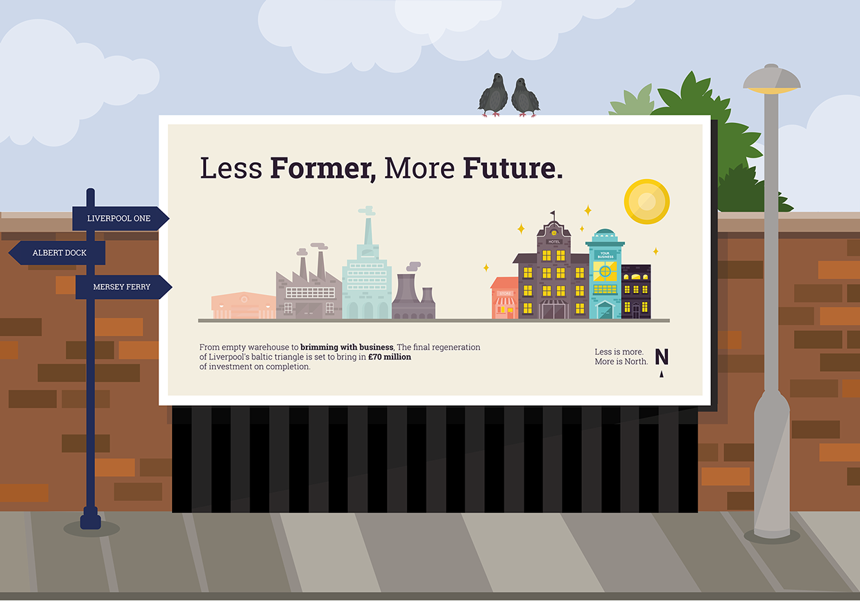
I previously looked into the style guide used across the Interflora brand to attract customers. The regular demographic consists of middle aged people who have a large disposable income and enjoy spending this on more luxury products. Although the audience will still have to be people with a disposable income, the age range has changed to suit a younger dynamic of 18-26 year olds. Meaning that although the brand values will be kept in place I will need to change the current style to be more suitable for the younger audience. 

The current audience is taken in through how professional the company is in its transactions and interactions, in store, online, on television and printed. However for younger adults such as myself there are different priorities including ease, efficiency, individuality and fun. We might look to Interflora for a special gift that we can give a fun twist to. Through the age of the audience and theme of the campaign (stories) that the gift will be lighthearted and so the seriousness of the current Interflora marketing and brand needs to be toned down and exchanged for something more aesthetically appropriate and pleasing to a younger audience. 

I feel that avoiding photography, and trying to come to with a new visual alternative will take away from the seriousness of Interfloras current branding and provide something new and fresh that will appeal to younger people. I looked into the different media that I could use, and tried to analyse these to understand which would be most appropriate and appealing. 


Digital / animation.


I think animation is going to be a really great way to capture the interests of the younger audience. As found in my research Interflora have often used the platform of video to capture the interests of the consumer. I think that doing a video that plays upon and experiments with illustration/ animation will really help to make contact with the audience who find themselves constantly watching and sharing videos online. 


Illustration.


I think illustration would be a good media to use as it can be customised to appeal to the ages of any audience. Whilst I can create something that appeals to my younger audience I can also create something that is still in tune with the Interflora brand through style and colour, whereas imagery might be harder to manipulate.


Screen print.


Screen printing is another avenue that I could explore and I think that it would appeal to my younger audience, however I don't think it would be viable for the brand at all. Screen printing is very unpredictable and often has natural flaws that make it such a beautiful and organic process. However Interflora is a very elegant brand that prides itself on being well polished and elegant, which screen printing cannot always offer. 


Paper craft.


Paper craft is a cool media that I thought might appeal to and be appropriate for my audience. As well as allowing me to to experiment with a 3d element, mimicking the 3d existence of flowers it also allows me to manipulate that 'photographic' almost real feel, whilst still being bold with colour. 
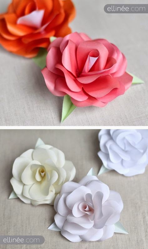


Paper quilling. 


I think paper quilling will be a great choice for the campaign, not only does it offer something new, fun and opportunistic for playing with elements such as colour, it is also a little bit out there and signals something a little bit more special than the ordinary. I also liked the link between the hand crafted element of paper quilling and the hand craft of flower arranging. Its almost as if the manipulation of paper to create floral arrangements would mirror that of using real flowers to create a composition. 


Monday 23 February 2015

OUGD603 / Extended Practice - YCN Interflora: Concept Brainstorm.

OUGD603.
YCN INTERFLORA. 
CONCEPT BRAINSTORM. 

Today I worked on brainstorming and finalising a concept in Response to the Interflora competition brief. 

Campaign platforms:

I began by thinking about the different outlets and platforms, where I think printed posters are a necessity for the campaign that can be posted both to locations such as bus shelters used regularly by young adults and in magazines. I also thought about what other platforms they would regularly use. It is obvious and would be a missed opportunity not to do something via social media. It is something used extremely frequently by young adults and so I needed to think of a way in which to take advantage of this.   

After some thinking I came up with with an idea to create a campaign called 'Thank you for'. The campaign would spread across printed posters as mentioned above, and social media taking into account users across facebook, twitter and instagram. 


'Thank you for' will not only inform Young adults of Granparents day, but also give them the oppurtunity to win an interflora gift for their grandparents, by sharing why they are thankful. 


What I will produce: 


- 3 x posters that share stories of why people are thankful for their grand parents, advertising grandparents day.

- An instagram/facebook/ twitter image that will give instructions on how they can enter the #thankyoufor competition for a chance to win an interflora gift for their grandparents. 
- 3 short animation videos that can be seen on social media platforms to advertise granparents day. Video sharing and viewing is becoming a massive trend on social media and so we must take advantage of that. 

How I aim to produce these:


3 posters:

- Use my own experiences and ask others of what makes them thankful about their grandparents big or small.
- Find a way to link these stories to the USP's of the company. 
- Find an aesthetic that will attract young adults but also directly relate to the current brand. 
- Create a layout that will look consistent across all 3 posters.  

Social media Image:

- Create an image with clear reading of campaign title 'Thank you for'
- Make aesthetic consistent with aesthetic of poster. 
- Make competition concept and make sure this relates the the present tone of voice at Interflora. 

3 short videos:

- Translate campaign idea into motion. 
- Find way of translating the media used for printed posters digitally. 


Coming up with 'Thank you for ideas':


Firstly I set up a survey monkey of one simple question which I thought would help me to understand why others are thankful for their grandparents and on what scale. Is it the little things, or is it the larger things? should I consider both? Would it be a more warming and entertaining campaign to focus on more individual stories, rather than just general ones such as 'looking after me' or 'making me tea'.


Whilst waiting for replies for the survey I began thinking of my own individual reasons as to why I am thankful for my grandparents. 


A fond memory that I have of my grandma when I was younger is going to Harden children's gala with my brother and my two cousins in tow. At every gala there would be a fancy dress competition where around a hundred children would gather from the surrounding area wearing costumes. There were a set of Judges that would give rossettes out with the titles 1st, 2nd and 3rd. For every children's gala we attended my grandma used to spend the time preparing, making and sewing each of us a costume by hand. My costumes ranged anything from, little miss muffet, rapunzel and pokemon. When I look back its amazing that my grandma took the time to make us all something so personal every single year. 


Another memory I have of my other grandma is that every time I used to go to visit and stay for tea she would homemake us a meat, potato and vegetable pie. After she's made the pastry, filled the pie and baked it, she would allow us to take the leftover pastry, roll it into sausage shapes and mould it into our names, and placing it on top of the pie. 


The same Grandma used to also take me and my cousins on some great trips out, Cliffe castle and to Ilkley for a picnic by the stream, she used to make me jam sandwiches because at the time I refused to eat any other type. 


Recently my grandparents on my mothers side learned to use Facebook so that I can catch up with them on a daily basis even when i'm not there, which is convenient and makes me feel better that because i'm busy at university that I don't get to see them as much. 


Conclusion to my own thoughts:


I find it hard to think of more general thank you thoughts because well, its in grandparents nature to do things such as be caring, or just be there. When listening to other people I always like to hear more unique stories, things that are individual to them. It is this that I think will make the campaign more unique, warm and interesting. 

Responses to the Surveys / other peoples thank you for's:


I also looked online at the sort of things people are thankful for and I was inundated with personal stories from things from their childhood like building castle fortes from boxes and blankets, to more current things such as learning to use skype like my grand parents learnt to use Facebook. 


Conclusion:
I have decided it would be best to use more individual stories for added impact and interest, therefore for the next task I will have to choose 3 from the many I have found to focus on. I would like to use a mix of both old thank you for's from years ago in peoples childhoods, to more contemporary ones using skype so that more people have something to relate to. 

I picked the three unique stories, and created them into short explanations reading to be used across the three platforms. 


The three stories:

Making my own personal fancy dress costumes:
Thank you for hand making me my own personal fancy dress costumes.

Helping me to build a castle den:
Thank you for helping me to build my make shift castle every weekend without fail. 

Learning to use Skype:
Thank you for learning to use Skype, so I don't miss out on your marvellous stories when I can't be with you. 


Interflora emphasised in their branding outline posted on YCN that the campaign collatoral must discuss or mention one each of the USP's and brand values. 


Our USPs
Why we are ‘the flower experts’
1. We are the biggest network of florists in the UK and Ireland, with a host of award-winning designers and passionate expert florists.
2. We are RHS Chelsea Gold Medallists.
3. We have the widest range of products for all occasions and all seasons.
4. Our range of delivery options is the best in the business, allowing gifts to be delivered same day, or even within 3 hours.
5. Our Designed to Order service gives our customers the option to send a unique gift designed by one of our expert florists.
6. Interflora promise: ‘If your order doesn’t arrive on time, or your recipient isn’t delighted with their flowers, let us know. We’ll do all we can to put the situation right, or, if you’d prefer, give you your money back.’


Our Brand Values
Trusted
Our customers trust us to be there when they can’t and hand-deliver the finest quality flowers on time, every time.
Personal Touch
From taking the order, to creating the chosen bouquet and then finally hand-delivering the flowers directly to the recipient’s door: with everything we do, we strive to add a personal touch.
WOW
WOW! is the reaction we want every time a recipient opens their front door and is presented with a stunning Interflora bouquet, exceeding all expectations. 


Making my own personal fancy dress costumes USP and Brand value:

Instantly after referring back to the USP's I picked up on the Design to order service, which allows customers to make a more personal arrangement of flowers. This reminded me of my own story which I have chosen to incorporate into the campaign, which details the personal things my grandma made for me. And so it seemed that the two concepts would be great to pair together. This also linked with the brand value 'Personal touch'. 

Using the word shower and beginners and connectors provided by Interflora in the tone of voice guidelines, I created a short piece of body copy that takes on board how Interflora choses to communicate itself, and the story related to the campaign. 

'The perfect way to send a beautiful personalised gift in return this grandparents day. Our exclusive designed to order service gives you the ability to send a truly unique gift lovingly designed by one of our expert florists.'

Learning to use Skype USP and Brand Value:

Interflora take great pride in their delivery service, in that they can delivery flowers quickly and carefully in a little as three hours. Making the process, fast, efficient and hassle free. Making the idea of gifting flowers even easier as  not only are they delivered by someone else, they can be delivered in a short time frame, great for young people who are very busy with other commitments such as uni and work, where such details may have slipped their mind. Which is also the reason that they may use skype. I felt tying this concept with the USP of delivery complimented each other well. Again in terms of brand value, I feel the idea echoes company/ costumer trust. The customer is being urged to trust Interflora that they can provide their order in a short space of time. 

I again used the word shower and connectors provided to create something within the already existing voice of Interflora. 

'Making sure your beautiful gift is delivered on time, every time is half of what makes giving with Interflora so special. We deliver on the same day or even within 3 hours, taking the worry away from your life and injecting joy into theirs. Show how much you care, even when you can't be there.'

Helping to build my make shift castle every weekend without fail USP and Brand value:

Lastly I tried to link the concept of the castle with interflora's must luxurious USP. That each decadent bouquet or flower arrangment they produce is created by a team or singular expert florist and award winning designers. I linked this idea with the idea of treating them in return like royalty. Again I used the word shower and connceters for communicative influences, and came up with something that was contextually rich in concept and theme (castle and royalty) and reflected the aims of the company. I also felt that such a theme would also represent the WOW! factor provided by Interflora.  

'Trust us to make them feel like royalty with a dazzling floral arrangement or enchanting bouquet thoughtfully created by our team of awarding designers and passionate expert florists. We make moments to remember, just like the memories.'

Conclusion:

I have therefore decided that i will communicate the 3 story concepts discussed above across the previously selected platforms, creating 3 posters and 3 animations, one of each for the three narratives. I will then create the instagram compeition post to link visually to all three, adapting a theme that is general and overheads the design rather than adheres to each of the personal stories. 


Friday 20 February 2015

OUGD603 / Extended Practice - DBA Capital North: Group meet up and development.

OUGD603.
DBA CAPITAL NORTH. 
GROUP MEET UP AND DEVELOPMENT. 


Today we had a short group meeting where we reviewed progress so far. We were happy with the illustration style I had done as It is easy for everyone to replicate and fits the brief well. However as a team we were a bit skeptical about the colours and felt that they were still too bright for the brief. Danielle indicated that we should look at Adobe cc colour schemes. From here Danielle approached us with a colour scheme that she felt would help lift the brand from looking too childish and young, to something much more professional. Collectively as a group we agreed. 

The new colour scheme features three neutral colours and one bright pop of colour. 


I liked the new colour scheme and thought it was much more appropriate for the North. However I also felt that it needed a slight bit more colour. So I looked to add another bright pop of colour. 


I added a blue as not only was it a bright colour, I thought it would also help to contrast the orange colour, bringing more dimension to the colour scheme. Danielle suggested off white as a background colour which I thought also worked well and was complementary. 

Tonight I will re colour my animation to see how it works using the new colour scheme. 

we have set the deadline to have this done by the following wednesday. 
However on Monday we will be meeting up to discuss ideas for the other elements including train livery and environmental design which we are all to create ideas for. 

Campaign development:

We edited the communication of the campaign 'Less is more, Less is North' ever so slightly. After working and preogressing with the campaign idea, we still feared that many would take the idea literally and it would backfire. Sarah came up with an idea of how to keep the same theme, but shine it in a more positive light. She tweaked the strapline slightly taking out less, and putting in more, from:
'Less is more, Less is North' to 'Less is more, More is North'. I think in reflection that this works much better and is much more appropriate as the phrase still has the same underlying meaning 'less is more', the North has less of (space, commuting, former/past) and therefore is is more. However it is now communicated more literally. Instead of saying Less is more, and therefore the North is less, we now say the North has less of these things and therefore it is more.  


Motion poster Development:

Me and Danielle worked with each other correcting the colour scheme, and also readjusting the structure of the moving posters. 

We worked closely together in the Mac suite insuring that we created a program of timing and entrances and exits for illustrations that would be consistent across all the motion posters. We started by working on the animation that I had currently made. 

The new structure:
Logo is in bottom right of screen full time
First enters 'Less former' followed by illustration. 
Fact enters.
Illustration slides to left and enters new illustration. 
'More future' then appears in tom left to describe illustration. 
Illustration then animates. (Lights turn on and sun rises)
Shot is still for a couple of seconds allowing people to finish reading the facts. 
finishing logo animation appears on screen.
'Less is more, more is North' 
Shortened and lengthen logo.

Not only did the reworked order give the video more structure it also provided a consistent framework and allowed for improved readability. Creating a better flow and more fluidity, the eye could now easily follow and expect what was to come next. The constant logo allows viewers to frequently refer back to the brand, and the prolonging appearance of the quote from start to finish, now allows for a larger amount of reading time so that the viewers don't miss any of the information. 

Danielle also found a selection of music that we could pair with the videos for presentation purposes. A selection of positive instrumentals from youtube. We wanted to find something royalty free that we could use free of charge when no money was being made from the project. We listened to the selection of songs as a group and picked our final three. We wanted something that would be proffessional, but fun, friendly and positive, and obciously that complimented the video style. 

We all agreed on one song and added this to the compositions.  

Old video:


New Structure and video:


With the motion video completed I progressed onto making the static version of my poster. 
When working with still, I had to consider how I would combine both visuals from the poster, Less formal and More future in one place, where in the video they were separated into two different shots. 

I came up with the idea to create a long 48 sheet billboard that would allow me to have both landscapes on, next to each other. On the left would be the illustrations of mills and factories, and on the right the new developments of hotels, shops and residential areas. However the opacity of the mills would be lowered so that the new developments are a lot brighter and make much more of an impact. 

In terms of text positioning and layout, I knew that any text would have to be very horizontally emphasised due to the format of a 48 sheet billboard. Therefore the header text like my animation would have to be horizontally justified on one line.

Underneath the title and the illustration I need to add the factual information regarding the slogan and the campaign message and logo. I will justify one piece of information to the left and one to the right for better balance. 


Final static poster design:


My groups posters:


After creating my motion and still poster my last job within the group was to create a set of backdrops for the posters each person has created. We have chosen as a group to illustrate these as we cannot find billboard mock ups to adhere to all the sizes of our posters / billboards, especially danielle's whose is a rare format. 

Instead I digitally illustrated each of the backdrops for the poster so this wasn't an issue. 
I tried to keep within the same illustrative style I had created for the rest of the campaign. I also thought it would be good presentation wise to try and display the posters in the cities which are listed in the brief. 


Therefore I took the time to create mock up designs using landmarks and signposts that refer to the four cities targeted on the brief: 


Sarah Heal's Bus stop format poster, in which I created a back drop inspired by manchester and the big wheel:


Mel Hardcastle's Bus stop format poster in which is based in Hull with a backdrop of the Humber bridge and sign posts to other Hull attractions. 


My Poster (48 sheet format) which I placed in Liverpool, inspired by the red brick and signposting attractions such as Liverpool One and Albert Dock. 


Daisy's Poster which I placed into Leeds Train station, with the train livery produced by Mel in the background. 


Danielle Harrison's poster which is vertically focused for placement on tall buildings features a city scape backdrop.


OUGD603 / Extended Practice - DBA Capital North: Digital development.

OUGD603. 
DBA CAPITAL NORTH. 
DIGITAL DEVELOPMENT. 

With influence from the illustrations I found, I began drawing up my sketches one by one. I produced them in a minimalist fashion, keeping in mind my range of audiences as I did them. The aim is to create something eye catching but genuine and honest.


Once I had finished the illustrations of mills and factories, I pitched them against a 'realistic' blue sky colour to give the feel of a landscape. 


I also added in the green line which would act as a conveyor belt where the two landscapes (mills and new developments) would move across. 

Next I moved on to create the illustrations for the second section of the motion poster in the same style. 


I placed this against the matching blue background and against the constant green line. 


I then began to implement the idea of making all the windows light up as if brightening up the north, putting the building into business and filling it with great potential. In order to make sure when animated that the rows of lights would come in one by one, I put them on separate lines which I will stagger in After effects and they will come in one by one. 


I also aim to have the sun moving and rising from the bottom left hand corner to the top right, further instigating the idea of a bright future. 


In terms of typography Danielle suggested a typeface. We were originally planning to go with a sans serif typeface as to keep clearness and clarity but also promote friendliness. We wanted to avoid serif fonts for the fear of the brand becoming too corporate. However Danielle suggested that in order to marry friendliness with a sense of formality ( to target business) we should consider a slab serif, which tends to lie in between sans serif and serif in formality. In particular she suggested Roboto slab. I tried implementing the typeface into the text sections needed  as both headings using the bold weight, and body copy using light for the most part, and bold for important pieces of information. 


I felt that the typeface was working well as it represented itself as both authoritative by friendly. Therefore I continued to use it for the next section which consisted of the Less is more, Less is North catchphrase. When using the typeface, It helped to create a bold and memorable statement. 


Finally I moved onto simply illustrating the final logo section a simple sequence of the smaller logo transitioning into the larger. Again I have created the sequence in 3 layers ready to be transported into After effects so that I can manipulate the N, compass arrow and 'Capital orth' separately, altering the positioning and opacity of each element. 


With the illustrative work done, I imported the files, retaining the layers into After effects. 

As stated I replicated the simple transitions, creating 4 different 'slides' and rendering them into one video. 
I wanted to try and keep the pace up as much as possible to make sure that people would not loose interest. I also wanted to make sure that the pace was continuos through out all 4 clips. 

The music chosen for the animation is not related to the subject at all and will be replaced at a later date. However it is useful to build the animation up with music to work with pace, and understand how it with combine with a song.  


I will take the animation with me to the next group meeting to get feedback from the rest of my group. 


Thursday 19 February 2015

OUGD603 / Extended Practice - DBA Capital North: Group meet up and personal development.

OUGD603.
DBA CAPITAL NORTH. 
GROUP MEET UP / PERSONAL DEVELOPMENT. 


After talking to Ian we got back into our group and came up with a concrete list of 5 'Less than... More than ideas' so that as a group of 5 we could all work on one poster and one idea each. 

Poster concepts:

- Less commuting, more living. (Danielle)
- Less outcome, more income. (Melissa H)

- Less squeeze, more space. (Daisy)
- Less former, more future. (Me)
- Less there, more here. (Sarah H)

My contributions were:

Less today, more tomorrow. Which I thought would be great as a basis for education to attract students. 
Less there, more here. A comparative to the world stage, not just a comparison between the North/ South divide. 
Less former, more future. (Industrial to service based)
Less being alone, more being together. (Northerners are known to be very welcoming and friendly)
Less romanticised, more realistic/ real life. (The south particularly London is very much popularised in television and film, as therefore appears magical due to its associations with such films as Harry Potter etc. Where as the North is branded based upon the elements it actually is)

We discussed the posters further. Recalling the DBA panel say how much clients like moving logos, we decided that not only would it be great If we had logos that moved, but also posters. It is becoming more and more common especially in ports of travel such as train stations for advertisements to be in motion. Therefore we will aim to produce both printed and moving billboards. 

However we want to give the posters more context and so taking advice from Ian we looked to evidence the point of each poster with a factual piece of information. When speaking with Ian he mentioned a particular set of city branded posters for York, and how they had used factual information about the city to promote it authentically and with context. 

Choosing the poster concept we wanted to work with the most (I chose business), we decided that we should each go away and come up with a concept. This relied mostly on aesthetic decisions and factual contextual information. Aesthetic decisions include, Illustration style, colours and typeface. 

I felt that understanding which fact we should use would help us to be inspired for the illustrated visuals. 

We also looked at the list of optional elements we had to pick two from. Out of the list we were all most drawn towards train livery and environmental design. However we felt that we should consider these options after finishing the logo / poster combination. 

We set tasks to go away and do: 

- Find a quote to go with the poster concept. 
- Look at other brands for inspiration and come up with a brand style. 
- Think about and develop poster aesthetics. How will it move and how will these appear static? How will the two be consistent?


Finding factual context:

First I worked on finding some factual information to put the poster into context. I searched extensively for information about Northern business development. I wanted to emphasise that the south is already rich and heavily developed and that the North is where a massive amount of potential and opportunity lives. 

I looked up up and coming business developments in the North where new business' could get involved, invest and become part of the ever growing and evolving landscape of the North. 

I found the Baltic triangle in Liverpool, a place previously dominated by 'then', by old warehouses and mills. The Baltic triangle is in its last section of development to become a thriving business, commercial and residential area. I felt that the Baltic triangle acted as a symbol that represents the attitudes and actions of all Northern cities.

The information regarding Liverpool also works greatly in context with the brief as Liverpool is one of the Northern cities named. 

Source of information


'On completion, there will be a mixed usage scheme with space for residential, commercial premises and parking. Phase II, is currently going through the planning stage, and will see much of the same, in terms of hotel, commercial and residential development. It is estimated that Phases I & II will have brought in £70 millions of investment on completion.'

'The Blundell Street development, halfway down the Triangle comprises multi-use space for retail and arts including The Orchard restaurant, theatre and cabaret bar. This property investment has now been here for about 10 years. Elevator Studios occupies 90,00sqft of refurbished warehouse space over six floors and four adjacent buildings creating more than 35 standard-sized and 18 full-floor studios for the creative industries. This restored Grade II listed warehouse, derelict before its regeneration is also home to a shop including the UK’s flagship store for Giant bikes and Europe’s largest online music retailer Dolphin.'

Information to be used:

From empty warehouse to brimming with business, The final regeneration of Liverpool's baltic triangle is set to bring in £70 million of investment on completion. 


Initial design development development:
Having given the poster some factual context I began sketching up my ideas. I had a visual of a moving landscape, much like a conveyor belt in which the landscape moved from old to new, growing from unused industrial area to thriving service sector creating a home to residential opportunities, stores, hotels and potential business investors a.k.a our audience. 

I wanted to keep the illustrations clear concise and minimalist, using a continuos solid line to act as the 'conveyor belt' landscape, and then illustrating four mills/factories/landscapes, which will then disappear out of frame, and four illustrations of shops/hotels/your business and residential property will move in, symbolising the arrival of a new 'North' and giving a literal visual meaning to the development of Liverpool's Baltic Triangle. 


I wanted to further the idea of a bright future within the motion poster and so I thought of literal ways to bring visual potential and brightness to the image. Here I decided to have a rising sun, symbolising the rise of a bright future, and in turn have all the lights switch on row by row in the buildings to signify them coming into use, and filling with potential.


Lastly within the poster sequence I need the phrase 'Less is more, Less is North to fade in.' for this section in particular I was inspired by a video Danielle made earlier on in the project, In which she had a constant phrase (The North is) and a rolling list of words. I wanted to take advantage of this idea and do a rolling list style creating a constant phrase using Less is - and then the rolling words would be more and North. 


Now that I have a plan for the animation of the poster, I need to think about how to incorporate the brand identity, by giving some reference to the brand, name and logo at the end of the video, I want to try and incorporate both the shortened and longer logo into the sequence.  


I came up with a short sequence that involved the secondary logo (capital N) transforming into the full logo 'Capital North'. The N with triangle underneath is first seen on screen, this then moves right, and the compass triangle underneath disappears, The longer logo then fades in (opacity increases) to reveal itself and the original N becomes the n in North. 


With a concept sketched up I moved towards looking at digital illustration styles. Firstly I looked at those used by current location brands, to look at the kind of level they were working at. I wanted to make sure that I wasn't doing something too illustrative based that it looked childish, but at the same time I didn't want it to resemble very corporate illustrations either.  


Northern rail:


York means business:


Porto:


Turkish Airlines - Kuala Lumpur:


Hildsheim:


As my illustrations will be building based, I also looked on pinterest and at illustrations of landscapes. I wanted my illustrations to look semi realistic, but I also wanted them to have a fun geometric / minimalist edge that made them simple to understand. People will look at the posters for a few seconds, and watch the animated versions for less then 20, so the illiustrations need to be somewhat bright, eye catching and clear. If they are too confusing, people will soon loose interest and move on. 


Making the aesthetics appropriate for the wide audience:

The illustrative styles that I felt would be most appropriate for my audience and the brief are:


Illustration style.


Realistic shapes.


Pallet of muted brights. 


It is important that I always go back and consider audience with everything that I do. The illustrations need to be geared towards and appropriate for all the demographic targets including younger and older people, students and businessmen, tourists. Therefore I think that trying to keep them as realistic as possible, will appeal to people who are looking for a more serious venture into the North. However we must also consider other audiences, people venturing to the North for tourism will be looking most likely for interest, entertainment and fun. Therefore to also appeal to them, I think that experimenting with a brighter and varied colour pallet would be best. However, I do not want the colour pallet to be too dishonest to Northern culture. Where as one may consider a pallet of bright reds, oranges, yellows and blues for example to brand a very urban and hot city such as Melbourne for example. We must consider a pallet that is complementary and truthful to the North. By doing so I think we can still use a range of colours, however, more muted versions. I put together a colour pallet of 5 different muted brights, with different shades and depths that could be used for shading. 


Now that I have a style and colour scheme set out I will move onto digitalising my sketches.