CHRISTMAS STATIONARY.
TYPOGRAPHIC CHRISTMAS CARDS.
Today I wanted to look into how Typographic christmas cards can be themed. Although the aesthetic of my cards will be dominated by type, I also want to nod to the great visual symbols I found in each of the three christmas films.
Source

Not only does this card design incorporate illustrative elements through a variety of typefaces, the designer also incorporates a small selection of minimalist illustrations in the same pallet colour as the text.
Source

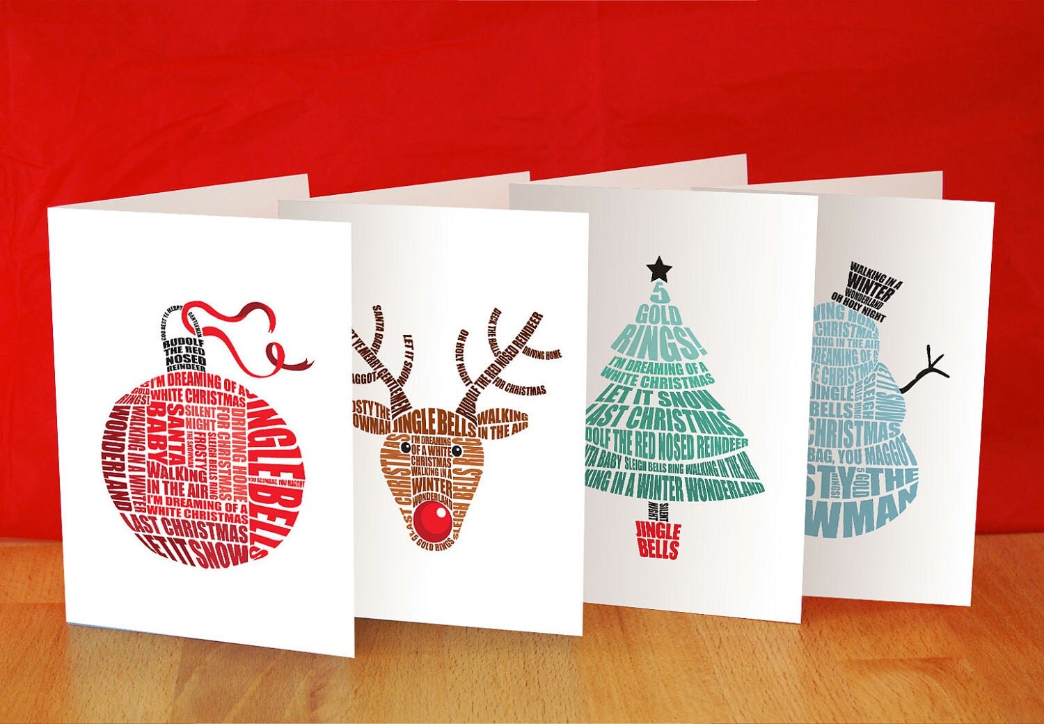
This designer has used the text itself as part of the illustrative element, using festive shapes to create a cutting mask around the text. I do however feel like this style was part of a trend which has now passed, and the effect itself does appears more mass produced, than individually done and special.
Source

This design is not particularly illustrative in terms of separate illustrations, however the type is treated more as a bespoke piece of lettering over a basic type face. This could be a good concept to do If the film has a strong type theme. The grinch in particular has a very identifiable typeface, used for the title, which is automatically linked to the film and Dr. Suess when seen.
Source

Here the designer has done something really cool using the negative space between and inside the letters to create illustrations. The decision is minimalist, but offers just the right amount of detail in reflection to the very basic typeface.
Source


I came across these designs, and really loved how the illustration and type elements differed large amounts yet the simple layout of the cards allowed them to stay consistent. The designs use the lettering pieces as the focal point, which are then encompassed by simple illustrative patterns. The designs also use the simplest pallet I have seen, using one colour for type, fill and line against the same colour backdrop. This indicates how complex illustrative designs that differ in illustration type and typeface can be kept in a coherent collection.
Source

However this designer shows how a larger pallet can also be used to create consistency across a range of cards with visually different aesthetics. The lettering on each card is fairly consistent, mostly using hand rendered script for inspiration. The illustrations are also the same style across each card using water colour brushes as the medium. All of the cards take on the same colour pallet, and have a similar painted theme.
Source

This card does something very different to any other design I have found. The text is very illustrative, however unlike the first card design I found, which uses a number of different typefaces with entirely different aesthetics, I find this which uses different fonts, with very similar aesthetics flows better and makes the card look more expensive and like more time has been taken. Although there is a small use of line based illustrative elements the main visual element is the use of photography behind the text. If the style of text, colour of text and illustration type are consistent across all 3 cards, then this could be a successful idea, however It would need experimentation, as two of the films selected are real life camera visuals, and the polar express is animation.
No comments:
Post a Comment