OUGD603.
BRREW ICED TEA.
INTERIM SUBMISSION BOARDS.
Sunday, 14 December 2014
OUGD603 / Extended practice - MAC cosmetics: Interim submission boards.
OUGD603.
MAC COSMETICS.
INTERIM SUBMISSION BOARDS.
MAC COSMETICS.
INTERIM SUBMISSION BOARDS.
OUGD603 / Extended Practice - DR ME: Interim submission boards.
OUGD603.
DR ME.
INTERIM SUBMISSION BOARDS.
DR ME.
INTERIM SUBMISSION BOARDS.
Tuesday, 9 December 2014
OUGD603 / Extended Practice - Christmas staionary: Visuals from films.
OUGD603.
CHRISTMAS STATIONARY.
VISUALS FROM THE FILMS.
POLAR EXPRESS:
Polar express train.

Golden ticket.

Mountain.

Bell.

Boy.

THE GRINCH:
Lit up house.
The grinch.

The grinches dog.

Mount crumpit.

Bauble.

Cindy Lou who.

Whoville

ELF:
Buddy makes breakfast with his favourite maple syrup.


CHRISTMAS STATIONARY.
VISUALS FROM THE FILMS.
POLAR EXPRESS:
Polar express train.
Golden ticket.
Mountain.
Bell.
Boy.
THE GRINCH:
Lit up house.
The grinch.
The grinches dog.
Mount crumpit.
Bauble.
Cindy Lou who.
Whoville
ELF:
Buddy makes breakfast with his favourite maple syrup.
OUGD603 / Extended practice - Christmas stationary: Typographic christmas cards.
OUGD603.
CHRISTMAS STATIONARY.
TYPOGRAPHIC CHRISTMAS CARDS.
Today I wanted to look into how Typographic christmas cards can be themed. Although the aesthetic of my cards will be dominated by type, I also want to nod to the great visual symbols I found in each of the three christmas films.
Source

Not only does this card design incorporate illustrative elements through a variety of typefaces, the designer also incorporates a small selection of minimalist illustrations in the same pallet colour as the text.
Source

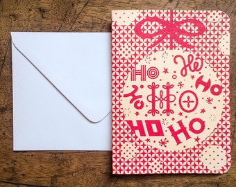
This designer has used the text itself as part of the illustrative element, using festive shapes to create a cutting mask around the text. I do however feel like this style was part of a trend which has now passed, and the effect itself does appears more mass produced, than individually done and special.
Source

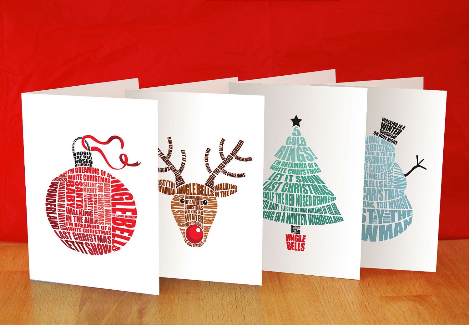
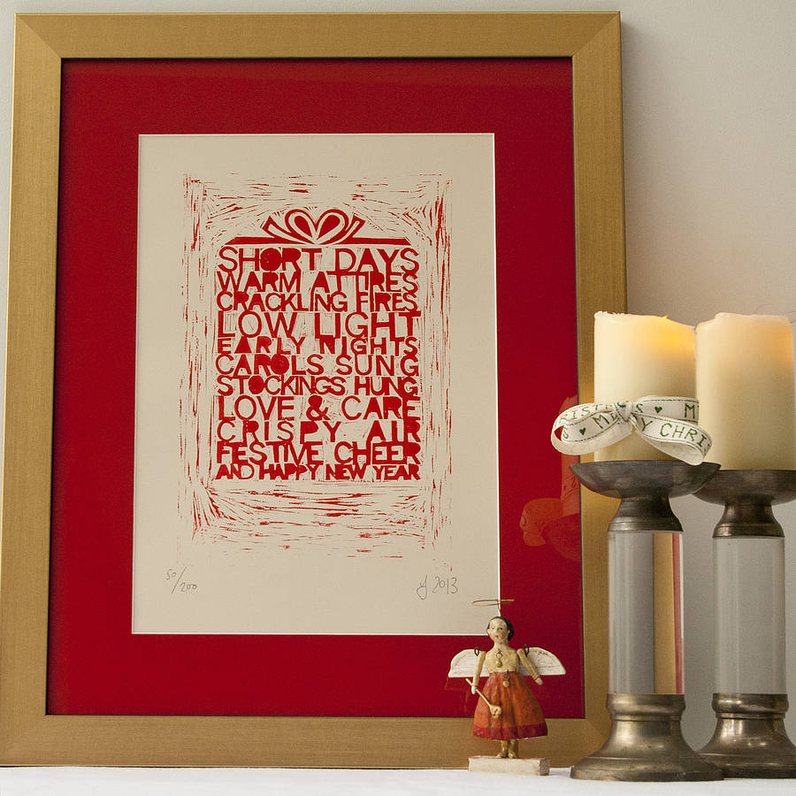
This design is not particularly illustrative in terms of separate illustrations, however the type is treated more as a bespoke piece of lettering over a basic type face. This could be a good concept to do If the film has a strong type theme. The grinch in particular has a very identifiable typeface, used for the title, which is automatically linked to the film and Dr. Suess when seen.
Source

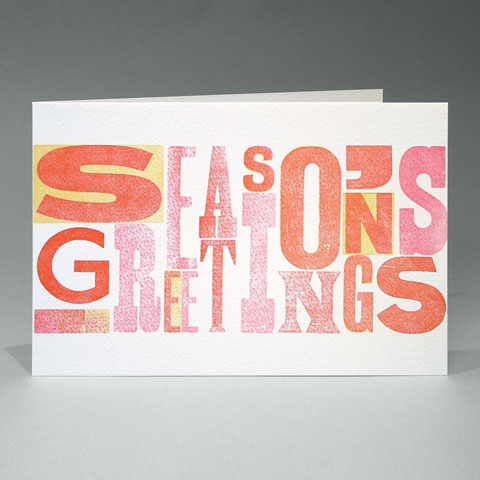
Here the designer has done something really cool using the negative space between and inside the letters to create illustrations. The decision is minimalist, but offers just the right amount of detail in reflection to the very basic typeface.
Source


I came across these designs, and really loved how the illustration and type elements differed large amounts yet the simple layout of the cards allowed them to stay consistent. The designs use the lettering pieces as the focal point, which are then encompassed by simple illustrative patterns. The designs also use the simplest pallet I have seen, using one colour for type, fill and line against the same colour backdrop. This indicates how complex illustrative designs that differ in illustration type and typeface can be kept in a coherent collection.
Source

However this designer shows how a larger pallet can also be used to create consistency across a range of cards with visually different aesthetics. The lettering on each card is fairly consistent, mostly using hand rendered script for inspiration. The illustrations are also the same style across each card using water colour brushes as the medium. All of the cards take on the same colour pallet, and have a similar painted theme.
Source

This card does something very different to any other design I have found. The text is very illustrative, however unlike the first card design I found, which uses a number of different typefaces with entirely different aesthetics, I find this which uses different fonts, with very similar aesthetics flows better and makes the card look more expensive and like more time has been taken. Although there is a small use of line based illustrative elements the main visual element is the use of photography behind the text. If the style of text, colour of text and illustration type are consistent across all 3 cards, then this could be a successful idea, however It would need experimentation, as two of the films selected are real life camera visuals, and the polar express is animation.
CHRISTMAS STATIONARY.
TYPOGRAPHIC CHRISTMAS CARDS.
Today I wanted to look into how Typographic christmas cards can be themed. Although the aesthetic of my cards will be dominated by type, I also want to nod to the great visual symbols I found in each of the three christmas films.
Source
Not only does this card design incorporate illustrative elements through a variety of typefaces, the designer also incorporates a small selection of minimalist illustrations in the same pallet colour as the text.
Source
This designer has used the text itself as part of the illustrative element, using festive shapes to create a cutting mask around the text. I do however feel like this style was part of a trend which has now passed, and the effect itself does appears more mass produced, than individually done and special.
Source
This design is not particularly illustrative in terms of separate illustrations, however the type is treated more as a bespoke piece of lettering over a basic type face. This could be a good concept to do If the film has a strong type theme. The grinch in particular has a very identifiable typeface, used for the title, which is automatically linked to the film and Dr. Suess when seen.
Source
Here the designer has done something really cool using the negative space between and inside the letters to create illustrations. The decision is minimalist, but offers just the right amount of detail in reflection to the very basic typeface.
Source
I came across these designs, and really loved how the illustration and type elements differed large amounts yet the simple layout of the cards allowed them to stay consistent. The designs use the lettering pieces as the focal point, which are then encompassed by simple illustrative patterns. The designs also use the simplest pallet I have seen, using one colour for type, fill and line against the same colour backdrop. This indicates how complex illustrative designs that differ in illustration type and typeface can be kept in a coherent collection.
Source
However this designer shows how a larger pallet can also be used to create consistency across a range of cards with visually different aesthetics. The lettering on each card is fairly consistent, mostly using hand rendered script for inspiration. The illustrations are also the same style across each card using water colour brushes as the medium. All of the cards take on the same colour pallet, and have a similar painted theme.
Source
This card does something very different to any other design I have found. The text is very illustrative, however unlike the first card design I found, which uses a number of different typefaces with entirely different aesthetics, I find this which uses different fonts, with very similar aesthetics flows better and makes the card look more expensive and like more time has been taken. Although there is a small use of line based illustrative elements the main visual element is the use of photography behind the text. If the style of text, colour of text and illustration type are consistent across all 3 cards, then this could be a successful idea, however It would need experimentation, as two of the films selected are real life camera visuals, and the polar express is animation.
OUGD603 / Extended practice - Christmas card stationary: Visual research.
OUGD603.
CHRISTMAS STATIONARY.
VISUAL RESEARCH.
To ensure that the christmas cards look consistent I want to produce them all using the same print techniques and if possible a small pallet of colours that can be used across all 3 cards. I knew that I wanted to create cards that used more hand rendered print processes that would allow for a more personal touch to a christmas card, over something that is digitally printed, and therefore feels quite mass produced.
I want to look into the different ways I could possibly print/ make the cards and what the limitations are for each process.
Screen printed cards:
Source

Printing cards via screen prints allows for the use of coloured card, over printing a backdrop shade onto light card. A coloured backdrop although as above provides a great background for black and white prints, It does provide problems when using coloured inks, as when printed on top of another colour, they loose the shade they are supposed to be.
Source

However all colours look great printed against a white background, including black paired with various other colours.
Source

Screen printing also provides a very personal effect, with natural flaws indicating that it is a process done by hand which with appear more special, and like much more of a gift to receivers.
Source

Screen printing also looks great when negative space is used effectively as shown in this design. Here the white card is not only used as a background colour, It as used as a colour in the design which provides the same amount of detail, and is just as important / a part as every other colour on the design.
Source

Again this is another screen printed card I liked that used the background colour as the backdrop and as negative space details in the design such as the rosy cheeks on the illustrations ect. I also like how the card looks very detailed and has a well themed colour pallet, whilst using only 2 shades of ink.
Source

The screen printing process becomes part of the aesthetic in christmas cards and so less detail and colour are needed. This is proved in the design above, where the simplicity of one colour ink and a simple type piece seems enough due to the process it has been printed in. If it were to be printed digitally I would think that this design might be too basic.
Source


Source

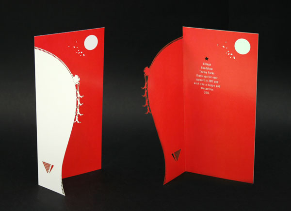
The above design demonstrates how laser cutting can be used to create a more luxurious design, with a more complex cutting pattern and the layering of two colours/ illustrations in a corsertina formation.
Lino print:
Source

As shown above, Lino print gives the most hand rendered and organic outcomes out of the print processes I have looked at. This is mostly because the process almost totally depends on drawing the original design by hand rather than on screen. There is 9 times out of 10, no computer involved and so the cutting of the design is also completely fulfilled by hand.
Source

Lino print is very unpredictable and so there is no knowing how the print is going to turn out until the time of carving out of the design. If looking to create a very crafty design in which flaws are appreciated this can work as a positive, however can impact the design negatively if looking for something a little more crisp. For these reason I think it would probably be best to seek out an alternative process for printing as I don't want the cards to appear to crafty, as I don't think this would suit their locations of distribution.
Source

There are however a lot of limitations with lino cut design including colour pallet, which if printed via this process, could only be very little, unless a piece of the tile is cut away each time. Another limitation is the clarity of text, detailed type is very hard to carve out of a lino tile, and this also means that type will not be consistent, a particular typeface cannot be used.
Source

Letterpress:
Source

Letter press is a great idea if I were to do my design purely text based. Letter press would allow me to be experimental in terms of size of text, colour and layout, however if I were to use this process I would also be very limited.
Source

Unfortunately If I were to choose to use letter press as my print process I would be limited in terms of wanting to do illustrations. If I wanted to do these I would have to do them via screen print, or by experimenting with the emboss machine and laser cutting my own plates. However this brings extra complications and may add time which I don't have to spend on the project.
Source

However the beauty of letterpress shines when It is used in its simplest form, which is generally how I think the process looks best. Therefore this would be a great process to use if I end up going for simplicity. Another downside is that I am limited with typefaces and I am only able to pick from the selection that already exists at college.
CHRISTMAS STATIONARY.
VISUAL RESEARCH.
To ensure that the christmas cards look consistent I want to produce them all using the same print techniques and if possible a small pallet of colours that can be used across all 3 cards. I knew that I wanted to create cards that used more hand rendered print processes that would allow for a more personal touch to a christmas card, over something that is digitally printed, and therefore feels quite mass produced.
I want to look into the different ways I could possibly print/ make the cards and what the limitations are for each process.
Screen printed cards:
Source
Printing cards via screen prints allows for the use of coloured card, over printing a backdrop shade onto light card. A coloured backdrop although as above provides a great background for black and white prints, It does provide problems when using coloured inks, as when printed on top of another colour, they loose the shade they are supposed to be.
Source
However all colours look great printed against a white background, including black paired with various other colours.
Source
Screen printing also provides a very personal effect, with natural flaws indicating that it is a process done by hand which with appear more special, and like much more of a gift to receivers.
Source
Screen printing also looks great when negative space is used effectively as shown in this design. Here the white card is not only used as a background colour, It as used as a colour in the design which provides the same amount of detail, and is just as important / a part as every other colour on the design.
Source
Again this is another screen printed card I liked that used the background colour as the backdrop and as negative space details in the design such as the rosy cheeks on the illustrations ect. I also like how the card looks very detailed and has a well themed colour pallet, whilst using only 2 shades of ink.
Source
The screen printing process becomes part of the aesthetic in christmas cards and so less detail and colour are needed. This is proved in the design above, where the simplicity of one colour ink and a simple type piece seems enough due to the process it has been printed in. If it were to be printed digitally I would think that this design might be too basic.
Source
Screen printed material looks better with a smaller pallet of colours. So although screenprinting can be limiting in terms of a large colour pallet, this con, provides a positive impact on screen print design.
Lasercut cards:
Although laser cutting is probably the most limiting in terms of colour pallet, depending on complexity, the ability to play around with negative space and layering is endless. Laser cutting is also a very intricate process and takes quite a lot of time. Therefore whatever the design, the end result always appears more luxurious than if something were to be simply digitally printed.
This design indicates how laser cutting can cleverly be used to add great detail to a piece that has been digitally printed. Laser cutting is great for adding detail to something in which you only want to use a small colour pallet. Or If there is a select couple of colours as above, yet you want to add more detail.
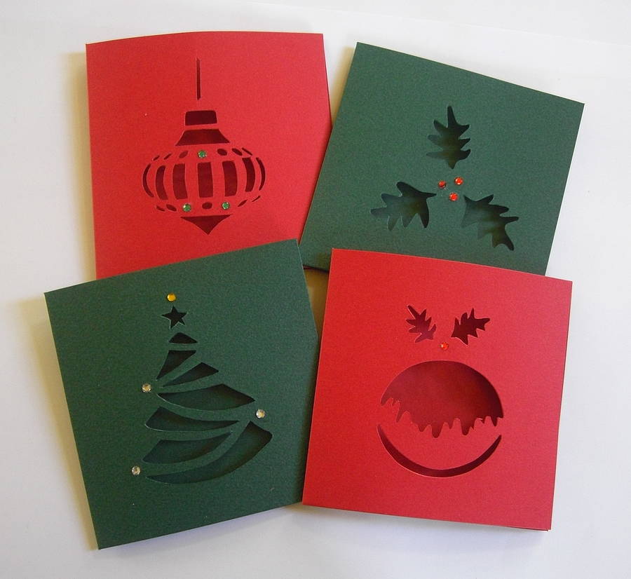
Above is an example of how the most basic visual ideas can come to life and appear special via laser cutting. Cut out are negative sections on a one colour background, details are added via small adhesive beads.
Source
The above design demonstrates how laser cutting can be used to create a more luxurious design, with a more complex cutting pattern and the layering of two colours/ illustrations in a corsertina formation.
Lino print:
Source
As shown above, Lino print gives the most hand rendered and organic outcomes out of the print processes I have looked at. This is mostly because the process almost totally depends on drawing the original design by hand rather than on screen. There is 9 times out of 10, no computer involved and so the cutting of the design is also completely fulfilled by hand.
Source
Lino print is very unpredictable and so there is no knowing how the print is going to turn out until the time of carving out of the design. If looking to create a very crafty design in which flaws are appreciated this can work as a positive, however can impact the design negatively if looking for something a little more crisp. For these reason I think it would probably be best to seek out an alternative process for printing as I don't want the cards to appear to crafty, as I don't think this would suit their locations of distribution.
Source
There are however a lot of limitations with lino cut design including colour pallet, which if printed via this process, could only be very little, unless a piece of the tile is cut away each time. Another limitation is the clarity of text, detailed type is very hard to carve out of a lino tile, and this also means that type will not be consistent, a particular typeface cannot be used.
Source
Letterpress:
Source
Letter press is a great idea if I were to do my design purely text based. Letter press would allow me to be experimental in terms of size of text, colour and layout, however if I were to use this process I would also be very limited.
Source
Unfortunately If I were to choose to use letter press as my print process I would be limited in terms of wanting to do illustrations. If I wanted to do these I would have to do them via screen print, or by experimenting with the emboss machine and laser cutting my own plates. However this brings extra complications and may add time which I don't have to spend on the project.
Source
However the beauty of letterpress shines when It is used in its simplest form, which is generally how I think the process looks best. Therefore this would be a great process to use if I end up going for simplicity. Another downside is that I am limited with typefaces and I am only able to pick from the selection that already exists at college.
OUGD603 / Extended Practice - Christmas stationary: First thoughts.
OUGD603.
CHRISTMAS STATIONARY.
FIRST THOUGHTS.
When I originally pitched the brief I had spoken of wanting to create a set of stationary including greetings cards, gift wrap and tags with the possibility of creating gift bags as well. Unfortunately due to time constraints I feel that it is now beneficial to stick to only creating a set of christmas cards in relation to three christmas films.
Which three christmas films?
As stated in my previous post that the audience for this brief, would be very vague in terms of diversity and more so that the audience would be drawn not by the design of the piece, but the christmas film itself.
In order to find what is the 3 most popular christmas films, I made a simple survey listing a stream of christmas movies and asked the users to select their 3 favourite.

When looking at the results of the survey, peoples favourite Christmas films from the selection in order of popularity were:
1. Home alone.
2. The Grinch.
3. Elf / Love actually
3. Elf / Love actually
4. The nightmare before christmas / Polar express / Santa clause the movie.
5. Miracle on 34th street / The holiday.
The rest of the films on the list got no votes.
I found when looking back at the top 3 suggestions for most popular christmas films, they had very different audiences and as a set they wouldn't particularly work together in a collection.
Therefore I decided it would be best to define the audience more to create a consistent selection. Looking at the list I found that the films that were favourited where generally associated with children to young adults, this would be because the people I reached out to on my social media are mostlybetween the ages of 16-23. With this realisation, I thought that the best way to move forward would be to select the 3 most popular films from the list that this generation of consumers would enjoy, this would then make sure that the card designs could share the same style, and work together as a set.
The three chosen cards:
- The grinch.
- Elf.
- The polar express.
The next decision I need to make is to choose which quote from each film will inspire the design.
The Grinch:
'Maybe Christmas he thought doesn't come from a store, maybe Christmas perhaps... means a little bit more.'
'Maybe Christmas he thought doesn't come from a store, maybe Christmas perhaps... means a little bit more.'
Elf:
you have such a pretty face, you should be on a Christmas card!
The Polar Express:
'Sometimes the most real things in the world are the things we can't see.'
Saturday, 6 December 2014
OUGD603 / Extended practice - Brrew Iced tea: Social media.
OUGD603.
BRREW ICED TEA.
Social media.
Today I began working on some of the promotion for Brrew.
I have decided to do social media promotion as word of mouth via social media is one of the best ways to transport information to my younger audience group of 16-30 year olds.
I worked on creating a set of designs for Facebook including a cover and profile photo.
Below I started playing with some ideas for a cover photo that would communicate to Face book users the range of flavours that Brrew has in its range. To do this I took the signature illustration found on the front of each box and split it into four sections, regarding the four flavours. The logo for Brrew is originally done in gold foil on the packaging which is difficult to translate to on screen and so I tried to find a colour that would act neutrally and wouldn't link to any of the colours already used in the design. I tried both black and blue.


I did however feel that by changing the colour of the logo, the social media design lost some of its connection to the original branding and therefore I looked for a way to counter this.

I went back to basics and tried to make the design for the Facebook banner as similar as possible to that of the box design. For this reason I have used the original box illustration in the most striking colour, however this could be interchanged to other flavours/colours throughout the course of the brands time on Facebook. Daily/weekly posts will also signify to the audience the range of products sold. The main function of the header is to be striking and identifiable.
I then thought it would correspond with the printed ephemera to also include the shortened down version of the logo. The shortened logo is a great size and shape to fit that of a profile picture. This combination would be a great simple and identifiable online reflection of the tactile brand.

Here I have put the Facebook designs I have created into a mock up to see how they communicate on an online platform. I feel that the design works very well and is very muech easily recognizable. Although the banner does not reflect the whole collection of Brrew which I think is a downside, I do think it does its job of lurring the customer in. I also think that information such as flavours will be available to communicate on posts made on the wall of the website.
Final product:

Tuesday, 2 December 2014
OUGD603 / Extended Practice - Ditto press: Methodology.
OUGD603.
DITTO PRESS.
METHODOLOGY.
Today we met up with Ben again from Ditto Press and we spoke more in a group setting about our individual methodologies. I find this set up helpful as although I work much differently to others, everyone has their own way of working, I am alerted to things in my own process I have forgotten, that others sometimes remind me I do.
We individually spoke about our methodologies.
I had been confused about the task but prepared something to talk about anyhow, that I could gain feedback on. My methodology I felt was simple, and was something I had come up with when looking back at some of the projects I completed towards the end of last year and early this year.
I named my methodology 50/50.
50/50:
The method behind 50/50 spoke of sourcing of research.
My plan via 50/50 was for every piece of secondary research I did, I would do a piece of primary research.
eg. If I sourced some images online, I would also look to go and source some of my own imagery.
However, This could be a useless process, taking my own photos could be unnecessary and therefore to follow the methodology would be a waste of time. Therefore I need to think more about what information I source over how I source it.
However after speaking to Ben and listening to others in the group, I found that I was looking at the idea of a methodology in completely the wrong sense. Whilst I was looking more so into what outlets of research I do, such as online, photography etc. What I was supposed to look into, and what would be way more useful is the information I need to source, rather than the sources themselves. Ben stated that it doesn't matter whether research is primary or secondary, as long as it is useful. And therefore we shouldn't think of research within these boundaries. I will however keep in mind at the development stage that primary elements (such as going to take photographs) will make my work more original and bespoke, over collecting images online.
I started thinking about how I have research, developed and designed up until now, and how it would be useful to do so in the future. What is the best way for me to attain information across all brief projects.
Separation then integration.
I found that when thinking about my process, I separate the brief into two sections which I can research into, function and form.
Function:
- Audience.
- Culture.
- Client personality.
- Context.
- Purpose of product. (Uses)
With results from research pick strongest theme/s. put these against the following form elements:
Form:
- Colour.
- Tone of voice.
- Ergonomics.
Pick strongest combination / idea wanted to work with.
Look at:
- Precedents.
- Production.
Rewrite brief regarding:
Theme + form + Production = design.
Refer design and development back to the first list and brief.
Client interaction / opinions.
Make amendments if necessary - Prototypes.
Client interaction / opinions.
Final piece.
Subscribe to:
Comments (Atom)